Design Team/Logo Ideas
Please add your logo ideas to the image gallery.
Designs by Luca Ferrari and Franco Lodato
![]()
![]()
![]()
![]()
![]()
![]()
![]()
![]()
![]()
Simplified versions
![]()
![]()
![]()
![]()
![]()
XO-based Logo


I have the SVG source available if either of these logos is selected. The second has the allusion of an infinity symbol and has a bit smoother look.
Designed by Murray Altheim
variation on theme
![]()
Cjl 04:49, 4 June 2008 (UTC)
Current Logo
![]()
I got this from the upper left hand corner of the wiki site. It is optimized for a black background - sorry. But I really like this since it is slightly different from the XO logo - by being thicker and having a hard candy pattern. It's my favorite from the list so far.--ThePlaz 17:16, 26 May 2008 (UTC)
Molecule
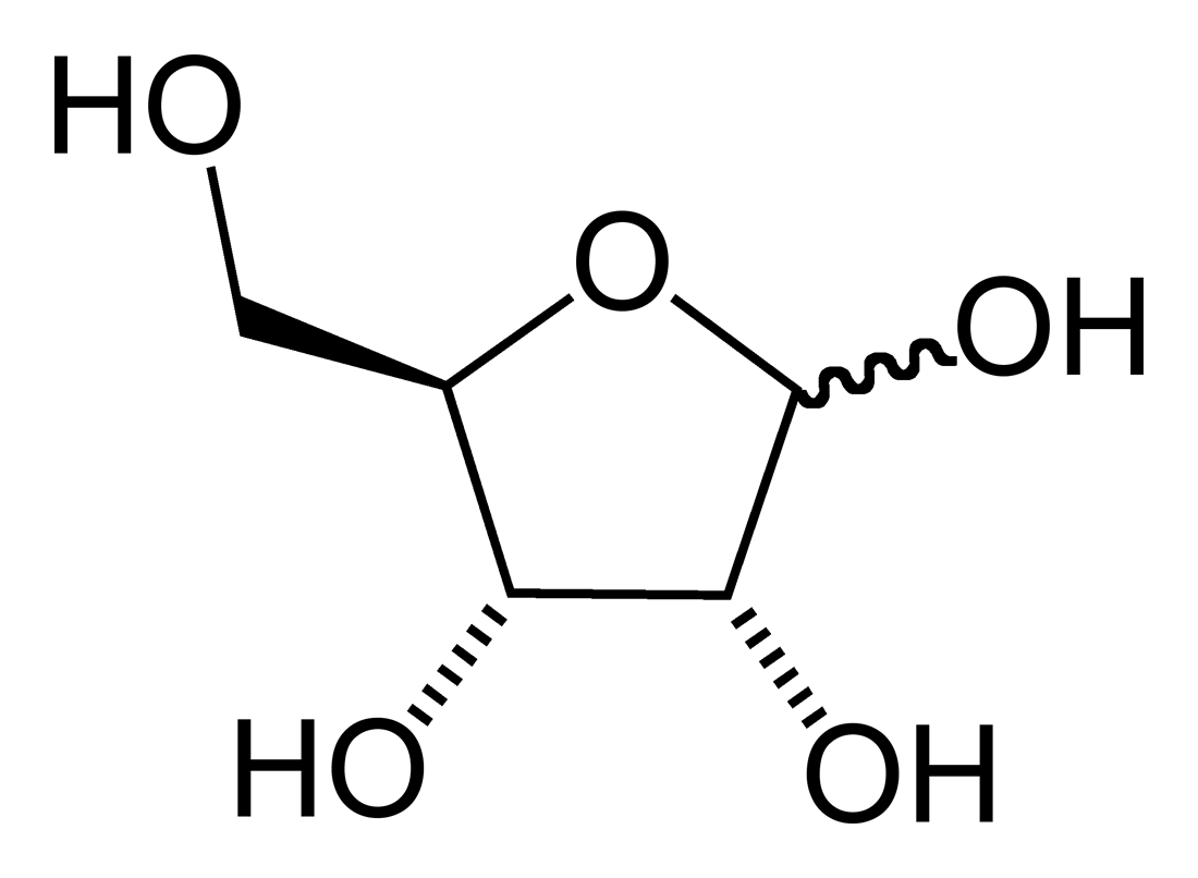 Ribose Sugar Ribose Sugar
|
| http://en.wikipedia.org/wiki/Image:Beta-D-glucose-3D-vdW.png Glucose Sugar |
Sugar Bowl


Individual grains of sugar fill the bowl. Attempting to be whimsical in use of color and simple in form. The font is Bentwood.
Designed by Marc Williams
"Peace" / Sugar cubes

Designed by Gaurav Bhushan, a student of Information Design, National Institute of Design India.
Comments and feedback welcome.
Another Sugar Cube
This logo variation is an axonometric sugar cube with the name sugar labs wrapping around the base. The name is set in Tempo heavy Condensed.
![]()
- May violate Sugar CRM's trademark.
Sugar Cube


- May violate Sugar CRM's trademark.
Building Blocks
Here's a derivative idea, based on the "Sugar cube" proposal from before. If we consider representing Sugar as a building block, we could treat Sugar Labs as community structure composed of those blocks, emphasizing both construction(ism) and collaboration. Please note that this is a really quick sketch, and details such as size, placement, color, font, and even the rendition of the cube should be considered in detail, if this direction seems worth exploring.

==
Letter blocks
Inspired by eben's building blocks. A "to-the-point" design. Have sugar be spelled using letter blocks. It immediately conveys the "kids learning" purpose of Sugar, plus hints at the enjoyment that goes along with learning. Rough mockup to show the idea.
![]()
A connected community of learners

I like the cube idea, I was inspired looking at the earlier Sugar Cube designs and wanted to build something. My ideal is to connect a lot of parts, LEGO-style. So I adapted a Rubics cube design to build an apartment community with the Python team, the Sugar team, and so forth. Please choose and letter your sides, something wonderful could happen.
You could use this to document software/API layers, or anything that could be boxed, the dBus and other system software would be helpful to visualize, as well as children in different area using the mesh networking.
==
Text in pseudo-Sugar icon style
The colors and line weights need adjusting, but just to give an idea. It is simple and flexible and it intends to give the impression of multiple elements making a whole--in this case a word.
Christian's take on this theme

the color orange

Eye Metaphor
I considered trying something different. Our eyes are the organs we humans absorb the most information with, especially when using a computer. Also, Sugar Labs may represent an eye for its users gathering information from all over the world. This metaphor was also incorporated in the rest of the suite, while each logo incorporates the function/tool it represents in a metaphorical way. An other thing that was taken into consideration is that the Sugar Labs logo can be recognized/memorized easily and additionally it is functional in some cases on its own, without the need of the "Sugar Labs" badge. Hope this helps

Introduce "Lab" visual element?

 I had taken a crack at a similar idea myself, when working with the "droplet of sugar" idea.
=>  Working atop of your image, I came with that result. To me, the thing should be green like the laptop (until XOXO) and I added a bit of sugar, or at least tried to represent some kind of sugarized treat with a cherry.
 Just to give idea about logo based on "Sugarcane" image with SUGAR painted on it, and pieces of Sugarcane making "LABS" structure
 Galaxy looking lollipop w/ lightbulb, also looks a bit like candyfloss - the sugariest, sweetest thing I've ever tasted.