|
|
| (15 intermediate revisions by 2 users not shown) |
| Line 1: |
Line 1: |
| − | <noinclude>{{TOCright}}<!-- START OF BLOCK -- 1. COPY & PASTE this BLOCK to below the END OF BLOCK line. | + | __TOC__ |
| − | 2. PASTE it before any pre-existing proposal,
| + | == [[Journal NewUI]] == |
| − | 3. then OVERWRITE the place holders with your information,
| + | == [[Design Team/Proposals/Journal#Datastore|Datastore]] == |
| − | 4. and DELETE the START & END OF BLOCK instruction lines.
| + | <noinclude> |
| − | 5. Click [Show preview] to check formatting, and adjust as necessary.
| + | * See Sascha Silbe's [http://git.sugarlabs.org/projects/versionsupport-project/repos/mainline version support project] specifically [http://git.sugarlabs.org/projects/versionsupport-project/repos/mainline/blobs/master/datastore-redesign.html datastore-redesign] (click the raw blob data link at the top of the page to see the HTML rendered in your browser), and this [http://www.mail-archive.com/sugar-devel@lists.sugarlabs.org/msg06008.html mailing list thread], or this [http://docs.google.com/Doc?docid=0AbFyRSVE0dmOZGQ5emZjOTZfMzBoeG1qMjhqbg&hl=en compilation of the discussion] in context with the proposal document. |
| − | 6. Click [Save page] to complete the edit.
| |
| − | -->
| |
| | </noinclude> | | </noinclude> |
| − | <!-- Pre-existing Proposal Block -->
| + | == [[Design Team/Proposals/Journal#Tags under titles|Tags under titles]] == |
| − | ===Datastore===
| + | <noinclude> |
| − | * See Sascha Silbe's [http://git.sugarlabs.org/projects/versionsupport-project/repos/mainline version support project] specifically [http://git.sugarlabs.org/projects/versionsupport-project/repos/mainline/blobs/master/datastore-redesign.html datastore-redesign] (click the raw blob data link at the top of the page to see the HTML rendered in your browser), and this [http://www.mail-archive.com/sugar-devel@lists.sugarlabs.org/msg06008.html mailing list thread].
| |
| − | | |
| − | ===Tags under titles===
| |
| − | | |
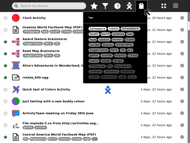
| | [[Image:journal_tag_mockup_frm_gary_v1.png|thumb|centre|640px|Example mock-up based on current Journal (0.84) using two lines for title and tags per each entry. Notes: Entries with no tags have their title vertically centred to keep visual balance; entries with more tags than can be displayed end with an ellipsis, this could just be indicative that there are more tags, or have hover hint function showing the remaining un-displayed tags. Clicking a tag should add it to the search field to allow drilling down into results.]] | | [[Image:journal_tag_mockup_frm_gary_v1.png|thumb|centre|640px|Example mock-up based on current Journal (0.84) using two lines for title and tags per each entry. Notes: Entries with no tags have their title vertically centred to keep visual balance; entries with more tags than can be displayed end with an ellipsis, this could just be indicative that there are more tags, or have hover hint function showing the remaining un-displayed tags. Clicking a tag should add it to the search field to allow drilling down into results.]] |
| | + | </noinclude> |
| | + | CSA: If you incorporate ordered tags, based on filesystem paths, they could look like this: |
| | + | [[Image:journal_tag_dir_styles.jpg|center|Tag styles]] |
| | | | |
| − | === Toolbar and palettes === | + | == [[Design Team/Proposals/Journal/Toolbar and palettes | Toolbar and palettes]] == |
| − | | + | <noinclude> |
| − | TODO:
| + | See Gary Martin's mockups, such as this: |
| − | * Add and mock-up an anyone/who palette.
| + | [[Image:journal_mockup_gary_tags_gradient_palette.png|centre|640px|link=Design Team/Proposals/Journal/Toolbar and palettes|Tag fill colour is graduated from white to grey based on the tag frequency. Not sure we want to introduce a new 'colour' language but thought a mock-up would be worth it (though it's certainly the most visually clear indication of frequency given the space). Also works with white text and grey to black fill.]] |
| − | * Try and find better design for the anything/what filter/funnel icon.
| + | </noinclude> |
| − | * Show multi entry selection and applying actions to them
| |
| − | ** shift key modifier and click to multi select (toggle, or could be block range)
| |
| − | ** modified pop-up palette when interacting with multi selected items
| |
| − | * Try tag functionality in the search magnifying-glass icon
| |
| − | ** less scary number of buttons for novice users
| |
| − | ** could also be part of autocomplete when typing
| |
| − | * What/Anything filter could switch main canvas to a 'tree map' like view
| |
| − | ** clicking on a grid would then just list that Activity type
| |
| − | ** each grid would be sized based on frequency of entries
| |
| − | ** each grid would show icon and Activity name
| |
| − | ** maximum use of space
| |
| − | ** no scrolling and no scary palettes
| |
| − | ** perhaps tags could be treated in the same way?
| |
| − | | |
| − | ==== Button icons in toolbar ====
| |
| − | [[Image:journal_mockup_gary_toolbar.png|thumb|centre|640px|Toolbar rework using standard button icons instead of text menus (the Activity filter icon is a temporary design placeholder, others could do with more work too, suggestions welcome!) If time is short, just the What/Anything, and When/Anytime menus could be replaced for consistency (ideally with the addition of Grid view vs. current List view), with other filter UI functionality (Who/Anyone, and Tags UI) added in a future release.]]
| |
| − | | |
| − | ==== What/Anything palette ====
| |
| − | [[Image:journal_mockup_gary_filter_palette.png|thumb|centre|640px|Example using a palette with a grid layout to show many items on screen at once and reduce scrolling (Activity filter icon is a temporary design placeholder, suggestions welcome!) Clicking on an item will highlight it (as shown on the default 'Anything' icon) and place its icon in the toolbar. As the list of installed Activities grows (33 shown here), this palette will need to scroll, or perhaps initially start adding extra columns.]]
| |
| − | | |
| − | ==== When/Anytime palette ====
| |
| − | [[Image:journal_mockup_gary_when_palette.png|thumb|centre|640px|Using same options and text as per the current Journal implementation. However, the change to using a toolbar icon does raise the issue of 'showing state' visually in the toolbar. How should the main icon change to indicate one of these filters is set? I'm not sure there are good/consistent visual icons for all these menu options, though that could be one solution (if we still want to show state in main toolbar).]] | |
| − | | |
| − | ==== Who/Anyone palette ====
| |
| − | * TBA
| |
| − | | |
| − | ==== Tags palette ====
| |
| − | | |
| − | ===== Simple order by frequency =====
| |
| − | | |
| − | [[Image:journal_mockup_gary_tags_palette.png|thumb|centre|640px|Simple, ordered by frequency tag list. Grey fill with black text shown here, but also grey fill with white text works, as does white fill with black text. Palette will need to vertically scroll as number of tags increases, but perhaps a flexible width will help reduce this.]]
| |
| − | | |
| − | ===== Show frequency as gradient =====
| |
| − | | |
| − | [[Image:journal_mockup_gary_tags_gradient_palette.png|thumb|centre|640px|Tag fill colour is graduated from white to grey based on the tag frequency. Not sure we want to introduce a new 'colour' language but thought a mock-up would be worth it (though it's certainly the most visually clear indication of frequency given the space). Also works with white text and grey to black fill.]]
| |
| − | | |
| − | ===== Show frequency as proportional size =====
| |
| − | | |
| − | [[Image:journal_mockup_gary_tags_size2_palette.png|thumb|centre|640px|Tags are proportionately scaled (fonts equal size). More space is taken by this layout but seems visually more consistent with the tag shapes. Grey fill with white text is used for comparison with other above grey fill with black text mock-ups.]]
| |
| − | | |
| − | ==== Grid view palette ====
| |
| − | [[Image:journal_mockup_gary_grid_palette.png|thumb|centre|640px|Grid palette, not much here to see, other than to note that Grid view has been placed as a top level toolbar button as it's likely a frequent view to be switched to and from (grid view is inherently an object-view).]]
| |
| − | | |
| − | ==== List view palette ====
| |
| − | [[Image:journal_mockup_gary_list_palette.png|thumb|centre|640px|List palette, Journal Grid view and List view are (I think) the primary views users will switch between, so I've swapped around the design priority from Eben so that (potential future) action-view and object-view are secondary items for the List view. Once/if action-view is implemented/proven it would likely be the default List view.]]
| |
| − | | |
| − | ==== Extended list view palette ====
| |
| − | [[Image:journal_mockup_gary_list_extended_palette.png|thumb|centre|640px|The list view palette is extended here to cover sorting feature requirements. View by last edit (modification date), is the current presentation of the Journal. View by creation date, would list objects creation date (do we store this?), when in this mode rather than "16 min ago", the time column would display the real creation date "Today 12:30pm", "July 5th", "November 10th 2008". View by storage size, would sort by storage space taken up so that large files could be removed if short on space, the column usually used for showing time would instead show Kb/Mb type information (no extra columns need, and helps show what sort context a list view is in.)]]
| |
| | | | |
| | + | == [[Design Team/Proposals/Journal#GMail-style tag view |GMail-style tag view]] == |
| | <noinclude> | | <noinclude> |
| | + | Tags drag-and-drop-able from a left-side palette. |
| | + | [[Image:journal_mockup_cscott.png|thumb|center|640px|GMail-inspired Journal mockup.]] |
| | + | [[Image:journal_demo_cscott.png|thumb|center|640px|Journal2 demo]] |
| | | | |
| | ==Subpages== | | ==Subpages== |
| | {{Special:PrefixIndex/{{PAGENAMEE}}/}} | | {{Special:PrefixIndex/{{PAGENAMEE}}/}} |
| | </noinclude> | | </noinclude> |