Difference between revisions of "Design Team/Proposals/Welcome First Boot Intro"
Garycmartin (talk | contribs) (Welcome first boot) |
Garycmartin (talk | contribs) |
||
| (14 intermediate revisions by the same user not shown) | |||
| Line 9: | Line 9: | ||
# Sugar home view | # Sugar home view | ||
| − | |||
==== Welcome View ==== | ==== Welcome View ==== | ||
| − | + | In the welcome view, the user can step through, or skip, welcome content with a goal of providing initial XO and Sugar orientation. The content should be centred, onto a plain white canvas (same colour as first boot intro background) with no borders. This allows for content imagers with no visible edge boundaries, or a seamless style of the content authors choosing (e.g. drop shadows, traditional frame, texture). Content images can be in varying width and height, up to some recommended maximum, always presented centred on the canvas. Note that the content image below has been given a subtle coloured glow/shadow in post production as one possible example of seamless styling content in a frameless view. | |
| + | |||
| + | A timer could allow for auto flipping through the content card deck if no interaction is made after a set period, though care should be taken not to take control away from a user who may just bee looking closely at one of the content images (timer should be stopped if the user is interacting, touching keys, moving cursor). For keyboard accelerators, the Enter/Return key should be used to move onto the Naming view, with Space bar navigating through the content slide deck (and or cursor left, cursor right, game pad left, game pad right). | ||
| + | |||
| + | For future efforts we should consider providing animated feedback to the interaction (and swipe touch gestures), where the content images quickly animate as translations left and right when navigated through (a carousel like effect). And ultimately a left right full screen transition animation stepping through the Intro views pages. | ||
| + | |||
| + | |||
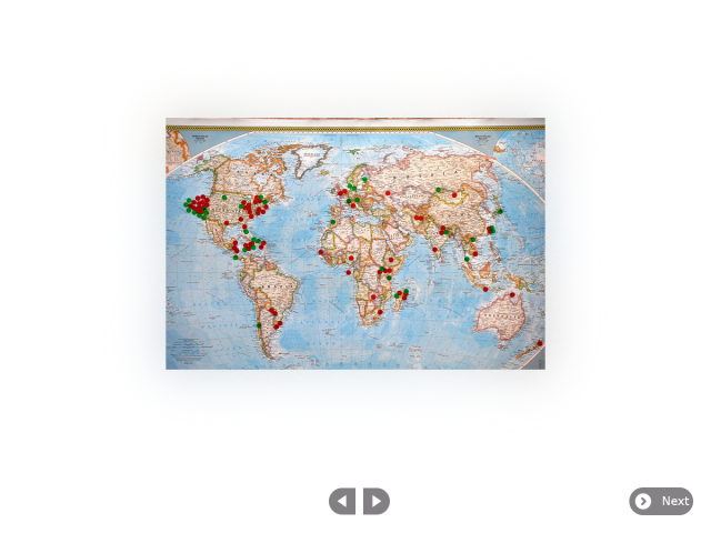
| + | [[File:First boot welcome proposal1.png|thumb|centre|640px|Layout example with centred go-previous-paired and go-next-paired content navigation buttons.]] | ||
| + | |||
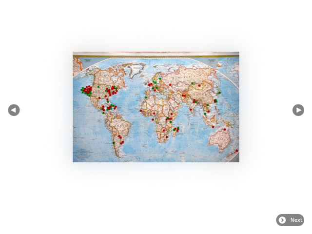
| + | [[File:First boot welcome proposal2.png|thumb|centre|640px|Layout example with go-previous and go-next content navigation buttons on opposite sides of the view.]] | ||
| + | |||
==== Naming View ==== | ==== Naming View ==== | ||
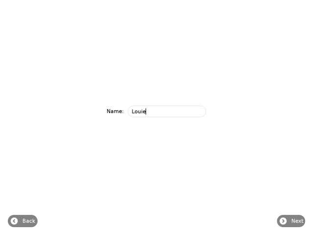
| − | [[File: | + | [[File:First boot name intro welcome proposal.png|thumb|centre|640px|Naming view, user types their name. The next button is initially inactive until the user starts to type a name. Note the addition of the Back button on the bottom left, this should return the user to the welcome content.]] |
| + | |||
==== Colour Picker View ==== | ==== Colour Picker View ==== | ||
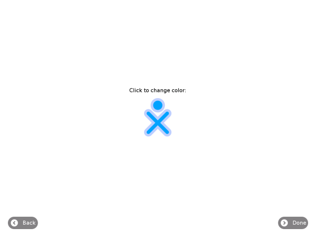
| − | [[File:First_boot_colour_picker_intro_blue.png|thumb|centre|640px|Colour picker, user chooses their fill and stroke colours.]] | + | [[File:First_boot_colour_picker_intro_blue.png|thumb|centre|640px|Colour picker, user chooses their fill and stroke colours. No change needed to this view.]] |
| + | |||
==== Sugar Home View ==== | ==== Sugar Home View ==== | ||
| − | + | First boot process leads to the Sugar Home view, where the user can choose to review the welcome content by starting the Welcome activity. Once at the Sugar home view a Welcome Activity is available if the user wants to review the welcome content at a later time. The Activity should have a standard Sugar toolbar with buttons for back and next that render the content, centred, onto a plain white canvas (same colour as first boot background) with no borders. This allows for content imagers with no visible edge boundaries, or a seamless style of the content authors choosing (e.g. drop shadows, traditional frame, texture). Content images can be in varying width and height, up to some recommended maximum, always presented centred on the canvas. | |
| + | |||
| + | * TODO: Design new Welcome Activity svg icon | ||
| + | |||
| + | |||
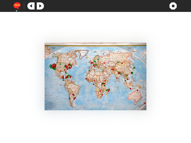
| + | [[File:Welcome activity mockup.png|thumb|centre|640px|Simple viewer activity for welcome content after first boot. Ideally the image content should be shared between both first boot and activity implementations to reduce disk space usage and stay consistent. Should the first boot implementation check and look inside the Welcome activity bundle, or should the Activity look for content somewhere in the system? Using the Activity as the content source would allow for easy upgrading and modifying of the content using existing tools and infrastructure, but might become an issue as different deployment start to provide different sets of localised welcome content (local Welcome activity version number will begin to conflict due to multiple maintainers, or become large in size if many sets of localised image based content are included in one officially maintained release).]] | ||
Latest revision as of 09:10, 12 May 2012
First Boot Welcome Feature
This design proposal tries to cove the needs of ticket #11816 while keeping the first boot user experience as smooth and Sugar friendly as possible. The first boot process should be:
- Boot animation
- Welcome view
- Naming view
- Coloir picker view
- Sugar home view
Welcome View
In the welcome view, the user can step through, or skip, welcome content with a goal of providing initial XO and Sugar orientation. The content should be centred, onto a plain white canvas (same colour as first boot intro background) with no borders. This allows for content imagers with no visible edge boundaries, or a seamless style of the content authors choosing (e.g. drop shadows, traditional frame, texture). Content images can be in varying width and height, up to some recommended maximum, always presented centred on the canvas. Note that the content image below has been given a subtle coloured glow/shadow in post production as one possible example of seamless styling content in a frameless view.
A timer could allow for auto flipping through the content card deck if no interaction is made after a set period, though care should be taken not to take control away from a user who may just bee looking closely at one of the content images (timer should be stopped if the user is interacting, touching keys, moving cursor). For keyboard accelerators, the Enter/Return key should be used to move onto the Naming view, with Space bar navigating through the content slide deck (and or cursor left, cursor right, game pad left, game pad right).
For future efforts we should consider providing animated feedback to the interaction (and swipe touch gestures), where the content images quickly animate as translations left and right when navigated through (a carousel like effect). And ultimately a left right full screen transition animation stepping through the Intro views pages.
Naming View
Colour Picker View
Sugar Home View
First boot process leads to the Sugar Home view, where the user can choose to review the welcome content by starting the Welcome activity. Once at the Sugar home view a Welcome Activity is available if the user wants to review the welcome content at a later time. The Activity should have a standard Sugar toolbar with buttons for back and next that render the content, centred, onto a plain white canvas (same colour as first boot background) with no borders. This allows for content imagers with no visible edge boundaries, or a seamless style of the content authors choosing (e.g. drop shadows, traditional frame, texture). Content images can be in varying width and height, up to some recommended maximum, always presented centred on the canvas.
- TODO: Design new Welcome Activity svg icon
