Difference between revisions of "Sugar Labs/SOM"
Garycmartin (talk | contribs) m (reorder gallery, new to old) |
Garycmartin (talk | contribs) |
||
| (285 intermediate revisions by 5 users not shown) | |||
| Line 1: | Line 1: | ||
| + | {{TOCright}} | ||
== Kohonen Self Organising Maps == | == Kohonen Self Organising Maps == | ||
[[Image:SOM_legend.jpg|thumb|172px|Legend]] | [[Image:SOM_legend.jpg|thumb|172px|Legend]] | ||
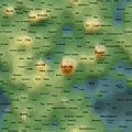
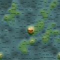
| − | Self Organising Maps (SOMs) can | + | Self Organising Maps (SOMs) can be used as 2d spatial summariser visualisations of multidimensional data. In the maps shown here, text distance metrics are generated from the weekly/monthly content on some of the more active mailing lists. Using a geographic like landscape metaphor, the height (colour gradient) indicates features with strong associations to all other features; proximity represents association between specific features (e.g. related terms), and label size indicates guide to basic frequency of a feature. There are many "correct" 2d map layouts for the same set of data (due to the multidimensional nature of the data), each map generation will usually settle into a slightly different set of local minima, but the associations are no less valid for each. After removing linguistic junk words, and word stemming, the maps currently pick the weeks/months top ~200 features by frequency. Each map is a continuous, tillable surface, and wraps around north/south and east/west (surface of a torus); so if you find an interesting label to one edge, remember to check it's neighbours on the opposite side. |
== What Do They Show? == | == What Do They Show? == | ||
| − | Well, you could just treat them | + | Well, you could just treat them as tag clouds, showing the top two hundred word features used on the mail-list for a given week/month, but the maps also hold spacial information that provides context. Word features that appear close together on the map were used closely (on average) in email content from the mail-list. A height metaphor is used to indicate the combination of feature association strength and feature frequency; word features in the blue and green areas have weaker mean associations and frequency relative to the hot orange and pink highs, but should not be considered negatively as they are still in the top ~200 terms, and will often be tightly associated with surrounding neighbours. |
| − | == | + | == SOM Related Research Papers == |
| − | + | [[Image:Teemu_leinonen_som_learning_som.jpg|thumb|220px|Self-Organizing Maps and Constructive Learning SOM from text.]] | |
| − | Image: | + | [http://www2.uiah.fi/~tleinone/teemu_leinonen_som_learning.pdf Self-Organizing Maps and Constructive Learning (PDF)] Honkela T., Leinonen T., Lonka K., Raike A. (2000): Self-Organizing Maps and Constructive Learning. Proceedings of ICEUT'2000, International Conference on Educational Uses of Communication and Information Technologies, Beijing, China. August 21-25, 2000, pp. 339-343. |
| − | + | :''In this article, the use of the self-organizing map (SOM) is approached on the basis of current theories of learning. Possibilities of computer and networked platforms that aim at helping human learning are also inspected. It is shown how the SOM can be considered a model of constructive learning. The area of constructive learning is outlined and two cases of using the self-organizing map in computer supported learning environments are presented.'' | |
| − | + | <br clear="all"/> | |
| − | + | ||
| − | + | == It's An Education Project Mailing List == | |
| − | + | ||
| − | + | Monthly maps generated with posts from the [http://lists.sugarlabs.org/listinfo/iaep IAEP mailing list]. Most recent maps shown first - for older maps please see the [[Sugar_Labs/SOM/IAEP|IAEP map history map archive]] page. | |
| − | + | ||
| − | + | <gallery widths="275" heights="150" perrow="2"> | |
| − | + | File:2012-July-som.png|'''2012 July''' (31 emails) | |
| + | File:2012-June-som.png|'''2012 June''' (81 emails) | ||
</gallery> | </gallery> | ||
| − | == Sugar Mailing List | + | == Sugar Mailing List == |
| + | |||
| + | Monthly maps generated with posts from the [http://lists.laptop.org/listinfo/sugar Sugar mailing list]. Most recent maps shown first - for older maps see the [[Sugar_Labs/SOM/Sugar|Sugar map history]] page. | ||
<gallery> | <gallery> | ||
| + | Image:2009-April-Sugar devel som.jpg|'''2009 April''' | ||
| + | Image:2009-March-Sugar-devel-som.jpg|'''2009 March''' | ||
| + | Image:2009-February-Sugar-devel-som.jpg|'''2009 February''' | ||
| + | Image:2009-January-Sugar-devel-som.jpg|'''2009 January''' | ||
| + | Image:2008-December-Sugar-devel-som.jpg|'''2008 December''' | ||
| + | Image:2008-November-Sugar-devel-som.jpg|'''2008 November''' | ||
| + | Image:2008-October-Sugar-devel-som.jpg|'''2008 October''' | ||
| + | Image:2008-September-Sugar-devel-som.jpg|'''2008 September''' | ||
</gallery> | </gallery> | ||
| + | |||
| + | == Technology in Education Academic Research Papers == | ||
| + | |||
| + | A selection of SOMs for technology in education [http://wiki.laptop.org/go/Academic_papers research papers] relating to the One Laptop Per Child project can be found on the laptop.org wiki. | ||
== Future == | == Future == | ||
| − | The mapping algorithms and visualisation style will continue to be refined, details will be posted | + | The mapping algorithms and visualisation style will continue to be refined, details will be posted on any significant modifications (see comments under images for changes). The code base was originally designed for bulk text documents from a single author, tested on works of literature from Project Gutenberg. |
Latest revision as of 22:23, 6 August 2012
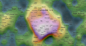
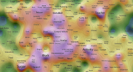
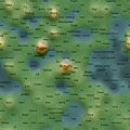
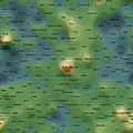
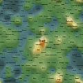
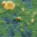
Kohonen Self Organising Maps

Self Organising Maps (SOMs) can be used as 2d spatial summariser visualisations of multidimensional data. In the maps shown here, text distance metrics are generated from the weekly/monthly content on some of the more active mailing lists. Using a geographic like landscape metaphor, the height (colour gradient) indicates features with strong associations to all other features; proximity represents association between specific features (e.g. related terms), and label size indicates guide to basic frequency of a feature. There are many "correct" 2d map layouts for the same set of data (due to the multidimensional nature of the data), each map generation will usually settle into a slightly different set of local minima, but the associations are no less valid for each. After removing linguistic junk words, and word stemming, the maps currently pick the weeks/months top ~200 features by frequency. Each map is a continuous, tillable surface, and wraps around north/south and east/west (surface of a torus); so if you find an interesting label to one edge, remember to check it's neighbours on the opposite side.
What Do They Show?
Well, you could just treat them as tag clouds, showing the top two hundred word features used on the mail-list for a given week/month, but the maps also hold spacial information that provides context. Word features that appear close together on the map were used closely (on average) in email content from the mail-list. A height metaphor is used to indicate the combination of feature association strength and feature frequency; word features in the blue and green areas have weaker mean associations and frequency relative to the hot orange and pink highs, but should not be considered negatively as they are still in the top ~200 terms, and will often be tightly associated with surrounding neighbours.
SOM Related Research Papers

Self-Organizing Maps and Constructive Learning (PDF) Honkela T., Leinonen T., Lonka K., Raike A. (2000): Self-Organizing Maps and Constructive Learning. Proceedings of ICEUT'2000, International Conference on Educational Uses of Communication and Information Technologies, Beijing, China. August 21-25, 2000, pp. 339-343.
- In this article, the use of the self-organizing map (SOM) is approached on the basis of current theories of learning. Possibilities of computer and networked platforms that aim at helping human learning are also inspected. It is shown how the SOM can be considered a model of constructive learning. The area of constructive learning is outlined and two cases of using the self-organizing map in computer supported learning environments are presented.
It's An Education Project Mailing List
Monthly maps generated with posts from the IAEP mailing list. Most recent maps shown first - for older maps please see the IAEP map history map archive page.
2012 July (31 emails)
2012 June (81 emails)


Sugar Mailing List
Monthly maps generated with posts from the Sugar mailing list. Most recent maps shown first - for older maps see the Sugar map history page.
2009 April
2009 March
2009 February
2009 January
2008 December
2008 November
2008 October
2008 September


Technology in Education Academic Research Papers
A selection of SOMs for technology in education research papers relating to the One Laptop Per Child project can be found on the laptop.org wiki.
Future
The mapping algorithms and visualisation style will continue to be refined, details will be posted on any significant modifications (see comments under images for changes). The code base was originally designed for bulk text documents from a single author, tested on works of literature from Project Gutenberg.