Difference between revisions of "Sugar Labs/SOM"
Garycmartin (talk | contribs) |
Garycmartin (talk | contribs) (Added another gallery comment) |
||
| Line 15: | Line 15: | ||
Image:2008-August-02-08-som.jpg|'''2008 August 2nd-8th''' | Image:2008-August-02-08-som.jpg|'''2008 August 2nd-8th''' | ||
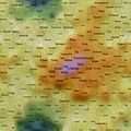
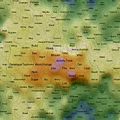
Image:2008-July-26-August-1-som.jpg|'''2008 Jul 26th - Aug 1st'''<br>A fairly quiet traffic week with a good educational focus (how to best use/apply/approach technology tools for education). | Image:2008-July-26-August-1-som.jpg|'''2008 Jul 26th - Aug 1st'''<br>A fairly quiet traffic week with a good educational focus (how to best use/apply/approach technology tools for education). | ||
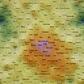
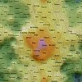
| − | Image:2008-July-19-25-som.jpg|'''2008 July 19th-25th''' | + | Image:2008-July-19-25-som.jpg|'''2008 July 19th-25th'''<br>Prominent verbs are: doing; programming; learning; and education; math; etc |
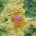
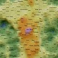
Image:2008-July-12-18-som.jpg|'''2008 July 12th-18th'''<br>Some prominent themes on mathematics education. | Image:2008-July-12-18-som.jpg|'''2008 July 12th-18th'''<br>Some prominent themes on mathematics education. | ||
Image:2008-July-05-11-som.jpg|'''2008 July 5th-11th'''<br>Good educational focus; lesson plans, teachers, learning. | Image:2008-July-05-11-som.jpg|'''2008 July 5th-11th'''<br>Good educational focus; lesson plans, teachers, learning. | ||
Revision as of 12:33, 9 August 2008
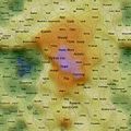
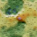
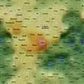
Kohonen Self Organising Maps

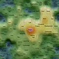
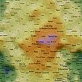
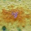
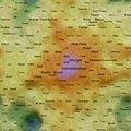
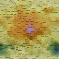
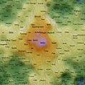
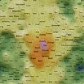
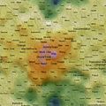
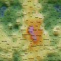
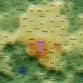
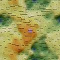
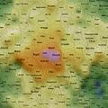
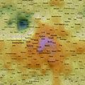
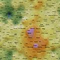
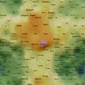
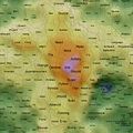
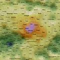
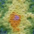
Self Organising Maps (SOMs) can act as 2D spatial summariser visualisations of multidimensional data. In the maps shown here, text distance metrics are generated from the weekly/monthly content on some of the more active mailing lists. Using a geographic like landscape metaphor, the height (colour gradient) indicates features with strong associations to all other features; proximity represents association between specific features (e.g. related words), and label size is a rough guide to basic frequency of a feature. There are many "correct" map layouts for the same set of data, each map generation will usually settle into a slightly different set of local minima, but the associations are no less valid for each. After removing linguistic junk words, and word stemming, the maps currently pick the weeks/months top ~200 features by frequency. Each is a continuous surface and wraps around north/south and east/west (surface of a torus), so if you find an interesting label to one side, remember to check it's neighbours on the opposite side.
What Do They Show?
Well, you could just treat them like tag clouds, showing the top 200 word features used on the list for a given week/month, but the maps also hold spacial information. Word features that appear close together on the map were used closely (on average) in text content from the list. A height metaphor is also used to indicate the features with the strongest mean associations - the map auto centres on the highest pink peak features, these words have the strongest associations with all the rest of the features on the map; word features in the blue and green areas have weaker mean associations relative to the pink highs, but should not be considered negatively as they will often be tightly associated with surrounding neighbours.
It's An Education Project Mailing List
Weekly maps generated with posts from the IAEP mailing list - most recent maps shown first.
2008 August 2nd-8th
2008 Jul 26th - Aug 1st
A fairly quiet traffic week with a good educational focus (how to best use/apply/approach technology tools for education).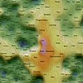
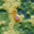
2008 July 19th-25th
Prominent verbs are: doing; programming; learning; and education; math; etc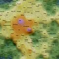
2008 July 12th-18th
Some prominent themes on mathematics education.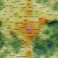
2008 July 5th-11th
Good educational focus; lesson plans, teachers, learning.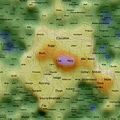
2008 Jun 28th - Jul 4th
Quiet again. Tail-end of Etoys discussion.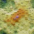
2008 June 21st-27th
List activity picked up this week; the ongoing Smalltallk/Debian drama is featured.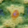
2008 June 14th-20th
A low traffic week. Most of it wiki admin related.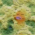
2008 June 7th-13th
The discussion seems to have been focused on features ("needs"), documentation and governance.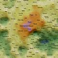
2008 May 31st - Jun 6th
Discussion seems to have been focused on Sugar development: what is used, needed, made and to be made.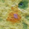
2008 May 24th-30th
The Sugar Lab wiki activity start to snowball.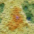
2008 May 17th-23rd
2008 May 10th-16th
Some overflow from dual boot Linux/Windows announcement.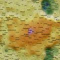
2008 May 1st-9th
Lots of discussion around the direction of Sugar, OLPC and the XO platform.


Sugar Mailing List
Monthly maps generated with posts from the mailing list - most recent maps shown first.
2008 July
2008 June
2008 May
2008 April
2008 March
2008 February
2008 January
2007 December
2007 November
2007 October
2007 September
2007 August
2007 July
2007 June
2007 May
2007 April
2007 March
2007 February
2007 January
2006 December
2006 November
2006 October
2006 September
2006 August
2006 July


Future
The mapping algorithms and visualisation style will continue to be refined, details will be posted here on any significant modifications. The code base was originally designed for bulk text documents from a single author, tested on works of literature from Project Gutenberg.