Design Team/Proposals/Welcome First Boot Intro: Difference between revisions
Garycmartin (talk | contribs) |
Garycmartin (talk | contribs) No edit summary |
||
| Line 11: | Line 11: | ||
==== Welcome View ==== | ==== Welcome View ==== | ||
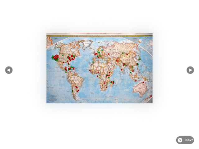
In the welcome view, the user can step through, or skip, welcome content with a goal of providing initial XO and Sugar orientation. The content should be centred, onto a plain white canvas (same colour as first boot intro background) with no borders. This allows for content imagers with no visible edge boundaries, or a seamless style of the content authors choosing (e.g. drop shadows, traditional frame, texture). Content images can be in varying width and height, up to some recommended maximum, always presented centred on the canvas. | In the welcome view, the user can step through, or skip, welcome content with a goal of providing initial XO and Sugar orientation. The content should be centred, onto a plain white canvas (same colour as first boot intro background) with no borders. This allows for content imagers with no visible edge boundaries, or a seamless style of the content authors choosing (e.g. drop shadows, traditional frame, texture). Content images can be in varying width and height, up to some recommended maximum, always presented centred on the canvas. Note that the content image below has been given a subtle coloured glow/shadow in post production as one possible example of seamless styling content in a frameless view. | ||
[[File:First boot welcome proposal2.png|thumb|centre|640px|Layout example with go-previous and go-next content navigation buttons on opposite sides of the view.]] | |||
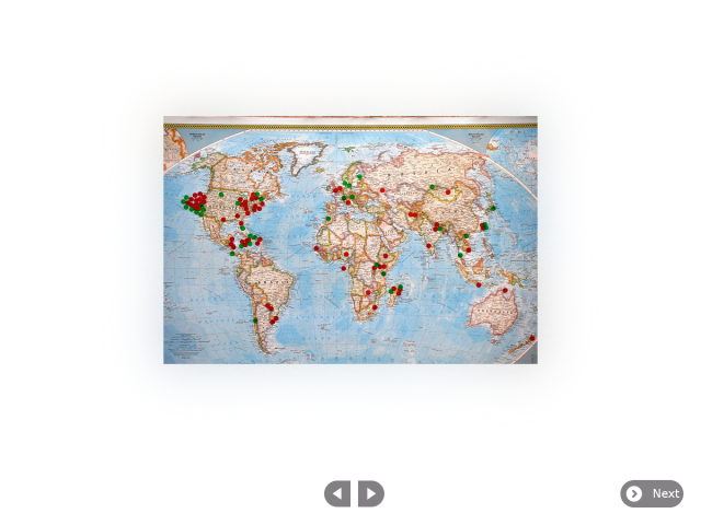
[[File:First boot welcome proposal1.png|thumb|centre|640px|Layout example with centred go-previous-paired and go-next-paired content navigation buttons.]] | |||
Revision as of 23:59, 10 May 2012
First Boot Welcome Feature
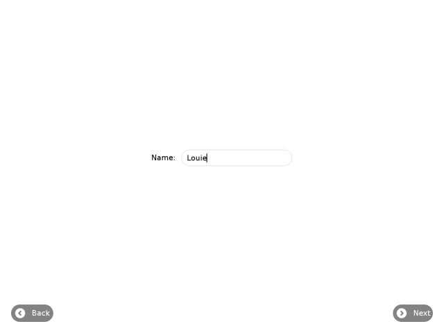
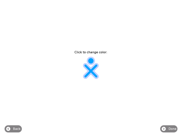
This design proposal tries to cove the needs of ticket #11816 while keeping the first boot user experience as smooth and Sugar friendly as possible. The first boot process should be:
- Boot animation
- Welcome view
- Naming view
- Coloir picker view
- Sugar home view
Welcome View
In the welcome view, the user can step through, or skip, welcome content with a goal of providing initial XO and Sugar orientation. The content should be centred, onto a plain white canvas (same colour as first boot intro background) with no borders. This allows for content imagers with no visible edge boundaries, or a seamless style of the content authors choosing (e.g. drop shadows, traditional frame, texture). Content images can be in varying width and height, up to some recommended maximum, always presented centred on the canvas. Note that the content image below has been given a subtle coloured glow/shadow in post production as one possible example of seamless styling content in a frameless view.


Naming View

Colour Picker View

Sugar Home View
First boot process leads to the Sugar Home view, where the user can choose to review the welcome content by starting the Welcome activity. Once at the Sugar home view a Welcome Activity is available if the user wants to review the welcome content at a later time. The Activity should have a standard Sugar toolbar with buttons for back and next that render the content, centred, onto a plain white canvas (same colour as first boot background) with no borders. This allows for content imagers with no visible edge boundaries, or a seamless style of the content authors choosing (e.g. drop shadows, traditional frame, texture). Content images can be in varying width and height, up to some recommended maximum, always presented centred on the canvas.
- TODO: Design Welcome Activity svg icon