Human Interface Guidelines/The Laptop Experience
| ← Design Fundamentals | [[Human Interface Guidelines/{{{curr}}}|{{{curr}}}]] | Activities → |
The Laptop Experience
OLPC Human Interface Guidelines/The Laptop Experience/Introduction
OLPC Human Interface Guidelines/The Laptop Experience/Zoom Metaphor
The Frame

Always Available on the Periphery
Glancing at the previous screen shots, you might have noted the absence of a menu bar or other form of persistent interface element. Such a persistent element reduces the screen space available for activities; since screen is at a premium, we have opted to use a frame—always on the periphery and just out of sight—to contain all of the peripheral information that a child might need, across all views. Since the Frame persists at all zoom levels, it provides a consistent place for those interface elements which apply to all views, including search, incoming invitations and notifications, a clipboard, and buddies you are currently interacting with.
When activated, the Frame slides in atop the currently visible view, providing access to needed functionality, yet quickly retracting from view once the task for which the child invoked it ends. Although these transitions happen quickly, a forgiveness parameter prevents unintentional Frame retraction in hopes of making interaction with this interface element completely natural.
Frame Components & Organization

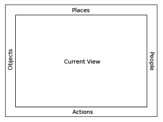
At a high level, one can consider the frame in two parts: The left, top, and right sides of the frame represent nouns: things, places, and persons. The bottom of the frame represents those elements that require action: activities, invitations, and notifications. More specifically, each edge of the frame is dedicated to one of people, places, objects, or actions.
People
As previously mentioned, the presence of others on the mesh defines much of the laptop experience. In order to surface this at all times in the interface, the right-hand edge of the Frame provides an easily accessible list of all the individuals a child is collaborating with in her currently active activity, represented by their colored XOs. This has a number of benefits. First, it provides a quick reference of the people she's working with, which updates as new people join and others leave. As new people arrive, they appear in the upper right corner, and as they leave they simply vacate their current location. Additionally, the secondary rollovers for these XO objects reveal biographical information about them: name, age, class, interests, and even a small photo. This makes the frame a great resource for meeting new friends, for what better place to meet them than in the activity she shares with them?
Places
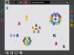
Of the various frame components, the Places category is the most abstract. However it also emphasizes the metaphors that the zoom levels build upon. In the upper left-hand corner reside the zoom buttons, which can instantly transition the user among the Activity, Home, Friend, and Neighborhood views. For clarity, the upper left-hand function buttons on the keyboard have identical icons and functionality.
On the other side of the Places edge resides the Bulletin-Board button. Again, this button has an analogous key on right-hand side of the keyboard's function keys. Discussed later, this button acts as a toggle for an auxiliary layer which can provide contextual chat and a place to share objects. This button functions within the Places bar because it acts as a modifier to any view. In a sense, it adds an additional layer of context to any other "place" on the laptop.
Finally, though not less importantly, this section of the Frame contains the global search field.
Objects
The clipboard has become a staple in any modern operating system. Nonetheless, its implementations have changed little, if at all, in decades. The clipboard has one "page", to which you can copy to, cut to, and paste from, and in most cases this hypothetical page remains invisible: to see what's on it, you've got to paste its contents. While this isn't strictly true (On Mac OSX, for instance, an item at the bottom of the 'Edit' menu allows you to 'View Clipboard Contents'), most users are oblivious about viewing its contents, as one must explicitly seek it out. This basic model, while simple, often falls short of many use cases. Thus, OLPC has extended the traditional clipboard, empowering the user with added functionality without increasing complexity.
On the laptops, the clipboard takes the form of the left-hand edge of the frame. This region serves as temporary storage for objects - a paper, an image, a sentence, a URL - facilitating their transfer among activities and, perhaps more importantly, among the various zoom levels. Any type of object that can be stored in the Journal can likewise be transported via the clipboard. A child may place an object on the clipboard in a couple of convenient ways. First, keyboard shortcuts will provide an interface for simple cut, copy, and paste functions in the way already familiar to us. Additionally, since objects support direct manipulation, she may simply drag a photo, file, or selection onto the frame in order to copy it, and may then drag it out to paste it in another location, such as within another activity, on a friend, or to a Bulletin Board. As items are placed on the clipboard, they are arranged temporally in a push-down stack, the most recent clipping appearing in the upper-lefthand corner of the frame.
With the presence of a clipboard which contains multiple items, it becomes necessary to add a means for selecting an active clipping as the source for any paste command. Since the usual copy/paste keystrokes will quickly become familiar to all, any invocation of the cut or copy shortcuts will automatically place the resulting clipping at the top of the stack, selecting it as the source, so that a subsequent paste command behaves as expected. When not using these traditional shortcuts, however, a single click on any object in the clipboard will select it, visibly indicating it as the new source. Of course, keyboard shortcuts will also provide a method for cycling through the currently selected clipboard item.
Actions
The bottom edge of the frame functions primarily as an activity launcher, but it also accumulates both incoming invitations and notifications. As a starting point for instantiating activities, this part of the frame is fairly straightforward. Whenever an activity receives a click, a colored instance of that activity appears within the activity ring in the child's own colors, and invitations are automatically sent as appropriate. On the other hand, anytime she receives an invitation it appears as a colored activity icon (in the color of the inviting XO, of course), clearly distinct from the uncolored outlines of the activities which reside on her own machine. Since an invitation to join an activity has no functional differences from starting one of her own, the invitations appropriately indicate this by their similar form. The rollover state for these invitations allows her to accept or decline the invitation, optionally providing a reason for declining.
Notifications, the third aspect of the Actions edge of the frame, function slightly differently. While they don't represent an activity that she can join, they do come as messages from activities or from the system, conveying important information about the state of the activity or system status such as battery strength or wireless signal. Though slightly different from activities and invitations, these notifications still require some action on her part, and are an appropriate addition to the frame which provides a convenient way to access them from within any view. Just as in the other edges of the frame, invitations and notifications organize by time, the most recent always in the lower left-hand corner, so that she may handle them in a timely manner.
Activation Methods
The Frame has multiple activation methods.
Hot Corners
Hot corners serve as the Frame's primary invocation method. As Fitts' Law implies, the corners are the easiest part of the screen to hit with a cursor. Moving the cursor to any corner of the screen will instantly invoke the frame. From a corner, one can readily scroll along an edge in search of a desired element. Since newly added people, objects, and invitations insert from the corners, the latest invitation, clipping, or participant is always close at hand.
Warm edges
"Warm edges" work identically to hot corners albeit on a short delay. For the laptop interface, this means that a half-second pause precedes the activation of the frame from an edge of the screen. Additional parameters, such as a minimum cursor velocity, virtually eliminate accidental invocation; this is importance since, again by Fitts' Law, the edges of the screen provide the optimal placement for toolbar buttons and scrollbars— these elements should extend to the very edge of the screen themselves. The ability to access the frame directly from the edges allows one to jump directly to the spot where a particular element, such as the search field, resides.
Function Key
In addition to trackpad-based activation, the information within the Frame lies just one keystroke away. A dedicated key has two modes of functionality: (1) momentary presses act as a toggle, turning the Frame on and off with each press; and (2) holding the key down, the Frame will appear on screen until release of the key. This latter method provides a quick way to glance at incoming invitations or other system status elements for a brief moment and then return full focus to the activity view itself.
Notification Overrides
Though rare, some urgent notifications such as low battery levels may override the Frame, automatically bringing it into view without user interaction. These overrides come from the system only; applications do not have privileges for override, although they may alert the user via standard notifications.
Bulletin Boards

Since the laptops have implicit connectivity via the mesh network, an additional layer of the UI has been designed to take advantage of it: Bulletin Boards. Taken literally, the Bulletin Boards provide a space for posting things.
Context is key to the usefulness of Bulletin Boards on the laptops. A button in the Places edge of the Frame toggles the Bulletin-Board layer on and off, and although only one button exists for this purpose, each view among the various zoom levels has its own Bulletin Board. The scope of individuals who have access to a given Bulletin Board matches the scope of individuals that the view represents. For example, any items posted to the Home view Bulletin Board may only be seen by the child that posted them, effectively providing a traditional desktop environment. Likewise, anyone within her list of Friends may view things she's posted to her Friends view Bulletin Board; the Mesh view Bulletin Board provides an environment for sharing with the entire laptop community. Furthermore, each activity has its own Bulletin Board, providing a space for sharing files and ideas surrounding the activity itself that don't have a place within it.
Spatially Contextual Chatting Interface
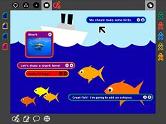
As a transparent layer above any view, the Bulletin Board provides a spatially contextual chatting interface. This means that, unlike traditional forum-style threads that organize temporally, chat bubbles may be freely positioned on screen. Discussions formulate around specific areas of the activity beneath. Annotation-style comments open the door to a wide variety of conversational interactions. In a drawing of the ocean, for instance, one conversation could be happening below the water's surface, while another group of children discuss what kind of birds fly through the sky. In another situation, one child could remotely assist another in learning how to use a new activity, pointing out specific interface elements with detailed descriptions of their functionality. In a literary application, child or teacher could proofread another child's story, correcting spelling mistakes, pointing out grammatical errors, and sharing thoughts about specific sections of the story without directly editing his work on the activity layer beneath.
An Environment for Sharing
In addition to contextual chats, Bulletin Boards provide a space for sharing. Any object may be posted to a Bulletin Board for others to look at and enjoy and to pass on to others, promoting viral sharing. The sharing environment is an integral element of all views.
In the Home view, for instance, only the child to whom the laptop belongs has access to the contents of the Bulletin Board. Here, the Bulletin Board provides a convenient area for the temporary storage of objects and activities, as well as those things kept around for quick access tomorrow's homework assignment, the pictures taken last week, the book she's reading, a favorite game. In this way, the traditional desktop that the zoom levels replaced finds its way back through the Home view Bulletin Board. The functionality described here mimics the traditional desktop to some extent. Note that the contextual chat bubbles are available in the Home view, providing a mechanism to write "notes-to-self". The Bulletin Board metaphor emphasizes a temporary and everchanging space for placing objects, distinctly separate from the space in which they are stored. This may prevent the common overuse of the desktop as the primary place to store everything, which limits its usefulness as a quick way to find the files that matter most at any given point in time.
From the Friends and Mesh view, the Bulletin Board serves as a place to share interesting things a child has found or created with her friends, and the entire mesh respectively. The important thing to remember with regard to sharing, of course, is that "transfer this .jpg file to Bob and Sue" translates to "Share this photo I took with my friends." The sharing metaphor functions much more naturally than the file transfer systems we're used to, since file transfer really just represents a technical implementation of the more abstract idea of sharing in the first place. Of course, children can also view the things that others have posted as well. Moreover, as a community space, group sharing occurs naturally.
Finally, the shared space the Bulletin Boards provide take on a slightly different, yet quite powerful meaning at the Activity level. Again, contextual to the current view, each activity has its own shared Bulletin-board. Posts to this layer provide supporting materials for the underlying activity that other participants in the activity may view (Or, if they'd like, keep for themselves). This actually means a great deal, since any object at all can be shared this way, including many objects that the activity itself may not provide support for. For instance, though one couldn't paste a song inside a drawing, a song posted to the Bulletin Board layer could provide inspiration for it. Similarly, it provides a means of collecting materials relevant to the task at hand within the activity. Rather than having 5 individuals each pasting images of a shark directly into the drawing, they could instead post them to the Bulletin Board for others to see and discuss before deciding which to use as a basis for the drawing. Thus, Bulletin Boards provides a space for gathering research and supporting materials, and holding discussions around both them and the activity.
View Source
While Bulletin-boards provide a layer of abstraction on top of any given activity, the View Source button allows one to look behind the activity, peeling away layers of abstraction in order to reveal the underlying codebase which makes it tick.
The Journal
Temporal Organization
Timeline...
Level of detail...
Granularity...
Falloff...
A Typical Journal Entry
Implicit...
Explicit...
The Power of Metadata
Implicit...
Ratings...
Use frequency...
Powerful Filtered Searching & Sorting
Filtering...
Sorting...
Special filters: about to be removed, lazy deleted (trash can), in progress...
Implicit Versioning System
Automatic, incremental saves...
Viewing revision history...
Automatic Backup and Restore
Automatic backups to server...
Full restore (temporal)...
Partial restore(by object)...
Temporary restore...
The Journal as a Progress Indicator
Two stages for entries...
| ← Design Fundamentals | [[Human Interface Guidelines/{{{curr}}}|{{{curr}}}]] | Activities → |