Design Team/Proposals/Home View/Toolbar
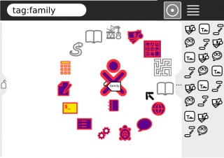
The current Home View toolbar is mostly wasted space.

There have been a number of Design discussions suggesting that
- The Home list view is confused with and should be replaced by the Journal.
- The Journal Icon should always be available in the Home View.
- The Frame is not discoverable enough.
- The number of and memory consumption of open Activities should be more apparent.
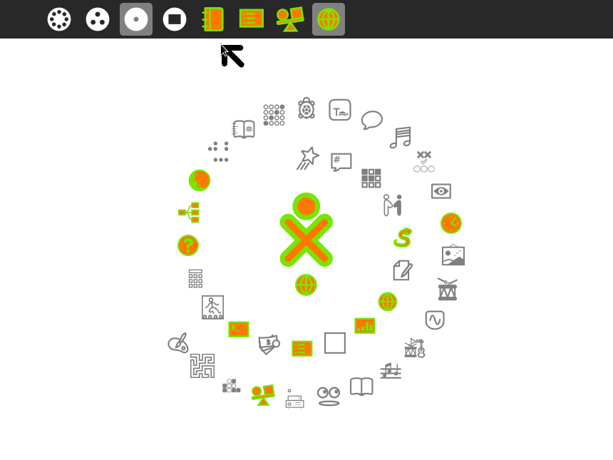
This proposal addresses these by replacing the Home View toolbar with the Frame upperbar.
The Home View framebar would
- Activate the full Frame on hover, exposing the Frame for greater familiarity.
- Provide a permanent link to the Journal.
- Reveal the number of open Activities.
- A dynamic, region for each open Activity instance that was roughly proportional to the fraction of available memory (back-highlighted as currently for the active Activity instance) would help reveal the memory economics.
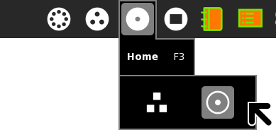
- Continue to offer Home View layouts by moving that palette under the Home F3 palette.
- This design would also eliminate the non-functional search tool (F5 or the Search button would still take one to the Journal search tool).
- A search tool could be added to the Home F3 icon palette.
- Until folks are comfortable with and have a 'System' Journal available through Journals, setting favorites for installed Activity bundles could be done on a list or gallery view accessed from the Home F3 palette that would popover the Home View, like the 'My Settings' dialog, to distinguish it from a Journal view (for now).
- Homunq's sidepane might also be suitable.


