Difference between revisions of "Design Team/Logo Ideas"
Jump to navigation
Jump to search

| Line 22: | Line 22: | ||
The colors and line weights need adjusting, but just to give an idea. It is simple and flexible and it intends to give the impression of multiple elements making a whole--in this case a word. | The colors and line weights need adjusting, but just to give an idea. It is simple and flexible and it intends to give the impression of multiple elements making a whole--in this case a word. | ||
[[Image:sugarlabs_text1.png|left]] | [[Image:sugarlabs_text1.png|left]] | ||
| + | |||
| + | <br clear='all'> | ||
| + | ====Introduce "Lab" visual element?==== | ||
| + | |||
| + | [[Image:Spoon-flask2.png]] | ||
[[Category:Design]] | [[Category:Design]] | ||
Revision as of 01:13, 15 May 2008
Please add your logo ideas to the image gallery.
Molecule
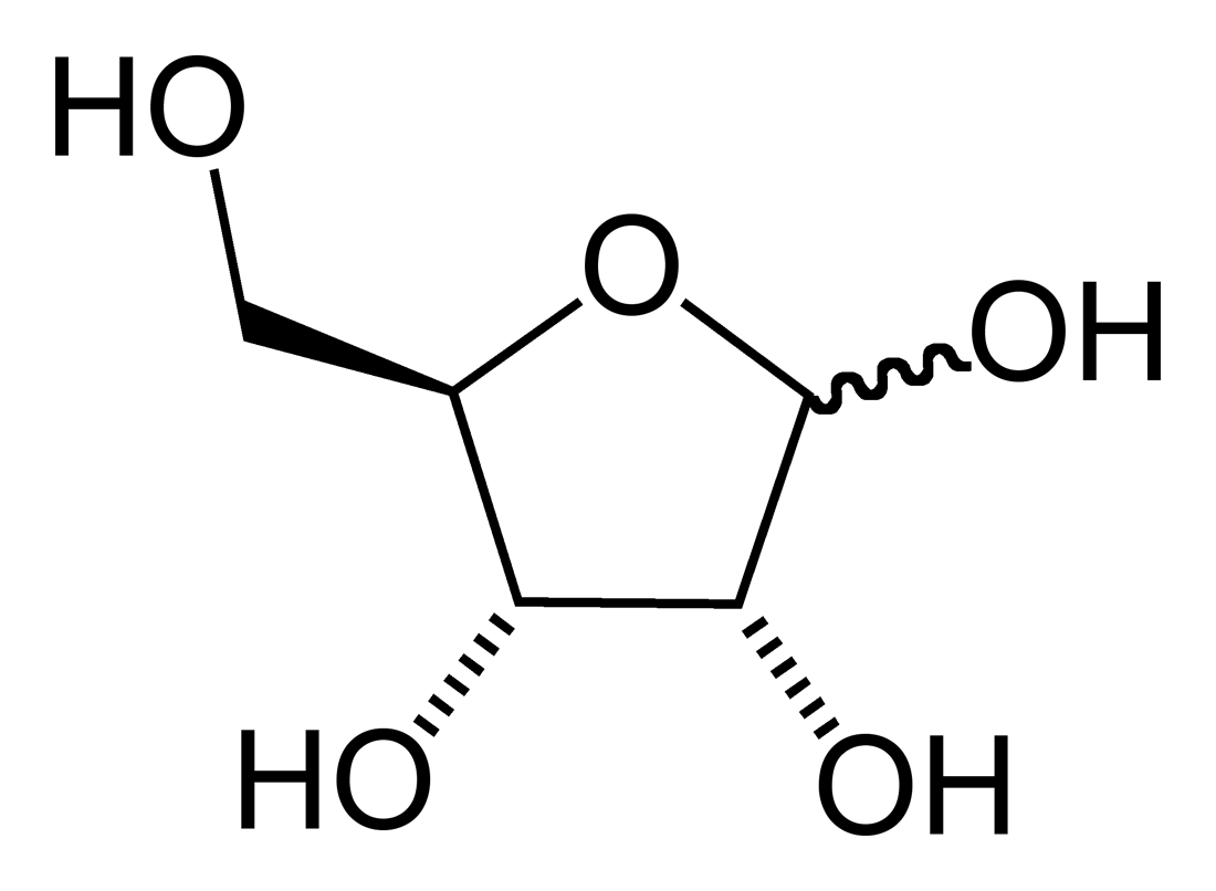 Ribose Sugar Ribose Sugar
|
| http://en.wikipedia.org/wiki/Image:Beta-D-glucose-3D-vdW.png Glucose Sugar |
Sugar Cube


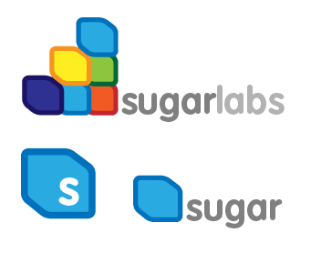
Building Blocks
Here's a derivative idea, based on the "Sugar cube" proposal from before. If we consider representing Sugar as a building block, we could treat Sugarlabs as community structure composed of those blocks, emphasizing both construction(ism) and collaboration. Please note that this is a really quick sketch, and details such as size, placement, color, font, and even the rendition of the cube should be considered in detail, if this direction seems worth exploring.

Text in pseudo-Sugar icon style
The colors and line weights need adjusting, but just to give an idea. It is simple and flexible and it intends to give the impression of multiple elements making a whole--in this case a word.
Introduce "Lab" visual element?
