Difference between revisions of "Design Team/Proposals/Journal"
< Design Team | Proposals
Jump to navigation
Jump to search
| (One intermediate revision by the same user not shown) | |||
| Line 13: | Line 13: | ||
== [[Design Team/Proposals/Journal/Toolbar and palettes | Toolbar and palettes]] == | == [[Design Team/Proposals/Journal/Toolbar and palettes | Toolbar and palettes]] == | ||
| + | <noinclude> | ||
See Gary Martin's mockups, such as this: | See Gary Martin's mockups, such as this: | ||
[[Image:journal_mockup_gary_tags_gradient_palette.png|centre|640px|link=Design Team/Proposals/Journal/Toolbar and palettes|Tag fill colour is graduated from white to grey based on the tag frequency. Not sure we want to introduce a new 'colour' language but thought a mock-up would be worth it (though it's certainly the most visually clear indication of frequency given the space). Also works with white text and grey to black fill.]] | [[Image:journal_mockup_gary_tags_gradient_palette.png|centre|640px|link=Design Team/Proposals/Journal/Toolbar and palettes|Tag fill colour is graduated from white to grey based on the tag frequency. Not sure we want to introduce a new 'colour' language but thought a mock-up would be worth it (though it's certainly the most visually clear indication of frequency given the space). Also works with white text and grey to black fill.]] | ||
| + | </noinclude> | ||
| − | + | == [[Design Team/Proposals/Journal#GMail-style tag view |GMail-style tag view]] == | |
| − | == GMail-style tag view == | + | <noinclude> |
Tags drag-and-drop-able from a left-side palette. | Tags drag-and-drop-able from a left-side palette. | ||
[[Image:journal_mockup_cscott.png|thumb|center|640px|GMail-inspired Journal mockup.]] | [[Image:journal_mockup_cscott.png|thumb|center|640px|GMail-inspired Journal mockup.]] | ||
Latest revision as of 15:16, 27 October 2011
Journal NewUI
Datastore
- See Sascha Silbe's version support project specifically datastore-redesign (click the raw blob data link at the top of the page to see the HTML rendered in your browser), and this mailing list thread, or this compilation of the discussion in context with the proposal document.
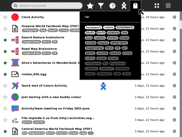
Tags under titles

Example mock-up based on current Journal (0.84) using two lines for title and tags per each entry. Notes: Entries with no tags have their title vertically centred to keep visual balance; entries with more tags than can be displayed end with an ellipsis, this could just be indicative that there are more tags, or have hover hint function showing the remaining un-displayed tags. Clicking a tag should add it to the search field to allow drilling down into results.
CSA: If you incorporate ordered tags, based on filesystem paths, they could look like this:

Toolbar and palettes
See Gary Martin's mockups, such as this:
GMail-style tag view
Tags drag-and-drop-able from a left-side palette.

