Difference between revisions of "Features/GTK3/Theme"
| (7 intermediate revisions by the same user not shown) | |||
| Line 6: | Line 6: | ||
* http://git.sugarlabs.org/test-theme-gtk2 | * http://git.sugarlabs.org/test-theme-gtk2 | ||
| − | The one using GTK+3 | + | The one using GTK+3 had a local CSS, with rules that were added to the CSS in sugar-artwork-gtk3. The latter can be found here: |
* http://git.sugarlabs.org/~erikos/sugar-artwork/gtk3 | * http://git.sugarlabs.org/~erikos/sugar-artwork/gtk3 | ||
| + | |||
| + | Now, the GTK+3 test activity is using the sugar-artwork CSS. | ||
==Status== | ==Status== | ||
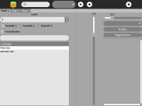
[[File:Gtk2_2011-12-08.png|200px|thumb|right|Reference, Gtk 2]] | [[File:Gtk2_2011-12-08.png|200px|thumb|right|Reference, Gtk 2]] | ||
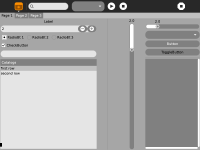
| − | [[File:Gtk3_2011-12-08.png|200px|thumb|right|Gtk3, | + | [[File:Gtk3_2011-12-08.png|200px|thumb|right|Gtk3, 2012-02-09]] |
The screenshots were taken in XO 1.5 with [http://build.laptop.org/12.1.0/os2/xo-1.5/|build os2] of olpc. | The screenshots were taken in XO 1.5 with [http://build.laptop.org/12.1.0/os2/xo-1.5/|build os2] of olpc. | ||
===GtkRadioButton, GtkCheckButton=== | ===GtkRadioButton, GtkCheckButton=== | ||
| − | SVGs made for the button variants, (normal, normal and selected, active, active and selected). The images seem to be cutted in the edges. | + | * <strike>SVGs made for the button variants, (normal, normal and selected, active, active and selected). The images seem to be cutted in the edges.</strike> DONE |
| + | |||
| + | * <strike>check if other variants are needed (inconsistent, insensitive)</strike> DONE | ||
| + | |||
| + | ===ColorToolButton=== | ||
| + | |||
| + | Check the look of the color selector palette. Add it to the test activities. <span style="background:#80ff80; color:black">''VERIFY''</span> | ||
| − | + | ===Selected text=== | |
| + | |||
| + | Check the style of the selected text and also the style when the selected text is being drag. <span style="background:#80ff80; color:black">''VERIFY''</span> | ||
===GtkScale=== | ===GtkScale=== | ||
SVG for the slider sketched, two variants (normal and active). Bar rounded. | SVG for the slider sketched, two variants (normal and active). Bar rounded. | ||
| − | * bar should be bi-colored. (Waiting landing of https://bugzilla.gnome.org/show_bug.cgi?id=665140) | + | * <strike>bar should be bi-colored. (Waiting landing of https://bugzilla.gnome.org/show_bug.cgi?id=665140)</strike> DONE |
| − | * active bar should have white border, seems doable in Adwaita. | + | * <strike>active bar should have white border, seems doable in Adwaita.</strike> DONE |
===GtkSpinButton=== | ===GtkSpinButton=== | ||
| Line 32: | Line 42: | ||
* style down arrow with SVG, seems not possible at the moment (maybe same issue as GtkSpinButton?) | * style down arrow with SVG, seems not possible at the moment (maybe same issue as GtkSpinButton?) | ||
| − | === | + | ===Style description=== |
| − | + | <strike>Description text should be black. See [http://dev.laptop.org/~gonzalo/write-anytime.png screenshot].</strike> DONE | |
| + | |||
| + | ===Style Sugar alert=== | ||
| + | The numbers in the countdown are white, should be black. Currently they are not visible because the background circle is white too. Test downloading a file with Browse. | ||
Latest revision as of 09:18, 9 March 2012
Testing the theme
We are comparing the look of these test activities:
The one using GTK+3 had a local CSS, with rules that were added to the CSS in sugar-artwork-gtk3. The latter can be found here:
Now, the GTK+3 test activity is using the sugar-artwork CSS.
Status
The screenshots were taken in XO 1.5 with os2 of olpc.
GtkRadioButton, GtkCheckButton
SVGs made for the button variants, (normal, normal and selected, active, active and selected). The images seem to be cutted in the edges.DONE
check if other variants are needed (inconsistent, insensitive)DONE
ColorToolButton
Check the look of the color selector palette. Add it to the test activities. VERIFY
Selected text
Check the style of the selected text and also the style when the selected text is being drag. VERIFY
GtkScale
SVG for the slider sketched, two variants (normal and active). Bar rounded.
bar should be bi-colored. (Waiting landing of https://bugzilla.gnome.org/show_bug.cgi?id=665140)DONEactive bar should have white border, seems doable in Adwaita.DONE
GtkSpinButton
- theme up and down arrows with SVG (only possible in GTK git and gnome-themes-standard git, will be packaged for gnome 3.3.3, 19th december)
GtkComboBox
- style down arrow with SVG, seems not possible at the moment (maybe same issue as GtkSpinButton?)
Style description
Description text should be black. See screenshot. DONE
Style Sugar alert
The numbers in the countdown are white, should be black. Currently they are not visible because the background circle is white too. Test downloading a file with Browse.

