User:Homunq/activity ring filters and sidepanes/shrunk
- (note: the mockups below all have the same set of activities in the ring. Imagine that this set is changing appropriately.)
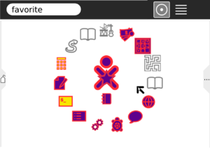
default view
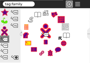
The home view would always have a (filtered) set of activities in a ring around the center The default filter would be "favorite". The current filter would be indicated in the search box and in the center of the ring.
(I'm not satisfied with the "superimposed over xo icon" idea; it would probably be better to replace the center icon completely. But then the default view would have a star in the center, which is not as good for branding.)
suggestion from djhbrown: i'm not sure how to add a suggestion to the wiki so am doing it here - i'm a total newbie to xo/sugar and sorry to say i dont like many things about it. first off, i hoped it would be an obvious interface, which it isn't. it's not obvious to a 5yo or a 63yo like me, that is. i get the feeling that what you have is entrenched in developers' minds and maybe even some see it as a branded style which they wont want to be totally changed.
here are some of the issues i feel non-geek users are presented with: 1. the interface is not intuitive. the icons are non-obvious, the list view is unnecessarily stretched out, the circle view is going to get worse as more apps are added to it, the huge cursor just gets in the way, + 100 other things 2. of all the interfaces in the world, xo sugar for kids is the one that most needs to require no tuition to use. but it's anything but that.
where is the discussion forum for design principles? where is the forum for user (ie kids and their teachers) feedback? why doesnt sugar have 2 separate environments; one for kids and one for teachers - they have different needs. teachers need guidelines, kids need suggestions on what they can do.
is sugar unable to run any of the other wonderful K12 stuff produced outside oplc? why isnt that included?
filter shortcuts panel
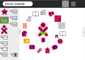
A pane on the left would have iconic shortcuts to some common filters, including favorite, recent, mine, and tags.
tags
Tags could be assigned by dragging to this panel. Tags would appear automatically in this pane when they grouped enough activities/instances, and would be ordered by size. An create-new-tag icon would be included.
leftovers panel
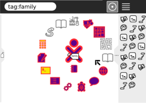
A pane on the right would show all activities. It could include a horizontal scrollbar (not shown.) Dragging between the ring and that pane would assign/remove the currently filtered tag. The menu for activities on the right would include "start" (tagless, new instance, default) and "start with current tag" (new instance) as well as including existing instances (ideally, draggable from the menu for tag assignment, though this is of course hard).
If the current filter had an excessive number of activities OR 0 activities, the ring would include a ... icon and the right pane would open by default. In the first case, the additional activities that fit in the filter but not in the ring would be on the left side of a divider, all other activities on the right.
Not shown in mockups
- horizontal scrollbar in panels
- Panels could pull down from top instead of in from side. That would connect filter panel to search entry, and leftovers panel to list view, which is logical.
- another possible filter would be "currently running". The pulldown for a currently running activity/instance would include halt and view source, just as the pulldown from the frame, and there could be a dark grey (frame-shade) rounded rect behind the icon, as a visual cue that it is currently running.
- Instead of superimposing filter icon on xo icon, the former could replace the latter. Or, to keep the central XO icon as a default, the filter icon could replace the XO for a couple-second timeout period.


