|
|
| (2 intermediate revisions by the same user not shown) |
| Line 17: |
Line 17: |
| | :'''Reviewer Comments:''' | | :'''Reviewer Comments:''' |
| | :: comments here (signed with: --~~~~) | | :: comments here (signed with: --~~~~) |
| − | END OF BLOCK line</noinclude> | + | END OF BLOCK line |
| − | Existing proposals block below: --> | + | Existing proposals block below: --></noinclude> |
| | | | |
| − | === Groups mock-up === | + | === [[#Groups mockup|Groups mockup]] === |
| | | | |
| | + | <noinclude> |
| | TODO: | | TODO: |
| | * Get agreement on any of this :-) | | * Get agreement on any of this :-) |
| Line 56: |
Line 57: |
| | [[Image:Groups_6.jpg|thumb|centre|640px|The groups one belongs to appear in the "Start with" and "Send to" menus, making sharing and collaborating with sets of friends easy and efficient. I like Gary's use of the group icon in the menus. In fact, we might assign "arbitrary" colors to groups based on their creator. The group icon we'd use in the UI (in the Journal list, menus, etc.) would be the three dots, with stroke and fill, rather than the circled white zoom level icon.]] | | [[Image:Groups_6.jpg|thumb|centre|640px|The groups one belongs to appear in the "Start with" and "Send to" menus, making sharing and collaborating with sets of friends easy and efficient. I like Gary's use of the group icon in the menus. In fact, we might assign "arbitrary" colors to groups based on their creator. The group icon we'd use in the UI (in the Journal list, menus, etc.) would be the three dots, with stroke and fill, rather than the circled white zoom level icon.]] |
| | | | |
| − | <noinclude>
| |
| | | | |
| | ==Subpages== | | ==Subpages== |
| | {{Special:PrefixIndex/{{PAGENAMEE}}/}} | | {{Special:PrefixIndex/{{PAGENAMEE}}/}} |
| | </noinclude> | | </noinclude> |
Latest revision as of 18:06, 14 February 2011
TODO:
- Get agreement on any of this :-)
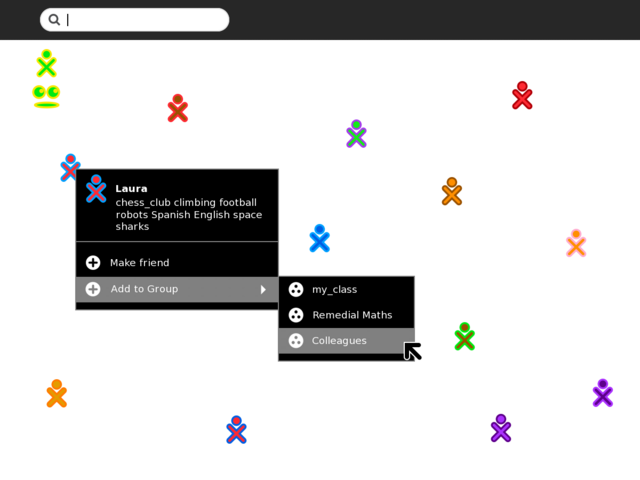
Add buddy to existing Group from Neighbourhood

Buddy palettes would show self tags (tags the buddy added to their own profile) and a new "Add to Group -->" menu showing any groups the user had already created (managing these groups is performed in the Group view). Friends can be considered as a default group provided by the system that you can't delete.
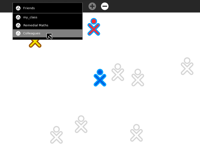
Group view with additional management

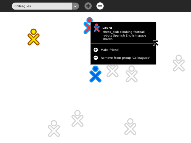
Note combination box for creating new and selecting existing Groups is currently set to "Colleagues". All buddy icons shown are for buddies already added to the "Colleagues" group. Hovering over a buddy reveals a palette that allows you to remove a buddy from this group.
Group view with additional management

Clicking the combination box reveals the other Groups already defined, including the default "Friends" group provided by the system. Selecting an entry updates the buddy icons shown on the main canvas for that Group. Clicking the erase (-) toolbar button would raise an alert "Confirm erase: Are you sure you want to permanently erase the '<group_name>' group? (Keep/Erase)". Typing a new string into the combination box would activate the add group (+) toolbar button and disable the (-) button. Typing a new name then clicking (+) would create the group and clear the canvas of previously shown buddies (you'll see none here until you add them from neighborhood).
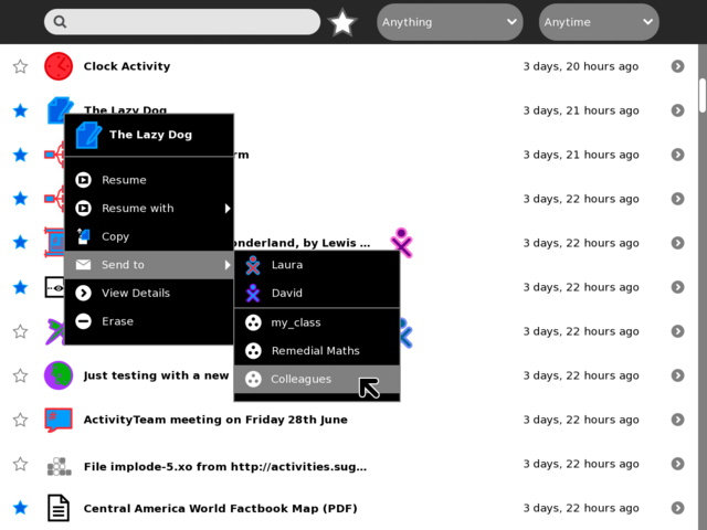
Journal view showing "Send to --> Group"

Once we have named Groups, the Journal "Send to -->" feature can be extended at some future release cycle to support sending an entry to a whole group. Named Groups could also appear in the Activity "Share with:" menu for quick private collaboration with a number of buddies (each buddy in the Group would receive an Activity invite request).
Former Design Sketches
These images represent some earlier explorations of Groups, of both "open" and "closed" nature. For additional background on groups and their behaviors, please see Design Team/Specifications/Groups. If the above "local group" concept is implemented as a stepping stone to this model, we should be very clear in determining how that transition will happen. It's unclear to me how to illustrate the difference between the two, or how to convert local named groups to mutual open groups down the road. I do, however, see the open and closed groups specified here as more useful than local group names, since the benefits of group creation are enjoyed by all members.

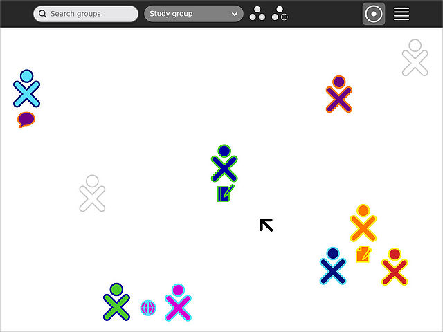
The toolbar of the Groups zoom level has a group filter, in addition to the usual search field, as well as controls for creating or leaving groups. (I think Gary's use of (+) and (-) may be clearer than this design.)

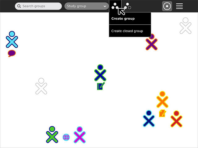
The "Create group" button has a secondary option for creating a "closed" group. This feature is more likely to be used by teachers in an organized context, such as to define a class, so it is not as prominent in the UI.

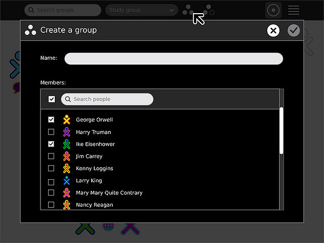
The group creation process consists of providing a name, and selecting a number of individuals to invite to the group as it's created. Alternatively, we could simplify this process some if we only required a name, and then individually invite members using the process shown below.

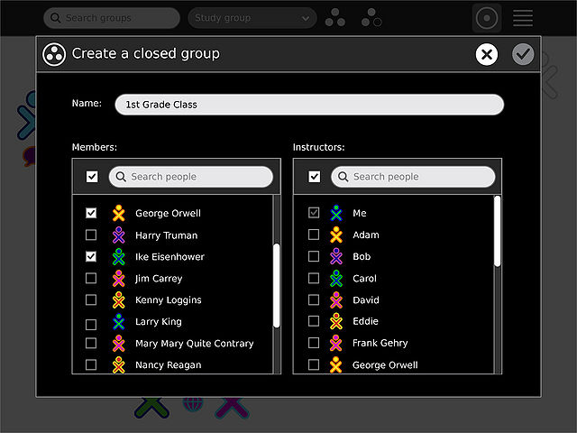
Creating a closed group is nearly identical, however a set of instructors (who can manage the groups members and name) is also chosen.

Group invitations appear in the upper left corner of the screen. They appear in the colors of the inviter, and show the inviters name and the name of the group.

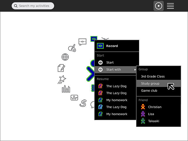
The groups one belongs to appear in the "Start with" and "Send to" menus, making sharing and collaborating with sets of friends easy and efficient. I like Gary's use of the group icon in the menus. In fact, we might assign "arbitrary" colors to groups based on their creator. The group icon we'd use in the UI (in the Journal list, menus, etc.) would be the three dots, with stroke and fill, rather than the circled white zoom level icon.
Subpages
