Design Team/Proposals/Toolbars/Activity-wide Toolbar mock-ups: Difference between revisions
Appearance
Garycmartin (talk | contribs) |
m moved Design Team/Proposals/Toolbars to Design Team/Proposals/Toolbars/Activity-wide Toolbar mock-ups: restructure |
||
| (29 intermediate revisions by 3 users not shown) | |||
| Line 1: | Line 1: | ||
<noinclude> | <noinclude>__TOC__<!-- START OF BLOCK -- 1. COPY & PASTE this BLOCK to below the END OF BLOCK line. | ||
2. PASTE it before any pre-existing proposal, | 2. PASTE it before any pre-existing proposal, | ||
3. then OVERWRITE the place holders with your information, | 3. then OVERWRITE the place holders with your information, | ||
| Line 5: | Line 5: | ||
5. Click [Show preview] to check formatting, and adjust as necessary. | 5. Click [Show preview] to check formatting, and adjust as necessary. | ||
6. Click [Save page] to complete the edit. | 6. Click [Save page] to complete the edit. | ||
===<Your proposal's pithy name here> | ===<Your proposal's pithy name here>=== | ||
:'''Rationale:''' | :'''Rationale:''' | ||
:: <Your rationale here> | :: <Your rationale here> | ||
:'''Features:''' | :'''Features:''' | ||
:# <1st feature here> | :# <1st feature here> | ||
:# <2nd feature here> | :# <2nd feature here> | ||
:'''Implementation Details:''' | :'''Implementation Details:''' | ||
:: <Details here> | :: <Details here> | ||
:'''Reviewer Comments:''' | :'''Reviewer Comments:''' | ||
:: comments here | :: comments here (signed with: --~~~~) | ||
END OF BLOCK line --></noinclude | END OF BLOCK line | ||
Existing proposals block below: --></noinclude> | |||
==[[ | ===[[#Activity-wide Toolbar mock-ups|Activity-wide Toolbar mock-ups]]=== | ||
<noinclude> | |||
:'''Rationale:''' | |||
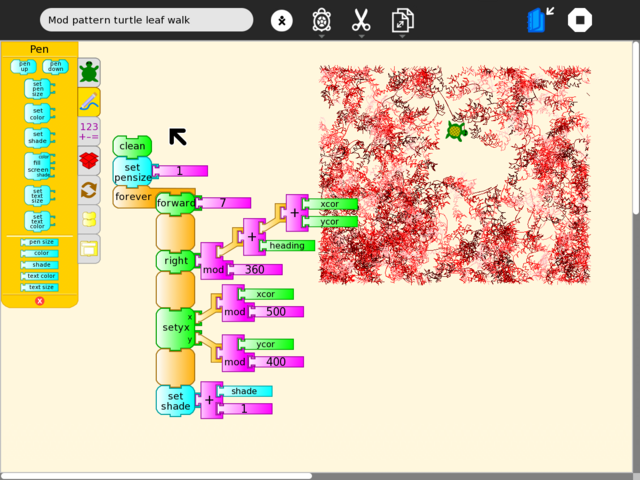
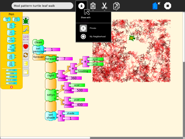
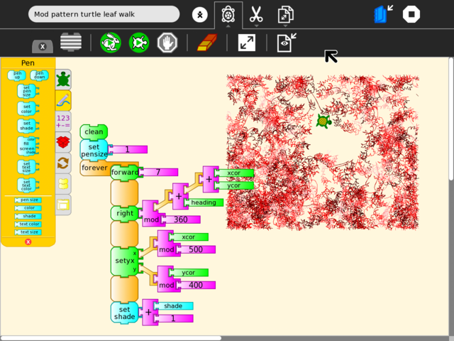
:: This proposal was an exploration that included early mockups based on Turtle Art and Write using a new Activity toolbar design. Main goals for the new toolbar design were for the Stop button to be available at all times; to replace the text tab sub-toolbar metaphor with something visual & larger; secondary toolbars that can be locked open to provide more tool space when needed. This work (after much discussion) eventually led to the new toolbar designs that landed in Sugar 0.86. --[[User:Garycmartin|Garycmartin]] | |||
:'''Features:''' | |||
:# <1st feature here> | |||
:# <2nd feature here> | |||
:'''Implementation Details:''' | |||
:: <Details here> | |||
:'''Reviewer Comments:''' | |||
:: <comments here> | |||
TODO: | TODO: | ||
| Line 53: | Line 61: | ||
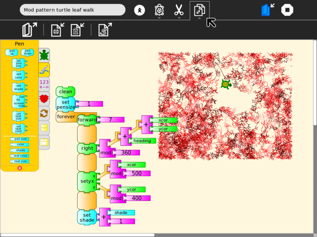
[[Image:toolbar_mockup_gary_turtle_art-52_save_as.png|thumb|centre|640px|I've just tried to show Walter's existing "Save at" tab here, though I do think import/export is a better text description ;-)]] | [[Image:toolbar_mockup_gary_turtle_art-52_save_as.png|thumb|centre|640px|I've just tried to show Walter's existing "Save at" tab here, though I do think import/export is a better text description ;-)]] | ||
==== Top level Activity toolbar for Write ==== | |||
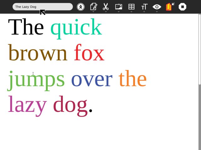
[[Image:toolbar_mockup_gary_write_activity.png|thumb|centre|640px|Example showing basic top level Activity toolbar. Note that I am not trying to redesign Writes toolbar user interface, I am trying to swap in the new proposed design without changing any existing tab/tool designs. The top level Activity toolbar is present at all times. It provides access to naming, collaboration, icons for previous tabs, the keep (version) icon, the stop icon. Write is the current worst case for extensive tab use (has 7 tabs) but you can see all can fit the new design without reorganisation. Note: the Activity title did need to be reduced a small amount for all icons to fit.]] | |||
==== "Share with:" menu for Write ==== | |||
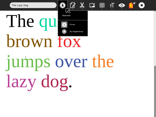
[[Image:toolbar_mockup_gary_write_share_with.png|thumb|centre|640px|Share with is replaced with a button icon and palette to provide enough space for the tab icon replacements to move into the main Activity toolbar as icons.]] | |||
==== Default Write toolbar ==== | |||
[[Image:toolbar_mockup_gary_write_default.png|thumb|centre|640px|This is the current default Write toolbar. Eben's design specs indicate the Activity author can set a secondary toolbar to be exposed by default on launch, if that provides the best usability case.]] | |||
==== Write's Edit toolbar ==== | |||
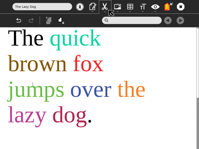
[[Image:toolbar_mockup_gary_write_edit.png|thumb|centre|640px|Writes edit and search features, as per current design.]] | |||
==== Writes Image toolbar ==== | |||
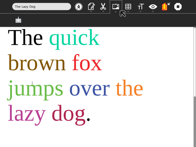
[[Image:toolbar_mockup_gary_write_image.png|thumb|centre|640px|Plenty of space for new image features here ;-)]] | |||
==== Writes Table toolbar ==== | |||
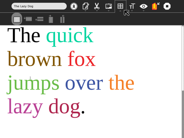
[[Image:toolbar_mockup_gary_write_table.png|thumb|centre|640px|This icons could do with a rework, but I'm trying to leave things as they are for comparison.]] | |||
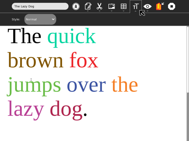
==== Writes Format toolbar ==== | |||
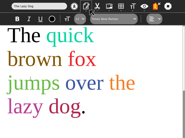
[[Image:toolbar_mockup_gary_write_format.png|thumb|centre|640px|Again, plenty of space for features here, Walter has suggested breaking out the drop-down menu into a set of icons for each style type (bullet list, dashed list, numbered list, heading, plain text, etc). A fine idea!]] | |||
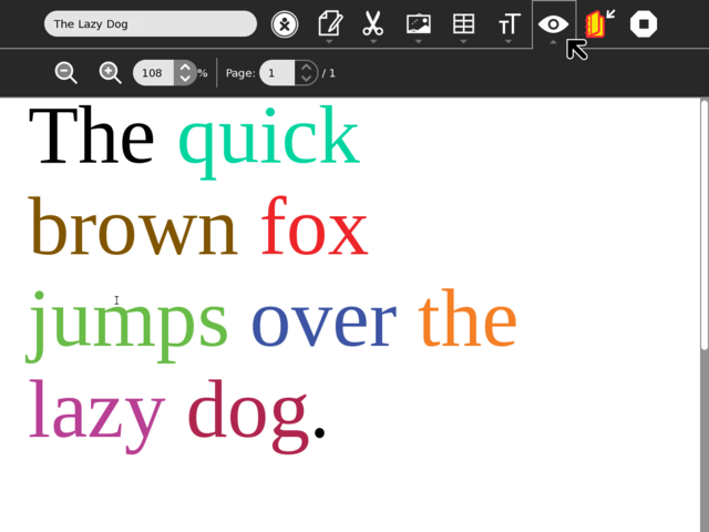
==== Writes View toolbar ==== | |||
[[Image:toolbar_mockup_gary_write_view.png|thumb|centre|640px|The Write view icon just fits in the space available (given a slight reduction in the title length input area).]] | |||
==Subpages== | ==Subpages== | ||
{{Special:PrefixIndex/{{PAGENAMEE}}/}} | {{Special:PrefixIndex/{{PAGENAMEE}}/}} | ||
[[Category:Proposal]] | |||
</noinclude> | </noinclude> | ||
Latest revision as of 14:17, 24 February 2011
Activity-wide Toolbar mock-ups
- Rationale:
- This proposal was an exploration that included early mockups based on Turtle Art and Write using a new Activity toolbar design. Main goals for the new toolbar design were for the Stop button to be available at all times; to replace the text tab sub-toolbar metaphor with something visual & larger; secondary toolbars that can be locked open to provide more tool space when needed. This work (after much discussion) eventually led to the new toolbar designs that landed in Sugar 0.86. --Garycmartin
- Features:
- <1st feature here>
- <2nd feature here>
- Implementation Details:
- <Details here>
- Reviewer Comments:
- <comments here>
TODO:
- Lots and lots of icon work
- find meaningful visual replacements for all text tab labels
- improve icon design for the stand in versions used below
- Icons should (somehow) reveal their original tab text names
- a still open design question
- really text + icons would be clearer, but space is limited
Top level Activity toolbar for TurtleArt
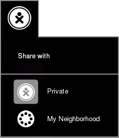
Private icon v1

Private icon v2
Example TrutleArt "Project" tab
Example TrutleArt "Edit" tab
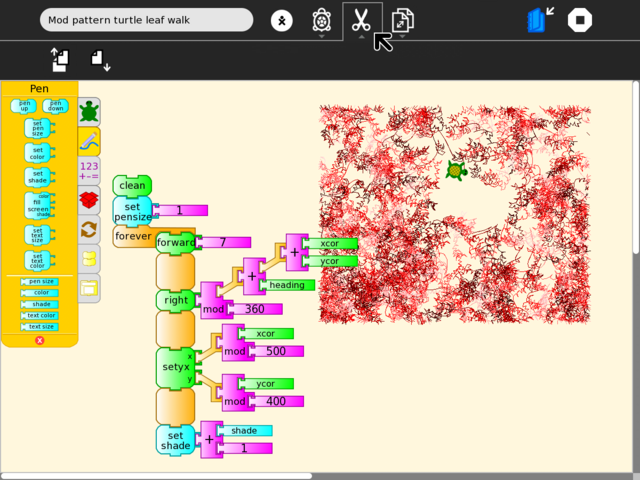
Example TrutleArt "Save as" tab
Top level Activity toolbar for Write
Default Write toolbar
Write's Edit toolbar
Writes Image toolbar
Writes Table toolbar
Writes Format toolbar
Writes View toolbar
Subpages