Features/Spiral Home View: Difference between revisions
No edit summary |
|||
| (15 intermediate revisions by 3 users not shown) | |||
| Line 1: | Line 1: | ||
<noinclude>{{TOCright}} | <noinclude>{{TOCright}} | ||
[[Category: | [[Category:FeatureLanded|Spiral Home View]] | ||
[[Category:Feature Accepted 0.90]] | |||
</noinclude> | </noinclude> | ||
| Line 14: | Line 15: | ||
* Last updated: (6 Aug 2010) | * Last updated: (6 Aug 2010) | ||
* Percentage of completion: 100% | * Percentage of completion: 100% | ||
* Comment: | * Comment: Reviewed bby design and deployment teams | ||
This feature is being tracked in [http://dev.sugarlabs.org/ticket/2143 Ticket 2143]. | This feature is being tracked in [http://dev.sugarlabs.org/ticket/2143 Ticket 2143]. | ||
| Line 25: | Line 26: | ||
== Detailed Description == | == Detailed Description == | ||
Experimental screenshots of the spiral layout at various stages of development: | |||
[[File:Spiral-home-view.png|300px]] | [[File:Spiral-home-view.png|300px]] | ||
This version progresses from the inside out. | |||
---- | |||
[[File:Ring-medium.png|300px]] | |||
[[File:Ring-standard.png|300px]] | |||
[[File:Sprial-standard.png|300px]] | |||
[[File:Sprial-intermediate.png|300px]] | |||
[[File:Spiral-small.png|300px]] | |||
These versions progress from the outside in, making for a less abrupt change between the ring and the spiral. There is also an intermediate icon size introduced between STANDARD ans SMALL. | |||
---- | |||
[[File:Spiral-size-standard.png|300px]] | |||
[[File:Spiral-size-intermediate-a.png|300px]] | |||
[[File:Spiral-size-intermediate-b.png|300px]] | |||
[[File:Spiral-size-intermediate-c.png|300px]] | |||
[[File:Spiral-size-small.png|300px]] | |||
These versions have a looser spiral and more intermediate steps. | |||
---- | |||
[[File:Spiral-out-standard.png|300px]] | |||
[[File:Spiral-out-intermediate-a.png|300px]] | |||
[[File:Spiral-out-small.png|300px]] | |||
And some spiral out versions. | |||
---- | |||
[[File:Gary-spiral.png|300px]] | |||
Approximation of Gray's even looser spacing. | |||
---- | |||
[[File:Home spiral showing 40 activities.png|300px]] | |||
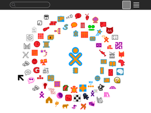
Screenshot of released spiral feature showing 40 activity favourite icons. When testing the layout on various screen resolutions the spiral triggers on 800x600 (SUGAR_SCALING=72) @ ~27 activities; on 1024x768 (SUGAR_SCALING=72) @ ~37 activities; on 1200x900 (SUGAR_SCALING=100) @ ~29 activities. | |||
== Benefit to Sugar == | == Benefit to Sugar == | ||
| Line 35: | Line 75: | ||
To implement this feature, I needed to make changes in one file: | To implement this feature, I needed to make changes in one file: | ||
<code>sugar/src/jarabe/desktop/ | <code>sugar/src/jarabe/desktop/favoritelayout.py</code> | ||
== How To Test == | == How To Test == | ||
| Line 52: | Line 92: | ||
== Release Notes == | == Release Notes == | ||
As more Sugar Activities become available, the Home View ring has become less effective as a means of laying out the available choices. The "spiral" extension to the ring enables more Activity icons to fit onto the Home View while still retaining a visual connection to the iconic Sugar ring. The Home View starts off with the familiar ring, but morphs into a spiral as more (30+ on an OLPC XO) icons are added. | |||
== Comments and Discussion == | == Comments and Discussion == | ||
* See [[{{TALKPAGENAME}}|discussion tab for this feature]] | * See [[{{TALKPAGENAME}}|discussion tab for this feature]] | ||
Latest revision as of 15:36, 5 November 2013
Summary
This is an enhancement to the Home View to enable the display of more icons. The idea is that after the circle becomes too large, rather than shrinking the icons, it morphs into a spiral. Only after the spiral no longer fits on the screen do the icons shrink.
Owner
- Name: Walter Bender
- Email: <walter at sugarlabs dot org>
Current status
- Targeted release: (0.90)
- Last updated: (6 Aug 2010)
- Percentage of completion: 100%
- Comment: Reviewed bby design and deployment teams
This feature is being tracked in Ticket 2143.
Summary of the discussion with the Design Team
We've discussed this extensively and there was consensus that a morph to a spiral would be an acceptable solution to the Home View sparsity problem. See http://lists.sugarlabs.org/archive/sugar-devel/2010-August/025874.html
Note that this enhancement is orthogonal to the discussion about replacing the List View with the Journal and/or enabling multiple collections of activities to be viewed on separate Home Views.
Detailed Description
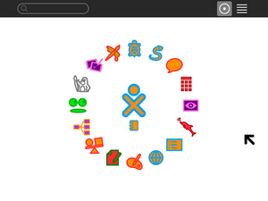
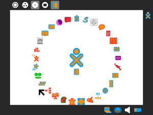
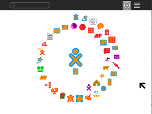
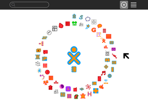
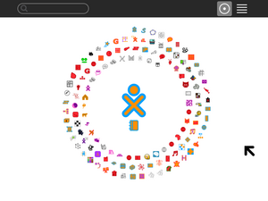
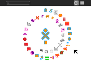
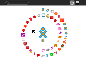
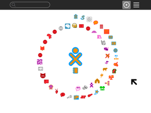
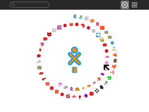
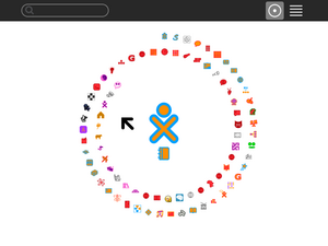
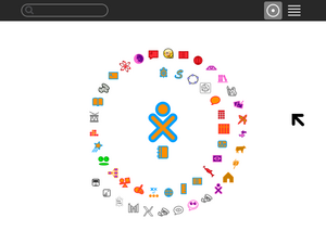
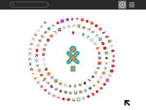
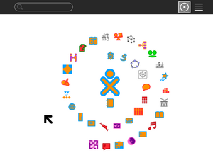
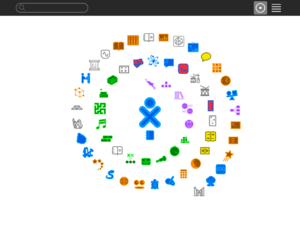
Experimental screenshots of the spiral layout at various stages of development:
This version progresses from the inside out.
These versions progress from the outside in, making for a less abrupt change between the ring and the spiral. There is also an intermediate icon size introduced between STANDARD ans SMALL.
These versions have a looser spiral and more intermediate steps.
And some spiral out versions.
Approximation of Gray's even looser spacing.
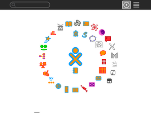
Screenshot of released spiral feature showing 40 activity favourite icons. When testing the layout on various screen resolutions the spiral triggers on 800x600 (SUGAR_SCALING=72) @ ~27 activities; on 1024x768 (SUGAR_SCALING=72) @ ~37 activities; on 1200x900 (SUGAR_SCALING=100) @ ~29 activities.
Benefit to Sugar
As we continue to grow the number of activities, there is more pressure to be able to include more on the Home View. This enhancement allows a smooth transition from the current ring view into a spiral, so it should be minimally disruptive while offering a solution to the problem.
Scope
To implement this feature, I needed to make changes in one file:
sugar/src/jarabe/desktop/favoritelayout.py
How To Test
- Apply the patch attached to http://bugs.sugarlabs.org/ticket/2143
- Add activities from the List View until the circle becomes too full -- after ~30 icons on an OLPC XO computer
- Observe the morph to a spiral
- Remove some activities
- Observe the morph back to a circle
- Add many more activities
- Observe icon size changing in the spiral
User Experience
Anyone who has tried to load too many activities onto their Home View has experienced the problem that the Ring View does not scale well. This is a remedy to this problem.
Dependencies
No additional dependencies are required to implement this feature.
Contingency Plan
None necessary, revert to previous release behavior.
Documentation
Release Notes
As more Sugar Activities become available, the Home View ring has become less effective as a means of laying out the available choices. The "spiral" extension to the ring enables more Activity icons to fit onto the Home View while still retaining a visual connection to the iconic Sugar ring. The Home View starts off with the familiar ring, but morphs into a spiral as more (30+ on an OLPC XO) icons are added.
