Design Team/Proposals/Toolbars/Activity-wide Toolbar mock-ups: Difference between revisions
Appearance
Garycmartin (talk | contribs) |
Garycmartin (talk | contribs) |
||
| Line 23: | Line 23: | ||
:'''Rationale:''' | :'''Rationale:''' | ||
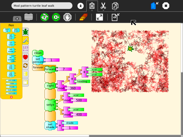
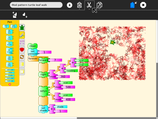
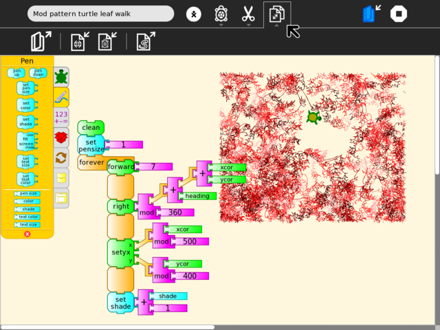
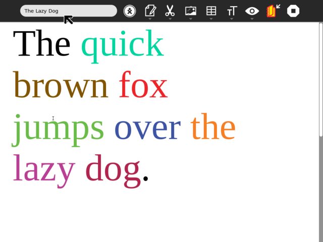
:: This proposal was an exploration that included early mockups based on Turtle Art and Write using a new Activity toolbar design. Main goals for the new toolbar design were for the Stop button to be available at all times; to replace the text tab sub-toolbar metaphor with something visual & larger; secondary toolbars that can be locked open to provide more tool space when needed. This work eventually led to the new toolbar designs that landed in Sugar 0.86. --[[User:Garycmartin|Garycmartin]] | :: This proposal was an exploration that included early mockups based on Turtle Art and Write using a new Activity toolbar design. Main goals for the new toolbar design were for the Stop button to be available at all times; to replace the text tab sub-toolbar metaphor with something visual & larger; secondary toolbars that can be locked open to provide more tool space when needed. This work (after much discussion) eventually led to the new toolbar designs that landed in Sugar 0.86. --[[User:Garycmartin|Garycmartin]] | ||
:'''Features:''' | :'''Features:''' | ||
:# <1st feature here> | :# <1st feature here> | ||
Revision as of 11:33, 24 February 2011
Activity-wide Toolbar mock-ups
- Rationale:
- This proposal was an exploration that included early mockups based on Turtle Art and Write using a new Activity toolbar design. Main goals for the new toolbar design were for the Stop button to be available at all times; to replace the text tab sub-toolbar metaphor with something visual & larger; secondary toolbars that can be locked open to provide more tool space when needed. This work (after much discussion) eventually led to the new toolbar designs that landed in Sugar 0.86. --Garycmartin
- Features:
- <1st feature here>
- <2nd feature here>
- Implementation Details:
- <Details here>
- Reviewer Comments:
- <comments here>
TODO:
- Lots and lots of icon work
- find meaningful visual replacements for all text tab labels
- improve icon design for the stand in versions used below
- Icons should (somehow) reveal their original tab text names
- a still open design question
- really text + icons would be clearer, but space is limited
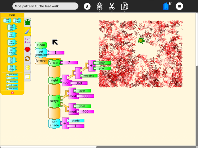
Top level Activity toolbar for TurtleArt
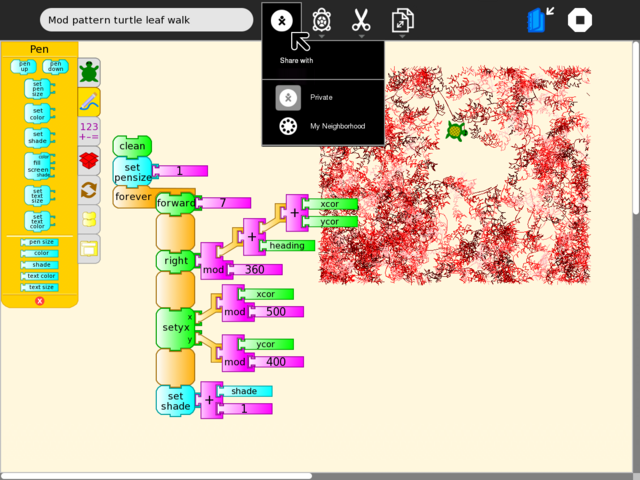
Private icon v1

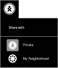
Private icon v2
Example TrutleArt "Project" tab
Example TrutleArt "Edit" tab
Example TrutleArt "Save as" tab
Top level Activity toolbar for Write
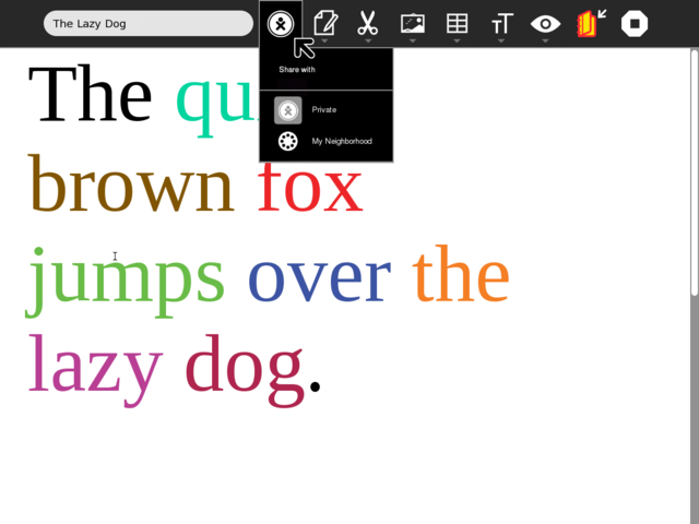
Default Write toolbar
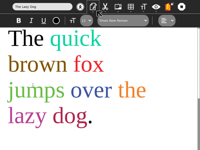
Write's Edit toolbar
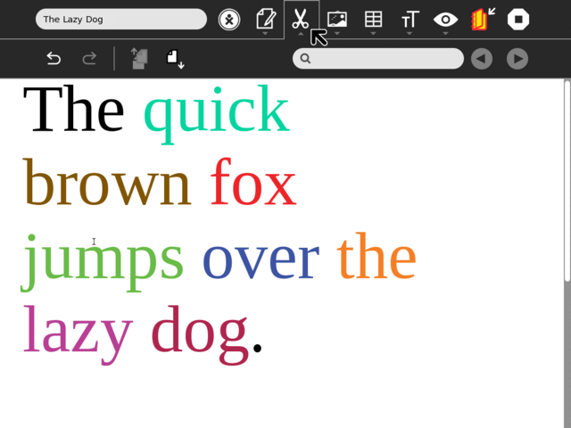
Writes Image toolbar
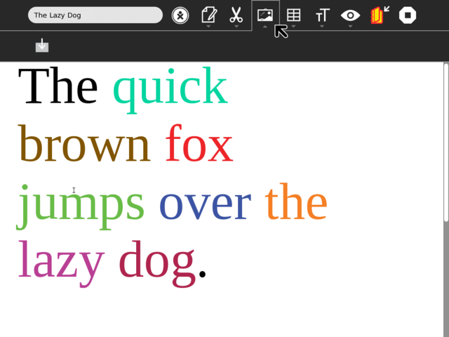
Writes Table toolbar
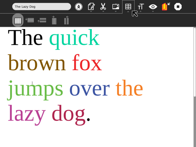
Writes Format toolbar
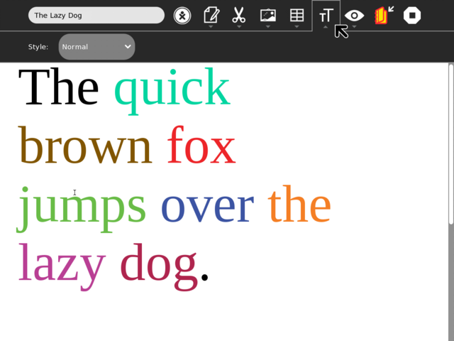
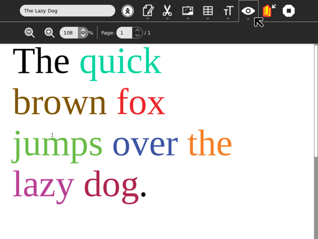
Writes View toolbar
