Design Team/Proposals/Journal
<Your proposal's pithy name here>
- Rationale:
- <Your rationale here>
- Features:
- <1st feature here>
- <2nd feature here>
- Implementation Details:
- <Details here>
- Reviewer Comments:
- comments here
Tags under titles
TODO:
- Mock-up of tag palette (before alstoot starts throwing heavy objects at me).
- Add and mock-up an anytime/when palette.
- Add and mock-up an anyone/who palette.
- Try and find better design for the anything/what filter/funnel icon.
- Show multi entry selection and applying actions to them
- shift key modifier and click to multi select (toggle, or could be block range)
- modified pop-up palette when interacting with multi selected items
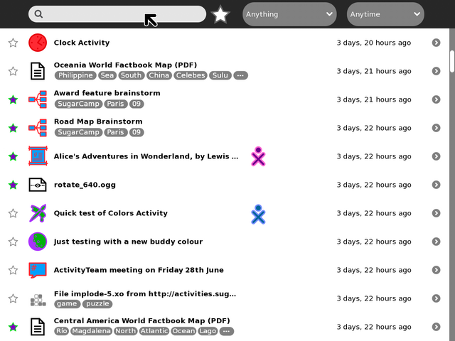
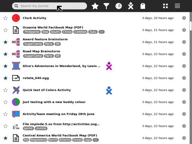
Tollbar and palettes
#1
#2
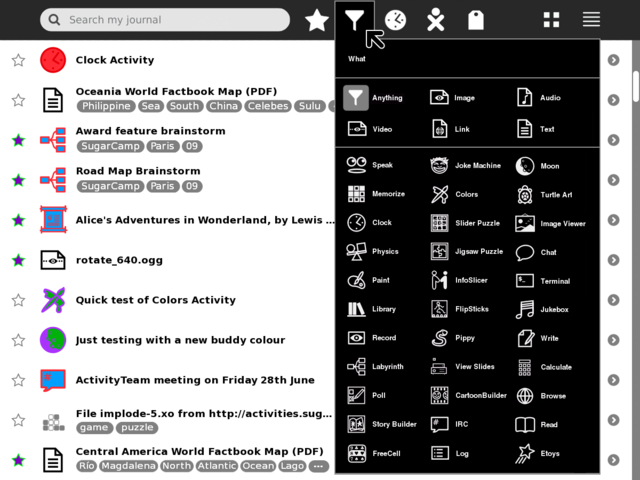
#3
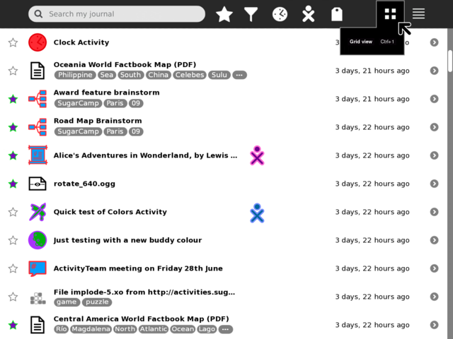
#4
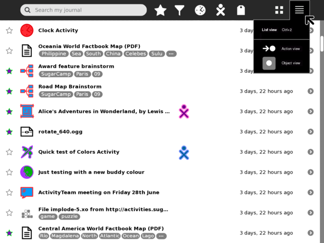
In additional
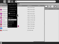
Compact list view
The purpose is, if user has lots of objects it could be useful idea to show as much as possible objects on one screen.
Having several column/grid layouts for example its very useful for books to have columns for author, genre, date; so, user can see the whole valuable info at once and sort objects by these columns; and so separate layouts for video audio etc. files.
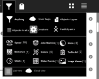
Additional types of filters
For example Library has several types to filter objects
- user tags
- object traits(additional columns from previous section) like author, genre, date for books
- activity creators(grouping by activity_id field)
- types of objects(like top section in filter palette)[3]
- filter by participants
- filter by sources(if we are in shared mode)
Its not clear that all of these modes are useful, but something could be(or another types).
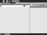
Several levels of chosen filters
In some cases it could be useful. For example user can filter all text/plane files and separate from them only objects that were made by Terminal activity. In that case there should UI element to show currently chosen filters(see bottom panel on below page).
