Human Interface Guidelines/The Sugar Interface/Layout Guidelines
Layout Guidelines
The Grid System
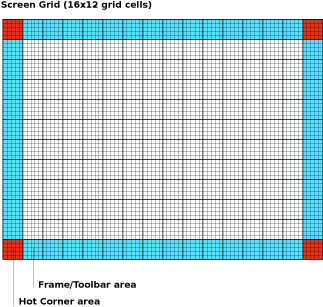
In keeping with the simple, flat visual style of the Sugar interface, we have designed all of the interface elements on a straightforward grid system. The system functions like a basic floorplan which allows interface elements to tile neatly within its boundaries. The grid consists of a 16x12 array of square tiles.
The diagram below shows the screen dissected into cells. Furthermore, the cells highlighted in blue indicate the areas suitable for activity toolbars. Note the exclusion of the corners, which are reserved for the hot corners which invoke the frame. In order to prevent accidental invocation, no buttons should be placed in these locations. Though all edges of the screen are suitable for placing toolbars, we recommend that the top and left edges of the screen serve as the primary location for them unless circumstances specifically suggest an alternative. Conforming to these guidelines will both make the variety of activities supported on the laptop feel more consistent, and also reserves the right and bottom edges for scroll bars, making navigation (when required) within the primary pane much simpler. Though the grab key provides the primary means for panning, preserving these edges for scroll bars even as visual indicators will increase usability.
Considering the screen at its maximum resolution of 1200x900 pixels in luminance mode, each square tile is 75x75 pixels in size. Each cell is comprised of a 5x5 array of 15 pixel subcells. These subcells provide layout guidelines at a finer level of detail. In general, the 3x3 subcell interior region is icon-safe.

