Design Team/Proposals/Toolbars/Activity-wide Toolbar mock-ups

<Your proposal's pithy name here>

Rationale:
<Your rationale here>
Features:
  1. <1st feature here>
  2. <2nd feature here>
Implementation Details:
<Details here>
Reviewer Comments:
comments here

Icons

Activity wide Toolbar mock-ups

TODO:

  • Lots and lots of icon work
    • find meaningful visual replacements for all text tab labels
    • improve icon design for the stand in versions used below
  • Icons should (somehow) reveal their original tab text names
    • a still open design question
    • really text + icons would be clearer, but space is limited

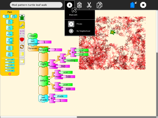
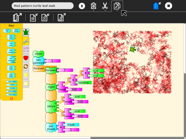
Top level Activity toolbar for TurtleArt
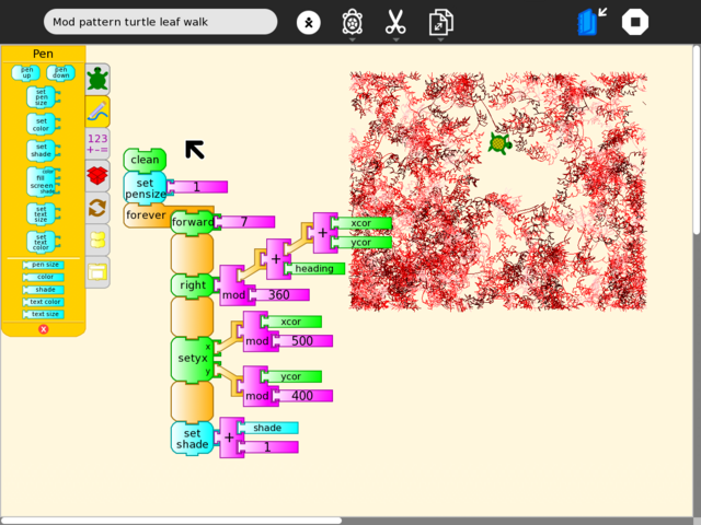
 
Example showing basic top level Activity toolbar. Note that I am not trying to redesign TA's toolbar user interface, I am trying to swap in the new proposed design without changing any existing tab/tool design from Walter. The top level Activity toolbar is present at all times. It provides access to naming, collaboration, icons for existing TA tabs, the keep (version) icon, the stop icon.

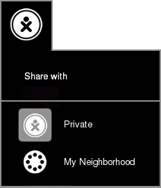
Icon replacement of "Share with:" menu

 
Share with is replaced with an button icon and palette to provide enough space for the tabs to move into the main Activity toolbar as icons. Note that this leaves just enough space for six replacement tab icons (enough to cover the existing Write toolbar tab content). Note that the toolbar icon would change to indicate the collaboration state.
Private icon v1
 
Nice and simple modification to the "private" icon, as shown in existing mock-ups
Private icon v2
 
Small "private" rework trying to indicate isolation/boundary. Based on the media-playback-start icon.

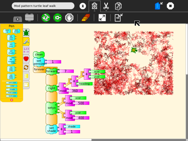
Example TrutleArt "Project" tab

 
I've used TA's Activity icon for the primary "project" tab, this could be a technique used for all default tab contents if needed. We could also design a generic "project" icon and perhaps use it in other activities. Note that the secondary toolbar is pinned open (it's icon was clicked once), an that this triggers a resize of the below canvas to fit the space (well see lot's of Activity bugs with resizing, but we already have this issue to fix due to now needing to support screen pixel dimensions other than 1200x900).

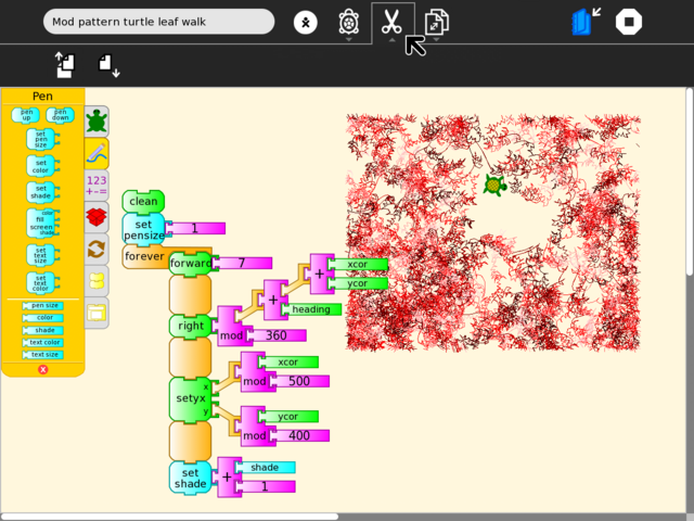
Example TrutleArt "Edit" tab

 
using Eben's generic icon for edit here, it's a good strong, memorable silhouette icon (though it may not be clear in all cultures). Worth noting that icons that have clear names are going to be important, imaging a teacher trying to explain which icon to click or in text documentation, i.e "Click the scissors icon if you need to use copy and paste."

Example TrutleArt "Save as" tab

 
I've just tried to show Walter's existing "Save at" tab here, though I do think import/export is a better text description ;-)

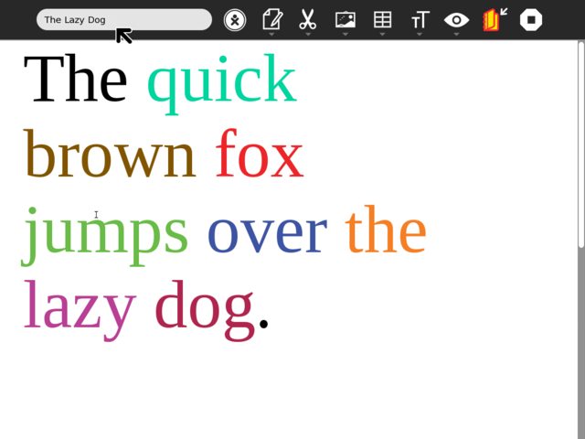
Top level Activity toolbar for Write
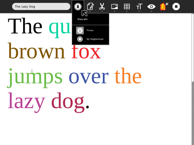
 
Example showing basic top level Activity toolbar. Note that I am not trying to redesign Writes toolbar user interface, I am trying to swap in the new proposed design without changing any existing tab/tool designs. The top level Activity toolbar is present at all times. It provides access to naming, collaboration, icons for previous tabs, the keep (version) icon, the stop icon. Write is the current worst case for extensive tab use (has 7 tabs) but you can see all can fit the new design without reorganisation. Note: the Activity title did need to be reduced a small amount for all icons to fit.

"Share with:" menu for Write

 
Share with is replaced with a button icon and palette to provide enough space for the tabs to move into the main Activity toolbar as icons.

Default Write toolbar

 
This is the current default Write toolbar. Eben's design specs indicate the Activity author can set a toolbar to be exposed by default on launch, if that provides the best usability case.

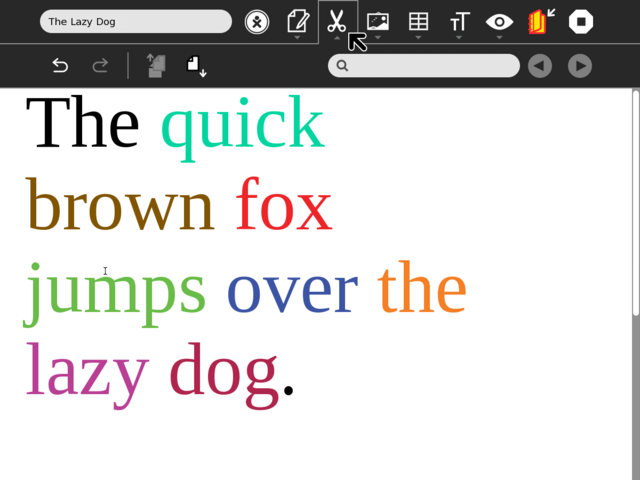
Write's Edit toolbar

 
Writes edit and search features, as per current design.

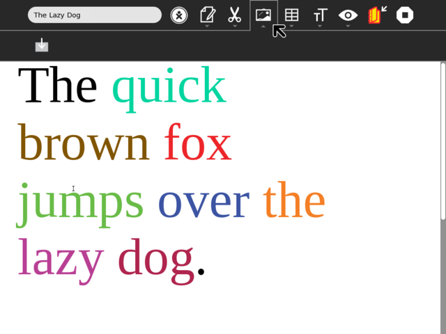
Writes Image toolbar

 
Plenty of space for new image features here ;-)

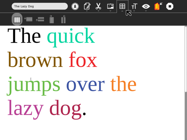
Writes Table toolbar

 
This icons could do with a rework, but I'm trying to leave things as they are for comparison.

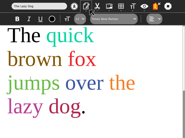
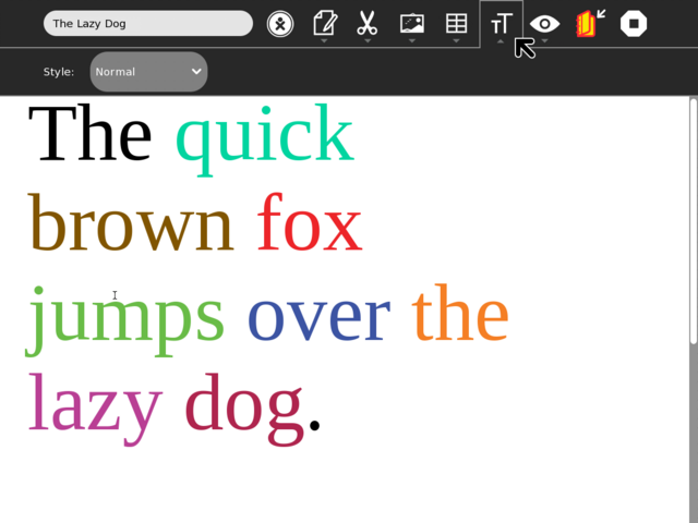
Writes Format toolbar

 
Again, plenty of space for features here, Walter has suggested breaking out the drop-down menu into a set of icons. A fine idea!

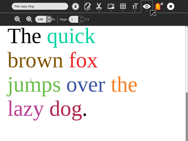
Writes View toolbar

 
The Write view icon just fit's in the space available (given a slight reduction in the title length input area).


Subpages