Features/Enhanced color selector
Summary
This is an enhancement to the color selector used in the About Me control panel. It enables the user to cycle rather than jump abut randomly through the available color choices.
Owner
- Name: Walter Bender
- Email: <walter at sugarlabs dot org>
Current status
- Targeted release: (0.90)
- Last updated: (16 Aug 2010)
- Percentage of completion: 100%
- Comment: feature accepeted, patch pushed
This feature is being tracked in Ticket 1592.
Summary of the discussion with the Design Team
We have gotten a lot of feedback on this feature from the Design Team. There is consensus regarding its merits, but a few outstanding issues remain to be resolved:
- Should the order of the icons be such that the next/prev buttons are on the outside (Eben) or between (Walter) the small and large XO icons (the latter is the order in the current implementation)? It is trivial to change. Gary proposed putting them under the icons due to considerations of centering.
- We've settled on the next/prev buttons being between the XO icons. If we get feedback from the field that this should be done differently, it is trivial to change.
- Should the behavior be such that the next/prev buttons get you (A) the next/previous random color or (B) the next/previous color in the region of the color space you are currently in (the latter being the behavior of the current implementation)? The motivation for the latter implementation is that it lets a user explore a region in the color space once they have randomly stumbled across a combination to their liking. The motivation for the former is that next/prev would give you a more standard behavior. A compromise could be to eliminate the random selection all together (except upon initialization); this would be trivial to implement--simply eliminate the callback from the center XO icon.
- We've left it in State B for the moment. Again, a trivial change to make if the feedback from the field merits it.
- Should there be be keyboard shortcuts? Yes, but I don't know how to implement them using Hippo Canvas. (There is a failed attempt in the current patch to do this by adding a hidden undo button. There was another purpose to the undo button, but it should be removed from the patch.)
- There are no keyboard shortcuts. These can be added if/when we migrate from Hippo Canvas
- Should the change be made to both the initialization screen and the control panel?
- The most recent patch only modifies the control panel. I would appreciate feedback from the design team re eliminating the color selector all together from the initial screen, so as to eliminate a step. A random color can be assigned and modified from the control panel if desired. (In my experience, kids love to change their colors, but it is a time-consuming process that should not be a required part of initialization. Eliminating it from initialization would allow a teacher to have more control over the flow.)
Take II
As per the latest discussion, summarized below, I have made some new patches that are attached to the ticket.
- A new design has been brought on the table. The arrows could be dropped (current design [1]) from the design and only next/previous fill/stroke XOs colors on all 4 sides of the large one could be shown.
This would make it possible to adjust the color in four directions. The form can be seen as a plus, not to be confused with a cross. Walter has been proposed to make the code changes needed for this design proposal.
Take III
Nothing new except a slightly cleaned up patch (pep8 caught a few things I had overlooked). Waiting for review.
Detailed Description
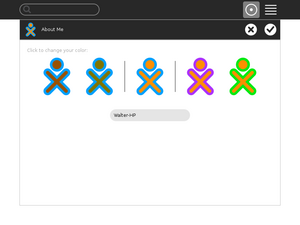
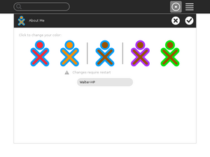
Buttons are added to either side of the XO icon currently used to randomly cycle through the valid-XO-color list. On the left are two buttons that cycles through the list to change the fill color. On the right are two buttons that cycles through the list to change the stroke color. The buttons farthest to the edge cycle one way; the buttons closest to the center cycle the other way, so they act as undo buttons for each other. The buttons always show a preview of the colors that will be selected if the button (or icon) is pressed. There is also a keyboard shortcut (Ctrl-Z) to undo the last change.
A video showing (a slightly out of date) new color selector is available here: [1]
Benefit to Sugar
There have been many requests for an undo button as people often go past the color they were interested in. This enhancement also lets you cycle more systemically as similar colors are cluster within the valid-color list.
Scope
To implement this feature, I needed to make changes in four two places:
- In sugar-toolkit/src/sugar-toolkit/src/sugar/graphics/xocolor.py I added new methods for getting the next and previous colors in the list xocolor.patch
In sugar/src/jarabe/intro/(colorpicker.py, window.py) I added the new buttons and callbacks patch-colorpicker patch-window- In sugar/extensions/cpsection/aboutme/view.py I added the new buttons and callbacks view.patch
In sugar-artwork/icons/scalable/actions/edit-undo.svg I added ENTITY support patch-edit-undo
How To Test
- 1. open the control panel
- 2. open the About Me panel
- 3. click on the XOs to see if the colors change and the alert message appears
- The icons to the left of the central XO are used to modify the fill color; the icons to the right are used to modify the stroke color.
- 4. exit and see if the selected colors appear on reboot
-
Initial colors with options for changing fill (left) and stroke (right)
-
After clicking on the left-most icon, the fill color has changed; the icon second from the left can be used to undo the change
-
After clicking on the right-most icon, the stroke color has changed; the icon second from the right can be used to undo the change
User Experience
Anyone who has used Sugar in the past who sees this feature immediately smiles. One can debate the details of the implementation (See [2]) but not the need for this feature.
Dependencies
No additional dependencies are required to implement this feature.
Contingency Plan
None necessary, revert to previous release behavior.
Documentation
See [3]
Release Notes
The Sugar color-selector in the "About Me" control panel section has been modified to allow the Sugar user to cycle through different combinations of stroke and fill colors. This replaces the "random" color selector.


