Difference between revisions of "Marketing Team/Logo"
| Line 24: | Line 24: | ||
*Scale down only as long as the color outline around "sugar" is still clearly visible. | *Scale down only as long as the color outline around "sugar" is still clearly visible. | ||
*While the Sugar Labs logo also exists as a stacked version for use in space-confined situations, the '''single line logo is the primary treatment''' and should be used wherever possible. | *While the Sugar Labs logo also exists as a stacked version for use in space-confined situations, the '''single line logo is the primary treatment''' and should be used wherever possible. | ||
| + | *'''Prefixes or suffixes should not be incorporated into the logo'''. This also accounts for country names, e.g. [Sugar Labs Logo] Columbia. The logo needs to stand on its own. Suffixes should not be handled as a part of the logo, but instead in regular text when talking about for example the country specific Sugar Labs entity, e.g. "Sugar Labs Columbia". | ||
If you have any questions about correct logo usage, contact [http://sugarlabs.org/go/User:Christianmarcschmidt Christian Marc Schmidt] at anything [at] christianmarcschmidt.com. | If you have any questions about correct logo usage, contact [http://sugarlabs.org/go/User:Christianmarcschmidt Christian Marc Schmidt] at anything [at] christianmarcschmidt.com. | ||
Revision as of 09:21, 15 December 2008
Sugar Graphic Identity
The Sugar Labs logo exists in the color combinations shown below. The logo can sit either on a white or black background, and the color combinations change order based on the background--against a white background the outline color around "sugar" is always lighter than the fill color, while against a black background the outline color is darker than the fill color.
Sugar logo variations
Sugar logo | primary colors | SVG | PNG
Sugar Labs logo | primary colors | SVG | PNG
Sugar Labs logo (alternate, usage discouraged) | primary colors | SVG | PNG
Logo usage
- The logo should be used only on a black or white background
- Make sure there is generous space surrounding the logo, as shown in the PNG and SVG files.
- Don't use any other color combinations than the ones shown below.
- Don't alter the logo in any other way--don't stretch, rotate, or change the letter spacing and size.
- Scale down only as long as the color outline around "sugar" is still clearly visible.
- While the Sugar Labs logo also exists as a stacked version for use in space-confined situations, the single line logo is the primary treatment and should be used wherever possible.
- Prefixes or suffixes should not be incorporated into the logo. This also accounts for country names, e.g. [Sugar Labs Logo] Columbia. The logo needs to stand on its own. Suffixes should not be handled as a part of the logo, but instead in regular text when talking about for example the country specific Sugar Labs entity, e.g. "Sugar Labs Columbia".
If you have any questions about correct logo usage, contact Christian Marc Schmidt at anything [at] christianmarcschmidt.com.
Sugar Labs logo for white backgrounds

|

|

|

|

|

|

|

|

|

|

|

|
Sugar Labs logo for black backgrounds

|

|

|

|

|

|

|

|

|

|

|

|
Sugar Labs logo (alt) for white backgrounds
(use only in space-confined situations)

|

|

|

|

|

|

|

|

|

|

|

|
Sugar Labs logo (alt) for black backgrounds
(use only in space-confined situations)

|

|

|

|

|

|

|

|

|

|

|

|
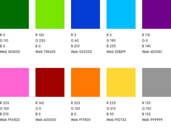
Color Palette
Documentation
Sugar Labs logo PDF (2008-12-07) http://www.sugarlabs.org/go/Image:081207_sugarlabs_logo.pdf
Sugar Labs certification badges PDF (2008-10-22) http://www.sugarlabs.org/go/Image:081022_badges.pdf
