Difference between revisions of "Features/GTK3/Theme"
Jump to navigation
Jump to search
(→Status) |
(→Status) |
||
| Line 14: | Line 14: | ||
[[File:Gtk3_2011-12-08.png|200px|thumb|right|Gtk3, 2011-12-08]] | [[File:Gtk3_2011-12-08.png|200px|thumb|right|Gtk3, 2011-12-08]] | ||
| − | The screenshots were taken in [http://build.laptop.org/12.1.0/os2/xo-1.5/|build os2] of olpc | + | The screenshots were taken in [http://build.laptop.org/12.1.0/os2/xo-1.5/|build os2] of olpc. |
| + | |||
| + | ===GtkRadioButton, GtkCheckButton=== | ||
| + | SVGs sketched, pending more SVGs for other button status (insensitive, focused, inconsistent). | ||
| + | |||
| + | ===GtkScale=== | ||
| + | SVG for the slider sketched. | ||
| + | * bar should be bi-colored. | ||
| + | * bar should have rounded endings | ||
| + | * bar should has border | ||
| + | |||
| + | ===GtkSpinButton=== | ||
| + | * theme arrows with SVG (only possible in GTK git and gnome-themes-standard git, will be packaged for gnome 3.3.3, 19th december) | ||
Revision as of 17:40, 8 December 2011
Testing the theme
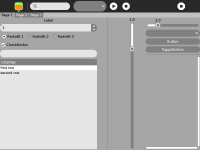
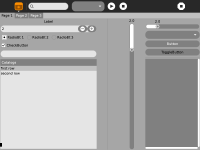
We are comparing the look of these test activities:
The one using GTK+3 has a local CSS, with rules that are added to the CSS in sugar-artwork-gtk3. The latter can be found here:
Status
The screenshots were taken in os2 of olpc.
GtkRadioButton, GtkCheckButton
SVGs sketched, pending more SVGs for other button status (insensitive, focused, inconsistent).
GtkScale
SVG for the slider sketched.
- bar should be bi-colored.
- bar should have rounded endings
- bar should has border
GtkSpinButton
- theme arrows with SVG (only possible in GTK git and gnome-themes-standard git, will be packaged for gnome 3.3.3, 19th december)

