Design Team/Proposals/Journal: Difference between revisions
Appearance
< Design Team | Proposals
Garycmartin (talk | contribs) |
Garycmartin (talk | contribs) |
||
| Line 34: | Line 34: | ||
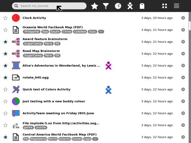
[[Image:journal_mockup_gary_toolbar.png|thumb|centre|640px|Toolbar rework using standard button icons (Activity filter is a temporary design placeholder, suggestions welcome!)]] | [[Image:journal_mockup_gary_toolbar.png|thumb|centre|640px|Toolbar rework using standard button icons (Activity filter is a temporary design placeholder, suggestions welcome!)]] | ||
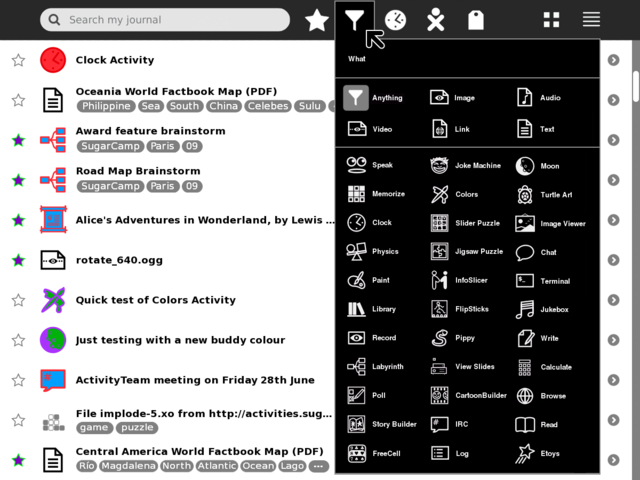
[[Image:journal_mockup_gary_filter_palette.png|thumb|centre|640px|Example using a palette with a grid layout to show many items on screen at once and reduce scrolling (Activity filter is a temporary design placeholder, suggestions welcome!)]] | [[Image:journal_mockup_gary_filter_palette.png|thumb|centre|640px|Example using a palette with a grid layout to show many items on screen at once and reduce scrolling (Activity filter is a temporary design placeholder, suggestions welcome!) Clicking on an item will highlight it (as shown on the default 'Anything' icon) and place it's icon in the toolbar]] | ||
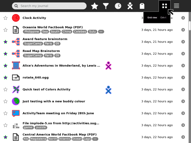
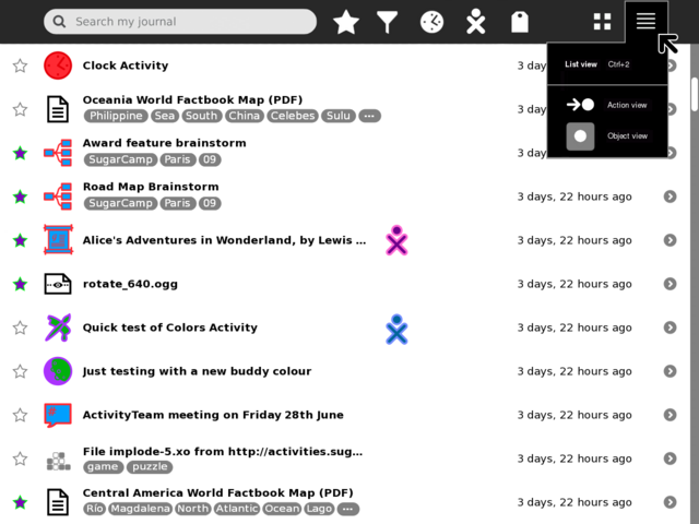
[[Image:journal_mockup_gary_grid_palette.png|thumb|centre|640px|Grid palette, not much here to see, other than to note that Grid view has been made a top level toolbar button as it's likely a frequent view to be switched to.]] | [[Image:journal_mockup_gary_grid_palette.png|thumb|centre|640px|Grid palette, not much here to see, other than to note that Grid view has been made a top level toolbar button as it's likely a frequent view to be switched to.]] | ||
Revision as of 23:23, 2 July 2009
<Your proposal's pithy name here>
- Rationale:
- <Your rationale here>
- Features:
- <1st feature here>
- <2nd feature here>
- Implementation Details:
- <Details here>
- Reviewer Comments:
- comments here
Tags under titles
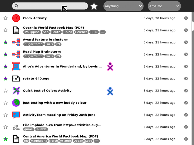
Tollbar and palettes
TODO:
- Mock-up of tag palette.
- Add and mock-up 'Anytime' palette.
- Add and mock-up 'Anyone' palette.
- Find better design for 'Anything' filter icon
