Marketing Team/Boot Logo
Basic Sugar Logo Boot Animation
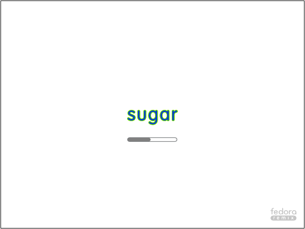
Below is a basic animation that could be considered a safe starting point for experimentation, no surprises, no messing with user interface metaphors. Comprises of a white background, the Sugar logo in default colour at the centre, and 24 grey dots appearing in a circle around it (assumes a grey Fedora Spin logo off in one corner).

Basic Logo Variant with Changing Logo Colour

Retaining the XO
The use of the outlined XO has always been an important part of the design for us, since it's meant to convey the transition of the laptop/avatar to its "on" state, and the transition of the child into a collaborative/learning space. Here's a very basic option which shows the logo for a bit, but retains the XO for the latter portion of the boot sequence before the transition to Home view, when it becomes colored. (My apologies: I just have two stills to show for now.)

Variant of XO Avatar Sugar Boot

Variant of XO Avatar Sugar Boot with Some Colour

Variant of XO Avatar Sugar Boot, Grey to Colour Dot Transition

Twelve Colour Dot Variant of XO Avatar Sugar Boot, Grey to Colour Transition

Eleven Color Ray Variant of XO Avatar Sugar Boot, Grey to Color Transition
The idea here, following an initial page with Sugar logo, distro logo, version information and copyright notice, is to signal a waiting period without the potential for confusion with Sugar graphic elements (networks, avatars, Activity icons). The shapes are inspired by the Activity spinner graphic which has the particularity of having eleven elements instead of the usual twelve; this top/bottom asymmetry reflects and reinforces the XO avatar asymmetry (head vs. legs). The "rays" communicate exuberance and exchanges. The ordered spectrum communicates predictable continuity during the boot process and in case of interrupted boot, Learners could potentially aid in debugging by indicating the last-seen color. The spectrum begins and ends with XO green (darker in this mockup due to author's bumbling). The XO avatar remains grey, indicating the non-ready state while booting. Possible improvements: each ray outline grey with thicker line, color then filling entire ray (no confining outline?)

Eleven Color Ray Variant, Growing XO Avatar, Starts With Logo Splash Page
After showing the Sugar logo, version number, copyright notices, a school logo, and Sugar Labs - distro logo, this variant shows a small, Neighborhood view size XO avatar which grows with each ray-step passed. The idea (aside from the obvious metaphor of a child growing and learning) is for the Learner to "meet" her avatar who will represent her when collaborating with other Learners in class. (Note: the school logo is for illustration only.)

Eleven Color Ray Variant, Growing XO Avatar, No Prior Outlines, Starts With Logo Splash Page
