Human Interface Guidelines/The Sugar Interface/lang-ko
슈가 인터페이스
| ← 보안 | 인풋 시스템 | 레이아웃 가이드라인 → |
인풋 시스템
키보드
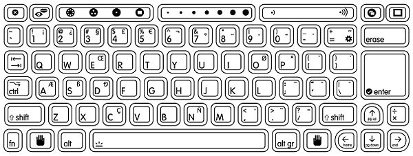
현지화된 키보드 레이아웃
| API Reference |
|---|
| Module: keymapping TBD |
키 설명
| 키 | 기능 |
|---|---|
| 보기 키 | |
| 이웃, 그룹, 홈, 그리고 활동 뷰 간의 이동. | |
| 현재 뷰의 게시판을 보는 토글 | |
| 프레임을 보는 토글 | |
| 하드웨어 컨트롤 | |
| 빌트인 카메라 그리고 마이크 (with Fn key) 켜고 끄기 토글 | |
| 아날로그 볼륨 조절기 슬라이더. | |
| 특별 기능 | |
| 소스 보기 키 (기어)는 Fn키와 더불어 활동 아래에 있는 소스를 볼 수 있게 합니다. | |
| Grab key for panning/scrolling... | |
| 세 개의 큰 "슬라이더" 키들의 가운데는 활동을 위한 것입니다. The slider can be mapped directly to a control in software. | |
| 편집 키 | |
 |
We've enlarged the enter key, and given it a visual indicator that maps directly to the graphics used in the UI. All instances of the confirm and cancel icons within the interface will be selectable directly via the enter and escape keys - a relationship strengthened by this visual mapping.
|
The escape key has a visual indicator that maps directly to the screen graphics, complementing the enter key.
| |
We've replaced the backspace and delete keys with an erase key. This new term more accurately describes its functionality both for erasing a few characters of text, but also for erasing drawings, sounds, and other objects. (Fn-Erase deletes beneath the cursor.)
| |
The Tab key differs little from those on modern keyboards. Shift-Tab functions as a reverse tab, as visually indicated on the key.
| |
| 수정 키 | |
The control key is the primary modifier for keyboard shortcuts on the laptops. Note that the control key takes the place of the nominally useful caps lock key on the OLPC keyboards. The removal of caps lock was a design decision on the part of the OLPC team, however placement of the control key in its location followed naturally, since this was its original placement prior to the PS/2, and is still widely accepted among many communities.
| |
The shift key is used as a modifier for typing capital letters and other "upper" characters.
| |
The alt key is a multipurpose modifier.
| |
The alternate graphics key is used to select the alternate characters printed on the right half of the key caps. The language key (found on the Thai and Arabic keyboards) acts as an Alt Gr Lock, switching the entire keyboard to the alternate characters. In this "locked" state, the Alt Gr key is used to select the Latin characters on the left half of the key caps.
| |
The Arabic and Thai language keys act as an Alt Gr Locks, switching the entire keyboard to the alternate characters. In this "locked" state, the Alt Gr key is used to select the Latin characters on the left half of the key caps.
| |
Fn is the function key. It is used to further modify keys; e.g., it is used to access the microphone; it modifys the arrow keys to home, end, page up, and page down; it is used to enable the analog slider controls; and it is used to convert the number key row from 1–dash to F1–F11.
| |
| 네비게이션 키 | |
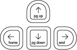 |
The standard arrow keys up, down, left, and right also operate as page up, page down, home and end respectively when used in conjunction with the Fn key.
|
소프트키 슬라이더
The slider keys have two modes: "digital" and "analog." In digital mode, the discrete functions printed on the key caps are accessed, four per key. In analog mode, accessed with the Fn key, intermediate key codes are enabled—there are seven positions along the slider; intermediary postions are interpolated in software, turning each of the keys into a 13-position slider.
단축키
For the purposes of development, you may want to review the detailed specifications for keys and their codes on the Keyboard Layout page.
This section should also go into more detail on the global keyboard shortcut tool which allows children to adjust their preferred key bindings, both at the OS level and for individual activities. Again, this is an interface that activities should implement, so there should be an API link.
트랙패드

The laptops employ a new development in trackpad technology; it is dual mode: capacitive (finger controlled); and resistive (used with a stylus as in a graphics tablet). With the addition of the stylus mode, children may write and draw directly within an activity, adding a personal touch to chat conversations or a signed email to a friend.
Only the center region of the trackpad has capacitance, responding to a finger. The entire trackpad responds to a stylus.
트랙패드의 마우스 역할
The use of the finger on the central trackpad area serves as the primary input device for pointing. Though external USB mice will work seamlessly with the laptops, their availability will be limited, and activity designers should not expect that children will have access to them. This means that a certain lack of precision can be expected when moving the cursor about the screen, and activities should not require extremely precise motion. Excessively small controls should also be avoided for similar reasons; details on how to design interface elements reside in the Controls section.
Movimiento del ratón...
Mouse motion...
In addition, the laptops have two buttons positioned beneath the trackpad for input. The left button is the primary button with which elements of the interface are selected, pressed, or activated. The right button has secondary functionality. Typically, the right mouse button invokes contextual menus, the content of which pertains directly to the interface element the mouse is positioned over.
트랙패드의 그래픽 태블릿 역할
When used with a stylus (none are included with the laptop; any small blunt utensil—such as a stick—will work), the entire sensing area accepts stimuli. The graphics tablet, which matches the width of the screen, uses absolute positioning.
Detalles...
Details...
마이크와 스피커
The laptop has a built-in microphone and stereo speakers to allow for voice communication and recording. You may integrate audio functionality directly into your activities by requesting access to this hardware in the Functional Manifest. There are also an external microphone and speaker jacks.
Need a section on using sounds in activities; particularly in the background...
카메라
The laptops have built-in cameras to allow for still photography and video recording. You may integrate camera functionality directly into your activities by requesting access to this hardware in the Functional Manifest.
"핸드헬드" 모드
The laptops feature a hand-held mode of operation in which the screen swivels around 180 degrees and folds flat, similar to a tablet PC. In this mode, the screen covers the keyboard and trackpad; however, the microphone and camera, mounted within the display bezel, remain available for use. Additionally, bezel-mounted controls provide auxiliary input suitable for the activities that Hand-held mode is designed to support: reading an eBook, playing games, etc.
전력 절약 이점
The laptop is engineered for extreme operating efficiency—a goal furthered by Hand-held mode. The CPU can be suspended while still displaying on-screen graphics. While reading an eBook, since the screen need only be updated when a page is changed, the time spent reading any given page requires no use of the CPU. The screen can run in reflective (daylight) mode—with the backlight off—for additional energy savings. These factors combine to create an extremely low-power, energy-efficient machine; Hand-held mode provides a usage scenario where maximal energy savings can be attained.
핸드핼드 컨트롤
Unlike a typical tablet PC, the OLPC laptop does not have a touch-sensitive screen. Primary user input comes from two bevel-mounted button sets: the D-pad (directional pad), which has 8 directions of articulation; and the button controller, which houses 4 discrete buttons (labeled ◯, ╳, △, ▢, on the B1 machine).
방향 버튼
The D-pad should not be, in general, used to move a cursor around the screen— in fact, the cursor will hide by default in Hand-held mode. Instead, it should be used for more discrete operations, such as flipping through pages, scrolling a view, or jumping to focusable elements on screen. When an interface necessitates focusable elements, these should be visually apparent and arranged in a natural order. In most cases, "natural order" will mean scan-line order, or the way in which one reads a page of text, but this may adapt to suit the needs of the activity. For instance, some activities may opt to scan first by column, then by row; some may use a clockwise ordering some may even zig-zag across the screen. All of these arrangements are acceptable as long as their orderings logically follow from one to the next according to the visuals provided on screen.
Specific activities may in fact benefit from a more traditional cursor. Some games, for instance, may require one. To support these cases, the cursor may be explicitly shown. However, these instances should be carefully considered, since in many cases a cursor will provide a simple yet inefficient solution to a problem for which a better one exists.
컨트롤러 버튼
Generally speaking, the controller buttons can act either as standard event triggers, or as modifier buttons to the target of the D-pad controls. A common use for standard buttons is as select and cancel buttons. In such instances, the ◯ button should always represent confirmation, selection, or forward progress, while the ╳ button represents cancel, escape, or backward progress. Adhering to these guidelines will make navigation of Hand-held interfaces consistent.
When used as a modifier, the visuals on screen should clearly indicate which of the directions—up, down, left, right—perform actions, and those actions likewise should be clearly indicated. For instance, in the eBook, holding down ∆ displays an overlay listing the book's chapters, and the up/down arrows will have focus within this list while the modifier key remains pressed. The currently selected chapter appears in the center of the screen, and up and down arrows above and below the selected chapter clearly indicate how to scroll through the list. When activities implement a combination of both standard and modifier buttons, we encourage ╳ and ◯ for standard, and △ and ▢ for modifiers, since the former two are easier to hit with natural finger placement.
핸드핼드 모드의 빌트인 하드웨어
Both the camera and microphone reside within the display bezel, and as such remain available for activities to use within Hand-held mode. The important trade off to consider before using the camera or microphone is that of energy efficiency: while the laptop conserves energy in Hand-held mode, continued use of either of these two devices requires constant CPU usage, virtually eliminating the benefits. Therefore, do not simply integrate these hardware components unless they provide a fundamental service to your activity—but don't let this deter you from doing so where appropriate.
스크린 회전
While in Hand-held mode, the laptops support screen rotation; by pressing a small button on the bevel of the display, the interface will rotate 90 degrees to provide a portrait layout of the currently active activity. Just as any activity can implement Hand-held mode, those which can benefit from a vertical aspect ratio may also implement this feature, and we encourage developers to take advantage of this functionality. The Read activity serves as a prime example of the usefulness of such a feature, since a vertical layout is well suited to displaying a single page from a book. This is just the type of activity one might want to do in Hand-held mode, and by providing two orientations a greater number of use cases can be covered.
In the current revisions of the laptops, its important to note that the buttons for interacting with Hand-held mode are slightly less accessible when the laptops are held vertically. For this reason, activities that require heavy or frequent use might not be best suited for this mode. However, OLPC is working hard on introducing touch-screen technology in the near future, which will nearly eliminate the dependency on the physical buttons, expanding the possibilities as every activity can take advantage of screen rotation. Therefore, even if screen rotation doesn't make sense for the first version of your activity, please construct your interface in such a way as to allow future adaptation to this new and potentially useful functionality.
| ← 보안 | 인풋 시스템 | 레이아웃 가이드라인 → |
| ← 인풋 시스템 | 레이아웃 가이드라인 | 아이콘 → |
레이아웃 가이드라인
그리드 시스템
단순함과 시각적 명료성을 위해, 우리는 모든 인터페이스를 직선 그리드 시스템 상에서 설계했습니다. 그리드는 12x16 크기의 타일들로 구성됩니다.
In keeping with the simple, flat visual style of the Sugar interface, we have designed all of the interface elements on a straightforward grid system. The system functions like a basic floorplan which allows interface elements to tile neatly within its boundaries. The grid consists of a 12x16 array of square tiles.
파란색 (blue) 영역은 활동 툴바로 적합한 영역입니다. 네 모서리는 프레임을 깨우는 핫 코너로 예약된 곳으려, 예기치 않은 일깨움을 방지하기 위해 어떤 버튼도 여기에 위치해서는 안됩니다. 네 가장자리는 툴바 위치로 적합하지만, 가능한 상단과 좌측 가장자리를 이용해 주십시오. 오른쪽과 하단은 네비게이션을 위한 스크롤 바를 위치시키면 다양한 활동들이 통일된 모습을 갖게 됩니다.
The diagram below shows the screen dissected into cells. Furthermore, the cells highlighted in blue indicate the areas suitable for activity toolbars. Note the exclusion of the corners, which are reserved for the hot corners which invoke the frame. In order to prevent accidental invocation, no buttons should be placed in these locations. Though all edges of the screen are suitable for placing toolbars, we recommend that the top and left edges of the screen serve as the primary location for them unless circumstances specifically suggest an alternative. Conforming to these guidelines will both make the variety of activities supported on the laptop feel more consistent, and also reserves the right and bottom edges for scroll bars, making navigation (when required) within the primary pane much simpler. Though the grab key provides the primary means for panning, preserving these edges for scroll bars even as visual indicators will increase usability.
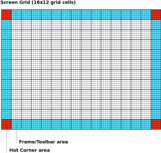 스크린을 최대 해상도인 1200x900 픽셀로 가정하면, 각 사각 타일은 75x75 픽셀입니다. 각 셀은 15픽셀 서브셀들의 5x5 배열입니다. 이 서브셀들은 정밀한 레이아웃 가이드라인이며, 일반적으로, 3x3 서브셀 내부 영역은 icon-safe입니다.
Considering the screen at its maximum resolution of 1200x900 pixels in luminance mode, each square tile is 75x75 pixels in size. Each cell is comprised of a 5x5 array of 15 pixel subcells. These subcells provide layout guidelines at a finer level of detail. In general, the 3x3 subcell interior region is icon-safe.
| ← 인풋 시스템 | 레이아웃 가이드라인 | 아이콘 → |
| ← 레이아웃 가이드라인 | 아이콘 | 컬러 → |
아이콘
아이콘 카테고리
XO
사람을 나타내는 아이콘은 특별한 위치에 있는데, 메쉬 이웃 상의 아이들과 노트북을 나타내며, 나아가 모든 아이들의 손에 노트북을 쥐어주려는 OLPC 프로젝트의 목표를 표명합니다.
The icons which represent People have special status on the laptops. Referred to generally as the XOs, they represent the children and their laptops on the mesh Neighborhood, and furthermore represent the OLPC project and its goals to place a laptop in the hands of every child.
활동 아이콘
오브젝트 아이콘
액션 아이콘
능동 대 피동 아이콘
인터페이스의 일부 요소가 비활성인 상태에서도 많은 인스턴스가 야기될 수 있습니다. 슈가는 부재와 비활동 개념을 나타내는 일관적인 시각 스타일을 정의합니다. 비활성 요소는 현재 클릭(선택)할 수 없는 버튼들 또는 일시적으로 꺼져있는 컨트롤입니다. 부재중인 요소는 실제로 그 순간에 참석하지 않은 사람들이나 사물을 나타냅니다; 예를 들면, 완료되지 않은 다운로드, 특정 활동에 아직 참여하지 않은 초대되지 않은 친구 등입니다.
Many instances may arise in which some elements of the interface are inactive. Sugar specifies a consistent visual style to represent the concepts of absence and inactivity. Inactive elements are buttons that are not currently actionable, or controls that are temporarily disabled. Absent elements are object icons that represent people or things which aren't actually present at the moment; for instance, an incomplete download, or an invited friend who hasn't yet joined the activity.
일반적으로, 인터페이스는 그러한 비활동을 회색 이미지로 나타냅니다. 그러나, 이 노트북은 흑백 모드로도 작동되므로, 이러한 컬러 구별은 어떤 경우에도 "사용되지 말아야" 합니다. 대신, 슈가는 비활성 오브젝트나 버튼을 흰색 가장자리 스트로크로 처리하고, 속을 비우는 벡터 그래픽의 이점을 취하고 있습니다.
Generally, interfaces represent such inactivity through grayed out imagery. Of course, since the laptop also operates in grayscale mode, such a color distinction must not be used under any circumstances. Instead, Sugar will take advantage of the vector graphics used for rendering objects and buttons by rendering inactive ones as a white outlined stroke, with no fill color.
능동
피동
아이콘 디자인 가이드라인
아이콘 포멧
슈가에서 사용되는 모든 아이콘은 SVG 포맷을 따라야 합니다.
All icons designed for use in Sugar must be provided in SVG format. Since all icons exist as vectors, dynamic scaling and coloring of the icons occurs without any degradation. This allows variably sized representations of particular icons to exist depending on context in the interface. Additionally, this provides support for dynamic coloring of activity and object icons based upon a child's chosen XO colors.
아이콘 사이즈
아이콘은 표준 사이즈로 제작 및 저장되어야 하지만, 인터페이스 내에서 실제 사이즈와 외관은 동적으로 변화할 수 있습니다.
인터페이스가 귀하의 아이콘 크기를 조절하더라도, 스트로크가 반드시 아이콘의 전체 사이즈를 비율적으로 조절하지는 않는다는 점에 유의하십시오.
Notice that when the interface scales your icons, strokes do not necessarily scale proportionally to the overall icon size. This ensures that the stroke weight remains visible enough at all sizes to convey its weight and color, but it may also limit the granularity with which you use strokes, which could begin to blend together at smaller sizes. The following chart relates the various icon sizes to their corresponding scale factors and stroke weights. We strongly suggest that you try rendering your icons at XS, S, and M sizes in order to tweak their appearance for optimal legibility.
| 아이콘 크기 Icon Size |
"스케일링 펙터 Scaling Factor |
"스트로크 무게 Stroke Weight
|
|---|---|---|
| XS | 0.5 | 2.25pt |
| S | 1.0 | 3.5pt |
| M | 1.5 | 4.0pt |
| L | 2.0 | 4.5pt |
| XL | 3.0 | 6.0pt |
스트로크 & 채우기
모든 아이콘은 두 가지 색깔로 처리됩니다: 스트로크와 필. 실제 스트로크와 아이콘을 채우는 칼러는 아이에 의해 결정되는데, 아이들이 그들의 노트북을 위해 선택한 색깔들에 맞춰 아이콘들의 색깔이 결정되기 때문입니다. 마찬가지로, 귀하가 귀하의 아이콘들을 저장하기 위해 선택한 색깔들은 임의적입니다. 그러나, 귀하의 스트로크가 렌더링될 대 색깔을 동적으로 취하므로, 똑 같은 색깔을 사용하는 모든 채우기에 주의하십시오.
All icons render in two colors: stroke and fill. The actual stroke and fill colors that an icon renders in are determined by the children, since they correspond to the colors they have chosen for their XOs. As such, the colors in which you choose to save your icon are arbitrary. However, note that any fills that have the same color as your strokes will dynamically take on their color when rendered.
All strokes within an "S" activity icon must have a line weight of 3.5pt. All icons should have a primary fill which represents its overall shape. In addition, any number of supplemental strokes and fills may be used; not all strokes within an icon must have fills, and not all fills must have strokes.
| ← 레이아웃 가이드라인 | 아이콘 | 컬러 → |
컬러
의미로 색깔을 고르기
색깔에 대한 슈가의 접근법은 독특합니다: 메쉬 상에서 소통하는 사람들을 표시하며, 활동이나 오브젝트가 아닙니다. 이중 컬러를 선택함으로써 아이들은 그들의 노트북과 그들의 참여를 표현합니다. 어느 한 아이의 모든 활동, 오브젝트, 그리고 코멘트는 그 아이 자신의 색깔로 표시되며, 다른 아이들의 노트북에 등장할 때도 마찬가지 입니다; 그 아이의 이름과 성격을 보완하는 시각적 정체성을 형성합니다.
Sugar treats color differently than the typical UI: colors are used in the interface represent the individuals who are interacting within the mesh, not the activities or objects they are using. Children personalize their laptops and their presence on the mesh by selecting a dual-tone color scheme. All of the activities, objects, and comments belonging to a child take on her own colors—even when they appear on the laptops of other children on the mesh—forming a visual identity that supplements her name and attributes.
이러한 컬러 처리는 활동 내에서도 마찬가지입니다. 더불어 웹 서피을 진행할 때, 한 아이가 게재한 웹 주소는 그 아이의 색깔로 표현됩니다. 흑백 모드인 경우, 색의 진하기를 조절함으로써 그와 같은 효과를 냅니다.
This color treatment extends even within activities. For instance, in the Web activity a link-sharing feature encourages children to browse the web in groups, sharing interesting or useful pages with each other. Each URL object posted for the others to view appears in the colors of the child who posted the link. Similarly, chat bubbles on the Bulletin Board take on the children's colors. Likewise, any object, text, or other interface element within your activities that corresponds to a particular child should be rendered in this manner. When the display runs in grayscale mode, this colored visual identity is less apparent. However, significant differences in value, according to the Munsell System, ensure that the XOs retain a level of visual distinction even in the absence of color.
아이가 아니라 특정 활동에 속한 인터페이스 요소, 버튼, 그리고 기타 아이콘은 가능한 흑백으로 표현함으로써 전세 시스템의 일관성을 유지해 주십시오. 기존 사용자 인터페이스에서 비활성 아이콘을 나타내는 회색 처리는 슈가에 적용되지 않으므로, 주의해야 합니다. 비활성 아이콘을 참조하십시오.
To maintain a degree of purity to this system, interface elements, buttons, and other icons that belong solely to the activity and not to any particular child should remain in grayscale to the extent possible. While removing color as a primary visual clue may seem counter-intuitive, it does encourage the icon's form to clearly indicate its function. Since the laptops will also run in grayscale mode, clearly distinct shapes become essential in the absence of chroma information, and so limiting activity icons to grayscale by default ensures compatibility in both modes. Additionally, keep in mind that the traditional method of "graying-out" inactive buttons and controls simply will not function on the laptops and must be avoided. Instead, please adhere to the guidelines for inactive icons.
문셀 컬러스페이스에서 대조
이 노트북의 기본적인 컬러 스킴은 컬러와 흑백모드 모두에서 작동해야 하는 제약이 있습니다. 이와같은 이유로, 우리는 적어도 두 가지 Munsell 밸류 스탭의 achromatic 대조를 위해 노력하고 있습니다.
The basic color scheme for the laptop is constrained by the need to work in both color (backlight mode) and grayscale (reflective mode); thus we have chosen guidelines that ensure at least some achromatic contrast under all conditions. Further, sustained legibility of text is accomplished by a combination of colors whose achromatic contrast is large and whose chromatic energy is of low to moderate level. For this reason, we are striving for achromatic contrast of at least two Munsell value steps.
The default value for the Frame is N2.5; the default value for the background is N9. Therefore, to maintain sufficient contrast, the line values for icons that appear on both the Frame and the background should range between N5 and N7. The interior fill of those icons should maintain achromatic contrast with the line value, e.g., the fill color for an icon with a line value of N5 should be either ≤N3 or ≥N7.
|
|
텍스트와 폰트
사이즈

OLPC 디스플레이는 200DPI입니다; 따라서, 1 포인트는 1/72 인치로 3 픽셀보다 작습니다 (2.78 픽셀). 디폴트 폰트 사이즈는 7pt입니다. 이 크기는 72DPI 기반의 어도비 일러스트레이터에서 19.45 pt와 비슷한 크기입니다. 활동 GUI mockup을 준비하기 위해서는, 상수 0.36을 곱해서 이 노트북의 디스플레이 해상도에 맞게 전환해야 함을 기억해 주십시오.
The OLPC display is 200DPI; therefore one point—1/72 inch—is just less than 3 pixels (2.78 pixels). We are settling on a default font size of 7pts. for the Sugar UI (using DejaVu LGS Sans). It is quite legible. This translates to a font size of approximately 19.45 pt in Adobe Illustrator, which bases its units on the traditional 72DPI display. For the purposes of preparing activity GUI mockups, you must always remember to make the conversion to the laptops' display resolution by multiplying by a constant factor of 0.36.
We will be looking at other faces, e.g., Arabic and Thai, and also looking into a large-type version of the interface for the younger children.
가독성
흑백 모드에서는 1200x900 (200 dpi), 컬러모드에서는 ~800x600 (133 dpi) 해상도를 가지므로, 일반 노트북들에 비해 글자들이 매우 선명하게 표현됩니다.
Due to the unique design of the OLPC display, particular techniques for text rendering will provide much better results than others. The dual mode display has a resolution of 1200x900 (200 dpi) in luminance mode, but only ~800x600 (133 dpi) in chrominance mode. Therefore, unless they are sufficiently large, fonts rendered with luminance and no chroma will appear sharper and more readable.
Additionally, the display has higher resolution in black pixels than in white pixels. This results from the fact that each pixel has a color part which contains either red, green, or blue information. In order to create white, red, green and blue parts must all work together; when off, each of the color parts is black on its own. Therefore, we recommend the use of black text on a white background for best readability of fine text.
롤오버
| Fase de Animación | Tiempo Transcurrido (segundos) |
Duración (segundos) |
|---|---|---|
| 백그라운드 체인지를 개시 | 0.0 | 0.1 |
| 프라이머리 롤오버가 확장을 시작함 | 0.1 | 0.2 |
| 프라이머리 롤오버가 표시됨 | 0.3 | 0.4 |
| 세컨더리 롤오버가 확장을 시작함 | 0.7 | 0.3 |
| 세컨더리 롤오버가 표시됨 | 1.0 | ---- |
| Animation Phase | Time Offset (seconds) |
Duration (seconds) |
|---|---|---|
| Immediate Background Change | 0.0 | 0.1 |
| Primary Rollover Begins Expanding | 0.1 | 0.2 |
| Primary Rollover Displayed | 0.3 | 0.4 |
| Secondary Rollover Begins Expanding | 0.7 | 0.3 |
| Secondary Rollover Displayed | 1.0 | ---- |
프라이머리 롤오버
세컨더리 롤오버
문맥적 매뉴로서 롤오버
파레트로서 롤오버
컨트롤
슈가는 노트북 사용자 인터페이스를 만들기 위한 자체 컨트롤 위젯 세트를 정의합니다. 대부분의 가용한 컨트롤들이 개발자들의 기대에 부합하겠지만, 우리는 이 노트북의 사용자 경험에 보다 적합하도록 새로운 컨트롤들을 개발하고, 기존 것들의 동작을 변경하였습니다. 이러한 새로운 개발과 더불어, 슈가 내의 광범위한 목표와 메타포를 유지하고, 협동적인 사용자 인터페이스 환경의 개발을 도울 수 있도록 컨트롤들의 용도와 위치에 관한 새로운 지침을 설립합니다.
컨트롤 위젯 스펙과 치침은 이 문서의 상당한 부분을 차지하므로, 페이지 네비게이션에 의한 내부 페이지는 각 컨트롤 세트의 헤드를 클릭함으로써 접근할 수 있습니다. 또한, 개별 페이지들은 위젯에 대한 상세한 스펙과 그것들의 다양한 상태를 설명합니다. 마지막으로, 우리는 지속적인 초기 어플리케이션 레이아웃과 디자인 모크업을 위해 최신 슈가 컨트롤 스펙 (07.04.05)을 어도비 pdf 파일 포맷으로 제공합니다. 이러한 스펙들과 실행이 아직 초기 단계이며, 디자인 역시 UI의 발전 상황에 맞춰 변화할 수 있음에 주의해야 합니다. 우리는 곧 컨트롤 API 링크를 제공하겠습니다.
Sugar defines its own set of control widgets that will create the user interface on the laptops. Though most of the available controls will match developers' expectations, we've also developed some new controls and altered behaviors of others to better suit the user experience on the machines. With these new developments comes a new set of guidelines for their usage and placement which both maintains the broader set of goals and metaphors setup within Sugar and aids in the development of collaborative user interface environments.
As the control widget specification and guidelines compose a substantial portion of this document, internal page by page navigation is available by clicking on the header for any control set. In addition, the individual pages provide detailed specifications for the widgets and their various states. Finally, we're providing developers with an Adobe Illustrator file of the most up to date Sugar Control Specification (07.04.05) in order streamline early application layout and design mockups. Please understand these specifications and their implementations remain in early development, and their designs may change as the UI progresses. We'll provide links to APIs for the controls as they become available; Thanks for your patience.
컨트롤 영역
슈가에서, 사전에 정의된 컨트롤 영역들에 컨트롤들이 위치하게 됩니다. 컨트롤이 위치할 영역의 백그라운드 컬러를 제한함으로써, 시각적 규칙의 일관된 세트가 심지어 컬러를 사용하지 않고서도 충분한 대비를 유지하면서 다양한 컨트롤들의 타입과 상태 모두를 정의할 수 있습니다. 오른쪽에 보이듯, 기본 영역은 캔버스, 툴바, 그리고 팔레트입니다. 캔버스: 어떤 활동 내에서 범용으로 이용되는 창조 공간입니다— 그림, 글쓰기, 또는 기타 작업 영역. 창조는 우리의 목표 중에서 우선적인 위치에 있으므로, 이것이 모든 활동에서 스크린의 주된 영역이기를 희망합니다. 캔버스 영역은 컨텐트 생성을 위한 특별한 곳이며, 그 위에는 어떤 컨트롤도 위치해서는 '안됩니다.' 마찬가지로, 캔버스는 활동이나 사용자가 원하는 어떤 컬러를 가질 수 있지만, 슈가는 흑백을 기본 디폴트로 지정합니다.
툴바: 활동 툴바는 다른 컨트롤 영역과 구별되는 고유한 진회색입니다. 이 프레임은 또한 고유한 진회색 명암을 통해, 어린이가 어떤 뷰나 활동에서도 활성화 시킬 수 있는 omnipresent 툴바임을 알리고 있습니다.
패널: 필요하다면, 활동은 스크린의 일정 부분을 추가적인 컨트롤을 위해 제공하고, 그 컨트롤이 툴바 외부에서 그리고 글로벌 활동 문맥에서 보다 의미를 가지도록 돕습니다. 이 영역에 위치한 컨트롤들은 해당 활동 또는 편집과 관련된 상태와 관계없이, 항상 적절성을 유지해야 합니다.
팔레트: 여러 문맥에서 나타나는 다목적 컨트롤 영역입니다. 전통적인 윈도우나 메뉴가 없는 인터페이스 안에서, 팔레트는 컨트롤의 세컨드 레이어로서 사용자 인터페이스의 많은 측면에 대해 유용한 해법을 제공합니다. 그 용도에 관한 완전한 설명은 팔레트와 롤오버 섹션을 참조하십시오.
컨트롤:이 섹션의 나머지는 귀하의 활동 UI 내에서의 용도를 위한, 특정 컨트롤들과 지침을 다룹니다. 여기서 제시되는 모든 컨트롤들의 디자인은, 다양한 상태에서 각 컨트롤이 보여줄 컬러, 선, 그리고 크기에 관한 기본적인 규칙 세트를 따릅니다. 이러한 광범위한 디자인 결정에 관한 세부 사항은 커스텀 컨트롤 섹션에서 다루어 집니다.
In sugar, a predefined set of control regions provide the surfaces upon which controls may be placed. Limiting the background colors that the controls sit on allows for a consistent set of visual rules to define both the type and state of various controls while maintaining sufficient contrast even without the use of color. Shown to the right, the basic regions are the Canvas, Panel, Toolbar, and Palette.

Canvas: The canvas is the general purpose "creation" space within any activity — the region for drawing, writing, or otherwise working within it. Since creation ranks high among our goals, we also hope that this is the dominant region of the screen in most activities. The canvas region is specifically for generating content and 'should not' have any controls placed upon it. As such, the canvas may be any color the activity or the user desires, though Sugar specifies both white and black as the basic defaults.
Toolbars: Activity toolbars have a unique dark gray color which distinguishes them from the other control regions. The Frame also uses this unique shade of gray to indicate its purpose as an omnipresent toolbar that a child may activate from within any view or activity. Each activity will have a toolbar at the top of the screen, though when necessary additional toolbars may also be specified.
Panels: When appropriate, an activity may devote a portion of the screen to additional controls which make more sense outside of the toolbar and within the global activity context. Controls placed in this region should always remain relevant at all times, regardless of any other state associated with the activity or editing context.
Palettes: Palettes serve as multipurpose control regions which appear in several contexts. In an interface without traditional windows and menus, palettes step in to provide a versatile solution in many aspects of the user interface as the second layer of control. For a full description of their uses, please see the section on Palettes and Rollovers.
Controls: The remainder of this section focuses largely on the specific controls and guidelines for their usage within your activity's UI. The designs of all controls presented here follow a basic set of rules regarding colors, line weights, and sizing for each of its various states. More detail about these broader design decisions is discussed in the custom controls section.
버튼
Human Interface Guidelines/The Sugar Interface/Controls/Buttons/lang-ko
기본적인 선택 컨트롤
추가적인 선택 컨트롤
조정 컨트롤
인디케이터
막대 결정

용도:
동작:
지침:
중간에 위치한 진행 막대

용도:
동작:
지침:
활동 스피너

용도:
동작:
지침:
레벨 인디케이터

용도:
동작:
지침:
등급 인디케이터

용도:
동작:
지침:
관련성 인디케이터

용도:
동작:
지침:
텍스트 컨트롤
텍스트 필드

- 용도
- 동작
- 지침
Usage:
Behavior:
Guidelines:
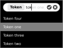
토컨 Tokenized Texto Fields

- 용도
- 동작
- 지침
Usage:
Behavior:
Guidelines:
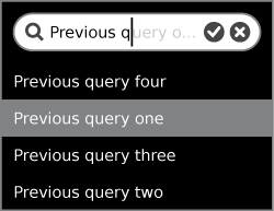
검색 필드

- 용도
- 동작
- 지침
Usage:
Behavior:
Guidelines:
토컨 검색 필드
- 용도
- 동작
- 지침
Usage:
Behavior:
Guidelines:
패스워드 필드


- 용도
- 동작
- 지침
Usage:
Behavior:
Guidelines:
멀티라인 텍스트 필드
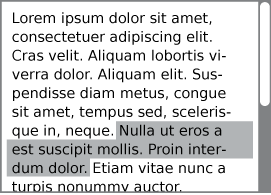
- 용도
- 동작
- 지침
Usage:
Behavior:
Guidelines:
- TRANSLATOR NOTE
- the images [[Image:textfield_suggestions.png]], [[Image:searchfield_suggestions.png]], [[Image:textfield_multiline.png]] have been 'lost/removed'...
보기 컨트롤
기본 소트 바
추가 소트 바
소트 바 뷰 토글
탭 바
탭 사이드바
개방 삼각형
- REVIEW CONCEPT / TRANSLATION
툴팁
그룹핑 컨트롤
세퍼레이터
트레이
커스텀 컨트롤
커스텀 컨트롤의 쓰임새
컨트롤 컬러 팔레트
컨트롤 사이징


