Difference between revisions of "User:Homunq/activity ring filters and sidepanes"
| Line 38: | Line 38: | ||
* Panels could pull down from top instead of in from side. That would connect filter panel to search entry, and leftovers panel to list view, which is logical. | * Panels could pull down from top instead of in from side. That would connect filter panel to search entry, and leftovers panel to list view, which is logical. | ||
| − | * another possible filter would be "currently running". The pulldown for a currently running activity/instance would include halt and view source, just as the pulldown from the frame, and there could be a dark grey (frame-shade) rounded rect behind the icon, as a visual cue that it is currently running. | + | * another possible filter would be "currently running". The pulldown for a currently running activity/instance would include halt and view source, just as the pulldown from the frame, and there could be a dark grey (frame-shade) rounded rect behind the icon, as a visual cue that it is currently running. |
* Instead of superimposing filter icon on xo icon, the former could replace the latter. Or, to keep the central XO icon as a default, the filter icon could replace the XO for a couple-second timeout period. | * Instead of superimposing filter icon on xo icon, the former could replace the latter. Or, to keep the central XO icon as a default, the filter icon could replace the XO for a couple-second timeout period. | ||
Latest revision as of 15:38, 22 March 2009
(note: the mockups below all have the same set of activities in the ring. Imagine that this set is changing appropriately.)
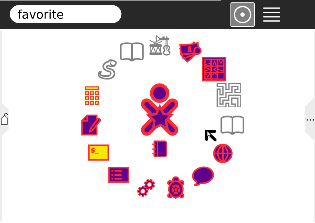
default view
The home view would always have a (filtered) set of activities in a ring around the center The default filter would be "favorite". The current filter would be indicated in the search box and in the center of the ring.
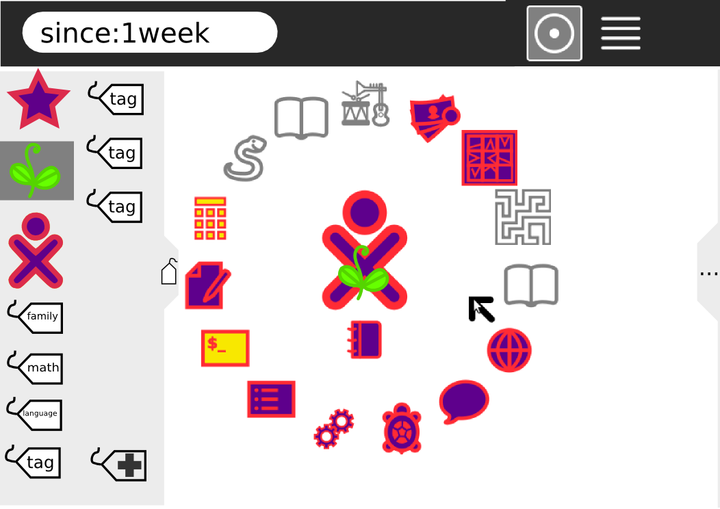
(I'm not satisfied with the "superimposed over xo icon" idea; it would probably be better to replace the center icon completely. But then the default view would have a star in the center, which is not as good for branding.)
filter shortcuts panel
A pane on the left would have iconic shortcuts to some common filters, including favorite, recent, mine, and tags.
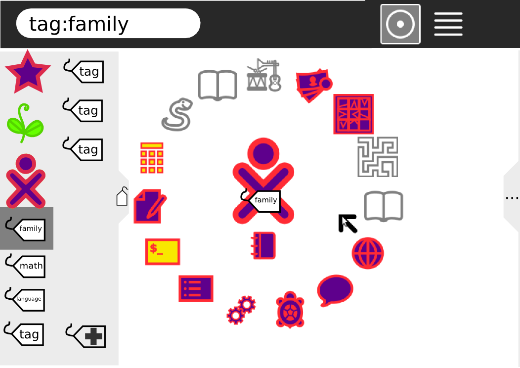
tags
Tags could be assigned by dragging to this panel. Tags would appear automatically in this pane when they grouped enough activities/instances, and would be ordered by size. An create-new-tag icon would be included.
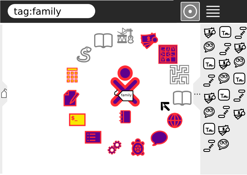
leftovers panel
A pane on the right would show all activities. It could include a horizontal scrollbar (not shown.) Dragging between the ring and that pane would assign/remove the currently filtered tag. The menu for activities on the right would include "start" (tagless, new instance, default) and "start with current tag" (new instance) as well as including existing instances (ideally, draggable from the menu for tag assignment, though this is of course hard).
If the current filter had an excessive number of activities OR 0 activities, the ring would include a ... icon and the right pane would open by default. In the first case, the additional activities that fit in the filter but not in the ring would be on the left side of a divider, all other activities on the right.
Not shown in mockups
- horizontal scrollbar in panels
- Panels could pull down from top instead of in from side. That would connect filter panel to search entry, and leftovers panel to list view, which is logical.
- another possible filter would be "currently running". The pulldown for a currently running activity/instance would include halt and view source, just as the pulldown from the frame, and there could be a dark grey (frame-shade) rounded rect behind the icon, as a visual cue that it is currently running.
- Instead of superimposing filter icon on xo icon, the former could replace the latter. Or, to keep the central XO icon as a default, the filter icon could replace the XO for a couple-second timeout period.


