Difference between revisions of "Marketing Team/Logo"
| Line 18: | Line 18: | ||
==Logo usage== | ==Logo usage== | ||
| − | * | + | *The logo should be used '''only on a black or white background''' |
| − | *Make sure there is generous space surrounding the logo, as shown in the PNG and SVG files. | + | *Make sure there is '''generous space surrounding the logo''', as shown in the PNG and SVG files. |
| − | *Don't use any other color | + | *Don't use any other color combinations than the ones shown below. |
| − | *Don't alter the logo in any other way--don't stretch, rotate, or change the letter spacing and size. | + | *'''Don't alter the logo''' in any other way--don't stretch, rotate, or change the letter spacing and size. |
*Scale down only as long as the color outline around "sugar" is still clearly visible. | *Scale down only as long as the color outline around "sugar" is still clearly visible. | ||
| − | *While the Sugar Labs logo also exists as a stacked version for use in space-confined situations, the single line logo is the primary treatment and should be used wherever possible. | + | *While the Sugar Labs logo also exists as a stacked version for use in space-confined situations, the *single line logo is the primary treatment* and should be used wherever possible. |
If you have any questions about correct logo usage, contact [http://sugarlabs.org/go/User:Christianmarcschmidt Christian Marc Schmidt] at anything [at] christianmarcschmidt.com. | If you have any questions about correct logo usage, contact [http://sugarlabs.org/go/User:Christianmarcschmidt Christian Marc Schmidt] at anything [at] christianmarcschmidt.com. | ||
Revision as of 23:17, 14 December 2008
Sugar Graphic Identity
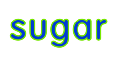
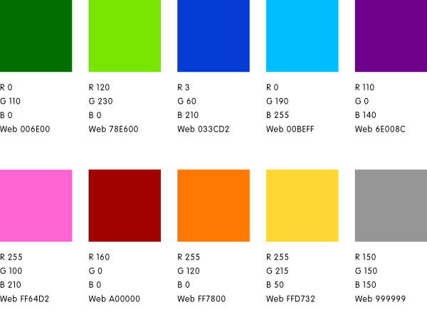
The Sugar Labs logo exists in the color combinations shown below. The logo can sit either on a white or black background, and the color combinations change order based on the background--against a white background the outline color around "sugar" is always lighter than the fill color, while against a black background the outline color is darker than the fill color.
Sugar logo variations
Sugar logo | primary colors | SVG | PNG
Sugar Labs logo | primary colors | SVG | PNG
Sugar Labs logo (alternate, usage discouraged) | primary colors | SVG | PNG
Logo usage
- The logo should be used only on a black or white background
- Make sure there is generous space surrounding the logo, as shown in the PNG and SVG files.
- Don't use any other color combinations than the ones shown below.
- Don't alter the logo in any other way--don't stretch, rotate, or change the letter spacing and size.
- Scale down only as long as the color outline around "sugar" is still clearly visible.
- While the Sugar Labs logo also exists as a stacked version for use in space-confined situations, the *single line logo is the primary treatment* and should be used wherever possible.
If you have any questions about correct logo usage, contact Christian Marc Schmidt at anything [at] christianmarcschmidt.com.
Sugar Labs logo for white backgrounds

|

|

|

|

|

|

|

|

|

|

|

|
Sugar Labs logo for black backgrounds

|

|

|

|

|

|

|

|

|

|

|

|
Sugar Labs logo (alt) for white backgrounds

|

|

|

|

|

|

|

|

|

|

|

|
Sugar Labs logo (alt) for black backgrounds

|

|

|

|

|

|

|

|

|

|

|

|
Color Palette
Documentation
Sugar Labs logo PDF (2008-12-07) http://www.sugarlabs.org/go/Image:081207_sugarlabs_logo.pdf
Sugar Labs certification badges PDF (2008-10-22) http://www.sugarlabs.org/go/Image:081022_badges.pdf
