Difference between revisions of "Design Team/Proposals/Journal"
< Design Team | Proposals
Jump to navigation
Jump to search
| Line 45: | Line 45: | ||
==== #4 ==== | ==== #4 ==== | ||
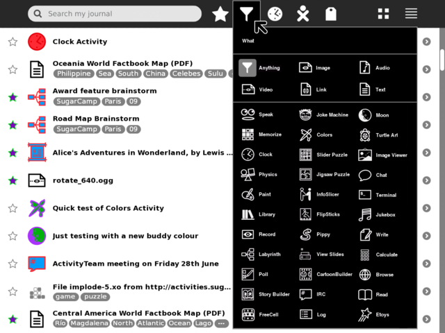
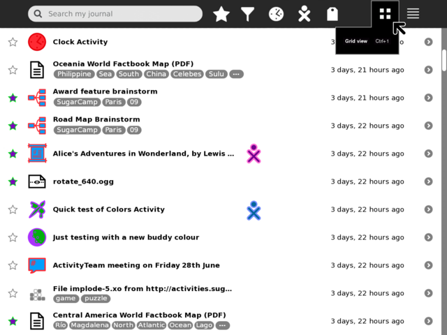
[[Image:journal_mockup_gary_list_palette.png|thumb|centre|640px|List palette, Journal Grid view and List view are (I think) the primary views users will switch between, so I've swapped around the design priority from Eben so that (potential future) action-view and object-view are secondary items for the List view. Once/if action-view is implemented/proven it would likely be the default List view.]] | [[Image:journal_mockup_gary_list_palette.png|thumb|centre|640px|List palette, Journal Grid view and List view are (I think) the primary views users will switch between, so I've swapped around the design priority from Eben so that (potential future) action-view and object-view are secondary items for the List view. Once/if action-view is implemented/proven it would likely be the default List view.]] | ||
| − | |||
| − | |||
| − | |||
| − | |||
| − | |||
| − | |||
| − | |||
| − | |||
| − | |||
| − | |||
| − | |||
| − | |||
| − | |||
| − | |||
| − | |||
| − | |||
| − | |||
| − | |||
| − | |||
| − | |||
| − | |||
| − | |||
| − | |||
| − | |||
| − | |||
| − | |||
| − | |||
| − | |||
| − | |||
| − | |||
| − | |||
<noinclude> | <noinclude> | ||
Revision as of 16:55, 3 July 2009
<Your proposal's pithy name here>
- Rationale:
- <Your rationale here>
- Features:
- <1st feature here>
- <2nd feature here>
- Implementation Details:
- <Details here>
- Reviewer Comments:
- comments here
Tags under titles
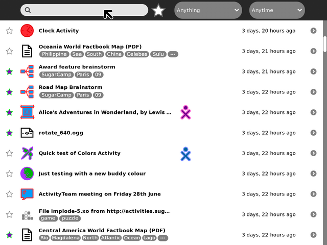
Example mock-up based on current Journal (0.84) using two lines for title and tags per each entry. Notes: Entries with no tags have their title vertically centred to keep visual balance; entries with more tags than can be displayed end with an ellipsis, this could just be indicative that there are more tags, or have hover hint function showing the remaining un-displayed tags. Clicking a tag should add it to the search field to allow drilling down into results.
Tollbar and palettes
TODO:
- Mock-up of tag palette (before alstoot starts throwing heavy objects at me).
- Add and mock-up an anytime/when palette.
- Add and mock-up an anyone/who palette.
- Try and find better design for the anything/what filter/funnel icon.
- Show multi entry selection and applying actions to them
- shift key modifier and click to multi select (toggle, or could be block range)
- modified pop-up palette when interacting with multi selected items
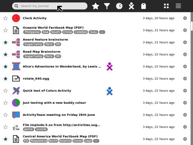
#1
#2
#3
#4
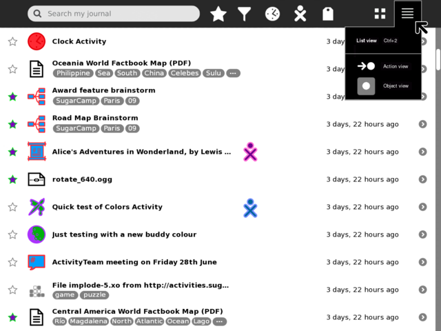
List palette, Journal Grid view and List view are (I think) the primary views users will switch between, so I've swapped around the design priority from Eben so that (potential future) action-view and object-view are secondary items for the List view. Once/if action-view is implemented/proven it would likely be the default List view.
