Difference between revisions of "Design Team/0.88 Meeting"
| Line 11: | Line 11: | ||
==Open== | ==Open== | ||
| − | ==Resume/Start new on the Home View== | + | ===Resume/Start new on the Home View=== |
* [http://lists.sugarlabs.org/archive/sugar-devel/2010-January/021771.html Mailing list discussion] | * [http://lists.sugarlabs.org/archive/sugar-devel/2010-January/021771.html Mailing list discussion] | ||
| − | ==3G Support== | + | ===3G Support=== |
Allow the Sugar user to connect to 3G networks. | Allow the Sugar user to connect to 3G networks. | ||
* [http://wiki.sugarlabs.org/go/Features/3G_Support Feature Page] | * [http://wiki.sugarlabs.org/go/Features/3G_Support Feature Page] | ||
| Line 20: | Line 20: | ||
* Needed: Icon to represent the connection in the frame, layout control panel section | * Needed: Icon to represent the connection in the frame, layout control panel section | ||
| − | ==Write to Journal anytime== | + | ===Write to Journal anytime=== |
Replacement for the Naming Alert that lets you write to the Journal at any time while working on an activity. | Replacement for the Naming Alert that lets you write to the Journal at any time while working on an activity. | ||
* [http://wiki.sugarlabs.org/go/Features/Write_to_journal_anytime Feature Page] | * [http://wiki.sugarlabs.org/go/Features/Write_to_journal_anytime Feature Page] | ||
| Line 26: | Line 26: | ||
* [http://wiki.sugarlabs.org/go/File:Description.png Proposal of option in the activity toolbar.] | * [http://wiki.sugarlabs.org/go/File:Description.png Proposal of option in the activity toolbar.] | ||
| − | ==Font configuration== | + | ===Font configuration=== |
Users need a way to be able to customize the Sugar font size. | Users need a way to be able to customize the Sugar font size. | ||
* [http://wiki.sugarlabs.org/go/Features/Font_configuration Feature page] | * [http://wiki.sugarlabs.org/go/Features/Font_configuration Feature page] | ||
* Needed: Control Panel section to increase/decrease the font size, icon for section, section layout | * Needed: Control Panel section to increase/decrease the font size, icon for section, section layout | ||
| − | ==Thumbs View in Journal== | + | ===Thumbs View in Journal=== |
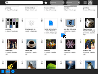
* <strike>[http://wiki.sugarlabs.org/go/Features/Thumbs_View_in_Journal Feature Page]</strike> implemented [[User:Alsroot|alsroot]] 03:43, 26 January 2010 (UTC) | * <strike>[http://wiki.sugarlabs.org/go/Features/Thumbs_View_in_Journal Feature Page]</strike> implemented [[User:Alsroot|alsroot]] 03:43, 26 January 2010 (UTC) | ||
[[File:thumbs.png|200px]] | [[File:thumbs.png|200px]] | ||
| − | ==Enhanced Color Selector== | + | ===Enhanced Color Selector=== |
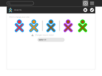
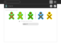
This is an enhancement to the color selector used in the About Me control panel and the initialization screen (same behavior but a different code base). It enables the user to cycle through color choices as well as jump randomly, which is the current default behavior. | This is an enhancement to the color selector used in the About Me control panel and the initialization screen (same behavior but a different code base). It enables the user to cycle through color choices as well as jump randomly, which is the current default behavior. | ||
* [http://wiki.sugarlabs.org/go/Features/Enhanced_color_selector Feature Page] | * [http://wiki.sugarlabs.org/go/Features/Enhanced_color_selector Feature Page] | ||
| Line 49: | Line 49: | ||
==Moved== | ==Moved== | ||
| − | ==Tags in Journal== | + | ===Tags in Journal=== |
| − | [http://wiki.sugarlabs.org/go/Design_Team/Proposals/Journal Design Page] | + | * [http://wiki.sugarlabs.org/go/Design_Team/Proposals/Journal Design Page] |
| + | * moved to 0.90 | ||
| − | ==Multiple selections in the Journal== | + | ===Multiple selections in the Journal=== |
| − | [http://lists.sugarlabs.org/archive/sugar-devel/2009-November/020630.html Mailing list discussion] | + | * [http://lists.sugarlabs.org/archive/sugar-devel/2009-November/020630.html Mailing list discussion] |
| + | * moved to 0.90 | ||
==Done== | ==Done== | ||
Revision as of 08:51, 30 January 2010
When/Where
- date: 2010-01-16 16:00 UTC == 17:00:00 CET == 11:00 EST
- place: #sugar-meeting on irc freenode
Important Dates
- Jan 18 Feature Acceptance: Acceptance of the features following the Features/Policy.
- Feb 01 Feature Freeze: No new features will be accepted for this release period.
- Feb 15 UI Freeze: Major UI revisions or changes must be done before this date.
Topics
Open
Resume/Start new on the Home View
3G Support
Allow the Sugar user to connect to 3G networks.
- Feature Page
- Design: A device will be added to the frame when a modem is connected, and the user will be able to connect and disconnect from there. Also, a section will be added to the control panel that will allow entering the details needed by the connection.
- Needed: Icon to represent the connection in the frame, layout control panel section
Write to Journal anytime
Replacement for the Naming Alert that lets you write to the Journal at any time while working on an activity.
Font configuration
Users need a way to be able to customize the Sugar font size.
- Feature page
- Needed: Control Panel section to increase/decrease the font size, icon for section, section layout
Thumbs View in Journal
Feature Pageimplemented alsroot 03:43, 26 January 2010 (UTC)
Enhanced Color Selector
This is an enhancement to the color selector used in the About Me control panel and the initialization screen (same behavior but a different code base). It enables the user to cycle through color choices as well as jump randomly, which is the current default behavior.
- Feature Page
- Mailing list discussion
- The latest question was: Do we need the color selector in the start-screen at all?
 '+' layout and do not mess changed/unchanged colors for "arrows"
Moved
Tags in Journal
- Design Page
- moved to 0.90
Multiple selections in the Journal
- Mailing list discussion
- moved to 0.90
Done
Drag icon
What image should be used for drag icon for:
- list view
- thumbs view
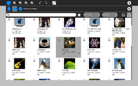
Sugars <0.84 used nasty default icon, 0.86 uses default TreeView method - row snapshot. Last method will look nice especially for thumb view but there is an issue, draging large row(list view) or cell(thumbs view) user doesn't see target drop place e.g. icon in volume list
Design_Team/Designs/Frame#15 mockup was implemented alsroot 02:52, 26 January 2010 (UTC)
Is it right if only widgets(Journal related, pure text from could be dragged as usual) that could be dragged are object icon in list view and thumb in thumbs view?
- implementing scheme when any space in row(list view) and cell(thumbs view) could be dragged is(of course) possible in new journal but requires not obvious coding
- does it make sense if empty space(in list view row) could be dragged as journal object, moreover it's easy to make a mistake and drag wrong object
Hover over mode
Should ObjectChooser highlight current item, <=0.84 has this feature, 0.86 doesn't.


