Design Team: Difference between revisions
Appearance
m added sun logo design |
m →ideas |
||
| Line 25: | Line 25: | ||
* The sun represents knowledge in many cultures | * The sun represents knowledge in many cultures | ||
* It looks a little bit like a child | * It looks a little bit like a child | ||
[[Image:Logodraft-starfish.png|500px|Inspired by Greg, Caroline, and "The Starfish and the Spider." Also somewhat boring and generic.]] | |||
[[Image:Logodraft-starfishweb.png|The starfish learns to spin a web, the starfish surfs the web, the starfish has a network... unfortunately, this could also be read as "the starfish got stuck in the web."]] | |||
[[Image:Logodraft-acorn.png|Somewhat boring and generic, but acorns are often a symbol for youth, trees a symbol of knowledge.]] | |||
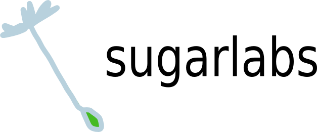
[[Image:Logodraft-dandelion.png|Dandelions sprout just about everywhere. Their flowers and seeds are often played with (and spread by) young children. They are also native to temperate areas of the northern hemisphere.]] | |||
[[Image:Logodraft-dandelion-seed.png|A dandelion seed in flight, one of billions off to explore the world and find a place to grow...]] | |||
[[Image:Logodraft-dandelion-head.png|A dandelion head ready to be picked up and blown on by a child.]] | |||
[[Category:DesignTeam]] | [[Category:DesignTeam]] | ||
Revision as of 22:56, 17 January 2009
Mission
Designs
At present, the latest designs for upcoming revisions of Sugar can be found here.
business cards
There are four images (orange, blue, magenta, and green) that can be used to make Moo Sugar Labs business cards.
ideas
The icon for Sugarlabs should have the following qualities in order to appeal to children
- Simple
- bright colors
- not overly polished
I like the sun logo because:
- The sun represents knowledge in many cultures
- It looks a little bit like a child


