Design Team/Proposals/Journal: Difference between revisions
No edit summary |
|||
| Line 20: | Line 20: | ||
Existing proposals block below: --></noinclude> | Existing proposals block below: --></noinclude> | ||
=== [[Journal NewUI]] === | |||
{{Transclude|Journal NewUI}} | |||
=== [[#Datastore|Datastore]] === | === [[#Datastore|Datastore]] === | ||
<noinclude> | <noinclude> | ||
| Line 30: | Line 32: | ||
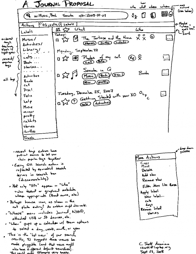
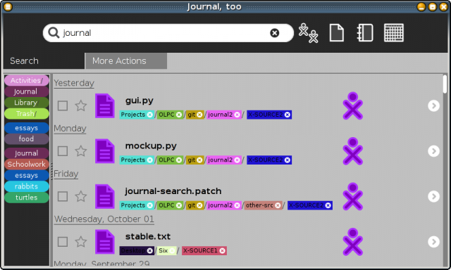
CSA: If you incorporate ordered tags, based on filesystem paths, they could look like this: | CSA: If you incorporate ordered tags, based on filesystem paths, they could look like this: | ||
[[Image:journal_tag_dir_styles.jpg|center|Tag styles]] | [[Image:journal_tag_dir_styles.jpg|center|Tag styles]] | ||
=== [[#Toolbar and palettes|Toolbar and palettes]] === | === [[Design Team/Proposals/Journal#Toolbar and palettes|Toolbar and palettes]] === | ||
<noinclude> | <noinclude> | ||
TODO: | TODO: | ||
Revision as of 14:18, 27 October 2011
Journal NewUI
Journal NewUI
== Authors ==- Martin Abente (tch)
- Andres Ambrois (aa)
- Gonzalo Odiard (godiard)
- Manuel Quiñones (manuq)
Goals
Our goal is to improve the journal usability adding new features and extensions.
Objectives
- Use the new toolbar.
- Enable multiple files operations.
- Use tags.
New toolbar
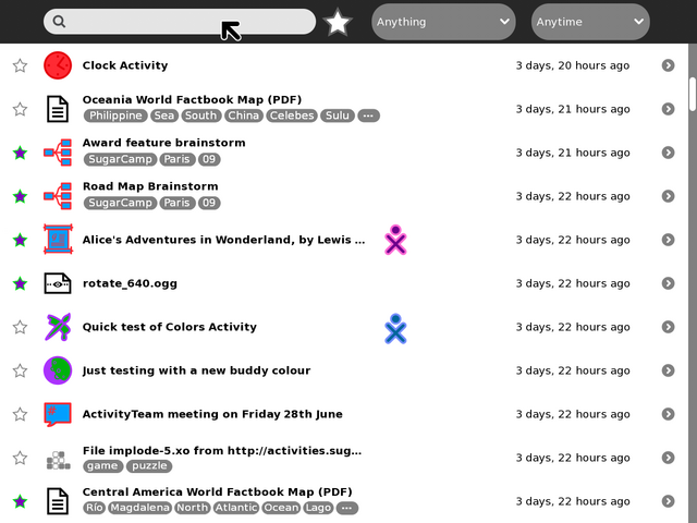
The current journal toolbar ran out of space for new options. The new toolbar provides the structure we require for adding these new GUI elements.
Filter and Sort sub-toolbar
The current toolbar will be completely moved to a new sub-toolbar. Since this sub-toolbar is not always visible we also add a new element to the journal GUI that pretends to display current [filters, sorting criterias, tags] at any time.
Multiple files operations
- Add a checkbox column to every journal entry.
- Display the edit sub-toolbar when more than one entry is selected.
Allowed Operations for multiple files
- Copy
- Send to
- Remove (this operation should display a warning before committing)
All of this operations should display a proper progress bar.
Tags
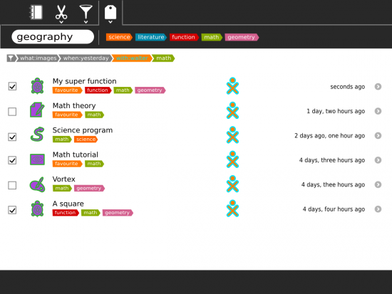
In this work we propose to remove the current star icon and replace it by tags. We propose to add a new sub-toolbar to manage the creation and deletion of tags. These tags could be used by dragging tags and dropping them on the journal entry.
Mockups
Journal with Tags subtoolbar enabled:
Main toolbar:

Edit sub toolbar:

Filters / Sort subtoolbar:

Datastore
- See Sascha Silbe's version support project specifically datastore-redesign (click the raw blob data link at the top of the page to see the HTML rendered in your browser), and this mailing list thread, or this compilation of the discussion in context with the proposal document.
Tags under titles
CSA: If you incorporate ordered tags, based on filesystem paths, they could look like this:

Toolbar and palettes
TODO:
- Add and mock-up an anyone/who palette.
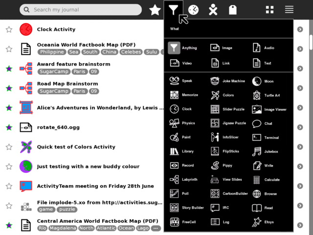
- Try and find better design for the anything/what filter/funnel icon.
- Show multi entry selection and applying actions to them
- shift key modifier and click to multi select (toggle, or could be block range)
- modified pop-up palette when interacting with multi selected items
- Try tag functionality in the search magnifying-glass icon
- less scary number of buttons for novice users
- could also be part of autocomplete when typing
- What/Anything filter could switch main canvas to a 'tree map' like view
- clicking on a grid would then just list that Activity type
- each grid would be sized based on frequency of entries
- each grid would show icon and Activity name
- maximum use of space
- no scrolling and no scary palettes
- perhaps tags could be treated in the same way?
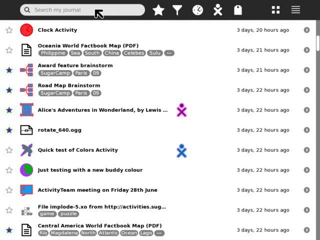
Button icons in toolbar
What/Anything palette
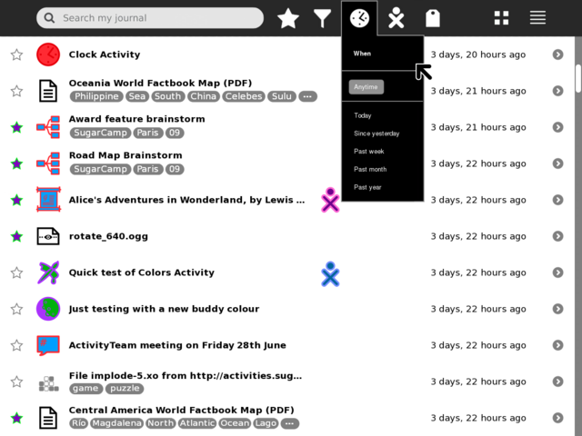
When/Anytime palette
Who/Anyone palette
- TBA
Tags palette
Simple order by frequency
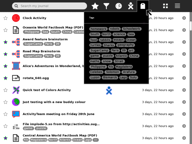
Show frequency as gradient
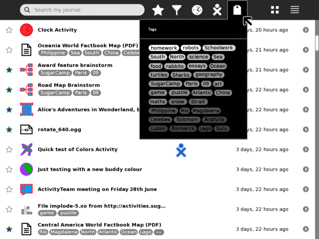
Show frequency as proportional size
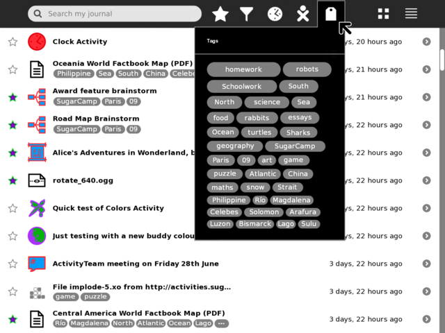
Grid view palette
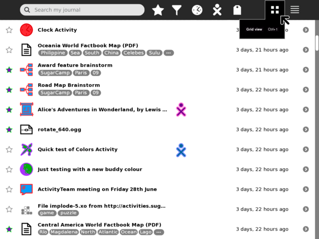
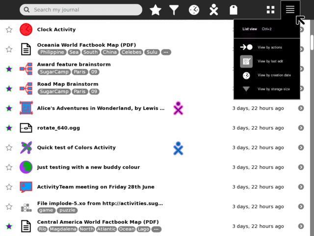
List view palette
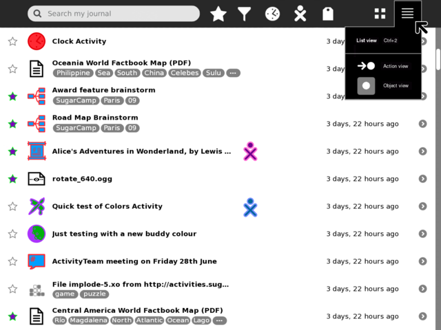
Extended list view palette
GMail-style tag view
Tags drag-and-drop-able from a left-side palette.
