Difference between revisions of "Design Team/Designs/Object Chooser"

From Sugar Labs
Jump to navigation Jump to search
(New page: {{OLPC}} {{Translations}} {{Translationlist | es | origlang=en}} __NOTOC__ ====Note==== The designs shown below are intended as a short term solution. A more detailed design specificati...)
 
(Link to Journal)
Line 6: Line 6:
 
====Note====
 
====Note====
  
The designs shown below are intended as a short term solution.  A more detailed design specification for the object chooser is forthcoming, and will be implemented in conjunction with the new Journal.
+
The designs shown below are intended as a short term solution.  A more detailed design specification for the object chooser is forthcoming, and will be implemented in conjunction with the new [[Designs/Journal|Journal]].
  
 
====01====
 
====01====

Revision as of 10:28, 23 September 2008

Template:OLPC

Please copy/paste "{{Translationlist | xx | origlang=en | translated={{{translated}}}}}" (where xx is Translation Team/ISO 639 language code for your translation) to Design Team/Designs/Object Chooser/translations HowTo [ID# 19319]  +/-  

english | Copy "{{subst:requesttranslation}}" to español


Note

The designs shown below are intended as a short term solution. A more detailed design specification for the object chooser is forthcoming, and will be implemented in conjunction with the new Journal.

01

back | next
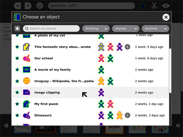
The object chooser appears as a modal alert, and looks very much like a view into the Journal, with similar search/filter functionality. Unlike the Journal, each entry has a light gray highlight on rollover, indicating that the entire entry is a single clickable object, which will be inserted upon click.

02

back | next

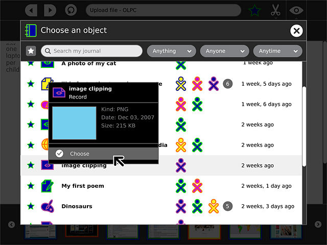
Though the entire entry is one clickable button, the object/people icons within retain their rollover palettes, offering more detailed information about the entry and its collaborators. Most importantly, this offers detailed info such as a preview, mime type, and file size. The future version of the object chooser will have a thumbnail view, allowing more natural visual browsing.


03

back | next

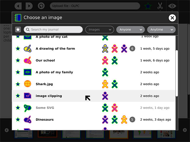
The object chooser supports some extra parameters from activities, including lists of filters and mime-types. The filter list specifies presets for the controls in the toolbar, for instance allowing an "insert image" button to automatically filter for all entries of type "image". A boolean for each specified filter determines whether or not the preset is locked, or remains adjustable by the child. The mime-type list specifies the formats which the activity can support. Items which do not match on this list and therefore cannot be selected are rendered with gray text, and do not receive a highlight on rollover.

04

back | next

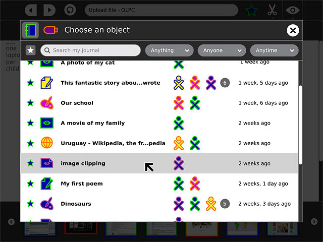
When external storage devices are present, they appear as radio buttons to the left of the header in the toolbar. The Journal is selected by default, but the child may select another device to choose from instead.