Difference between revisions of "Design Team/Designs/Journal"

From Sugar Labs
Jump to navigation Jump to search
m (→‎03: typo)
(Link to the object chooser mockups.)
Line 89: Line 89:


+
See also [[Object chooser]].


Revision as of 15:18, 22 September 2008


01

back | next

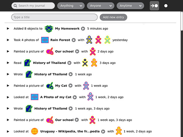
The new Journal captures a child's interactions with their laptop and with others, offering both activity- and object-centric views. The activity-centric view, shown here, provides a friendly browsable interface into the activities a child has participated in, and the actions they've taken. This makes it possible to distinguish between writing a story vs. reading one, and among objects a child creates or modifies vs. those they download, receive from a friend or copy from an external device, etc. This view also makes possible the logging of actions and events with no associated object, such as joining a group, making a friend, or changing global settings.


02

back | next

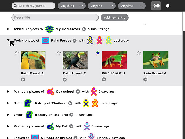
Each action may result in (or take effect on) one or more objects. The child may expand each entry to see more detail about a particular action; thumbnails are offered where available to make browsing through a day's events quick and effective.


03

back | next

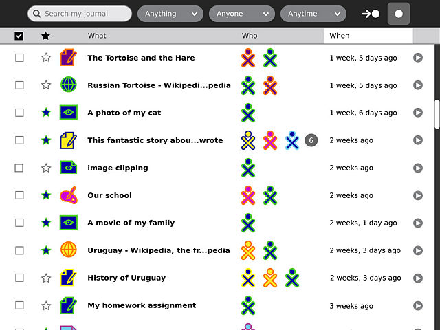
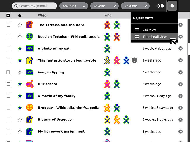
The object-centric view, on the other hand, retains a very similar form to that of the previous Journal. It offers a structured list of all the objects stored on the system, and provides a means to sort them based on various criteria.

04

back | next

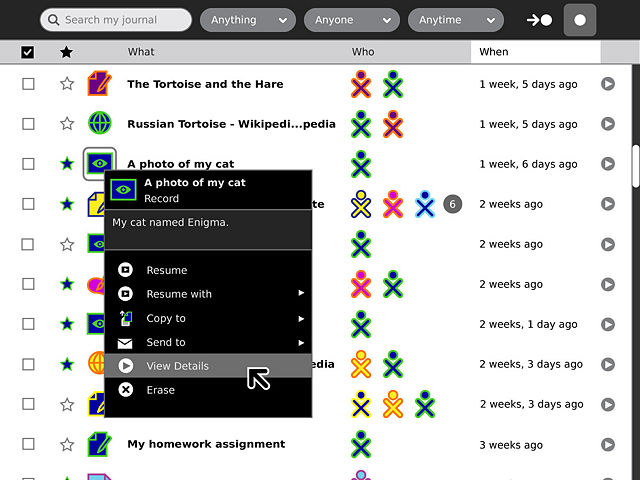
The icons in both views are actionable: A single click will start or resume an object or activity, and each also has a standard palette providing a basic description and a number of actions that may be taken upon it.

05

back | next

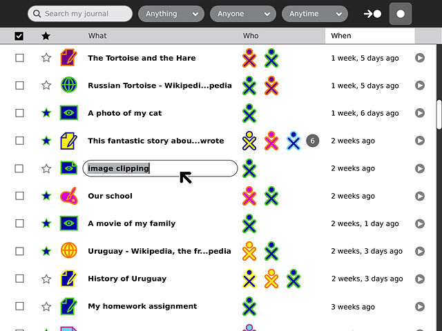
Clicking directly on the title of a given object will reveal an entry field, allowing the child to rename items without navigating to the detail view for the entry.

06

back | next

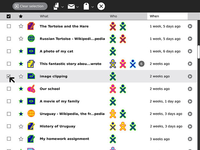
The checkboxes to the left of each entry select objects in the list. When a selection is made, a contextual toolbar appears offering a number of actions to take upon the selected items, including copy, tag, and erase. When activated, the button above the checkbox column will reveal only the selected items, providing a clear view of the objects the child will act upon.

07

back | next

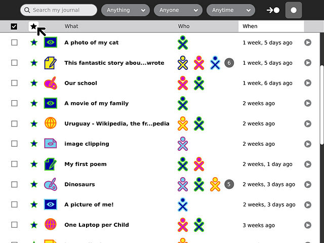
The star button will filter the list of objects, showing only the child's favorites. Constricting the list in this manner can make navigation much easier when the overall number of objects in the Journal gets large.

08

back | next

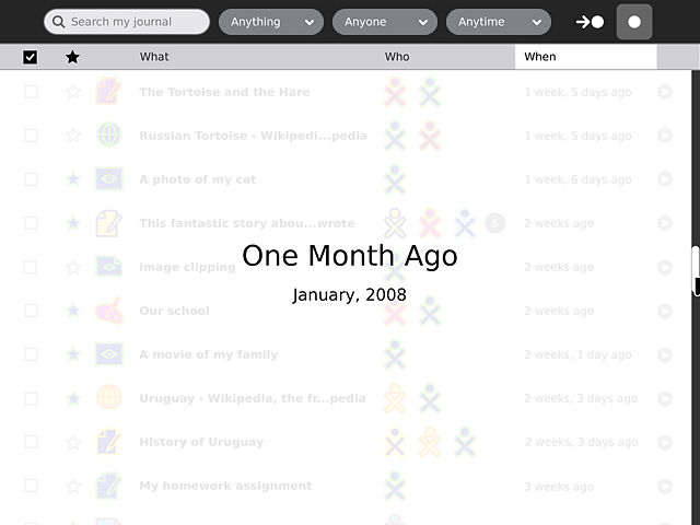
To further aid in scalability, the Journal has a new scrolling interaction. Smooth pixel-by-pixel scrolling will allow the child to navigate easily through several buffered pages of objects before and after their current location in time. When they scroll beyond the buffer, an overlay will appear to indicate their location in time as they move the scrollbar. Once they reach a point they are interested in, the buffer will be refilled at the new location.

09

back | next

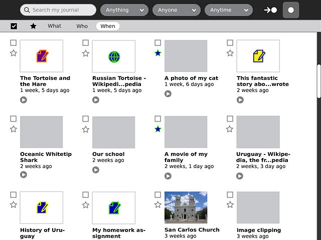
The palette for the object-centric section offers two views: list and thumbnail.

10

back | next

The thumbnail view makes searching through images and videos much more engaging and efficient. Over time, many activities will take advantage of the thumbnail capability to provide visual browsing for additional types of objects.

11

back | next

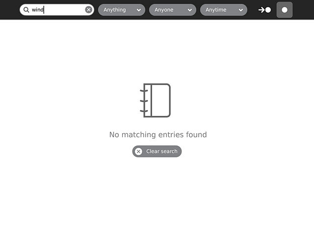
When a search or filter turns up no results this will be clearly indicated. A button will allow the child to clear their search and try again.

12

back | next

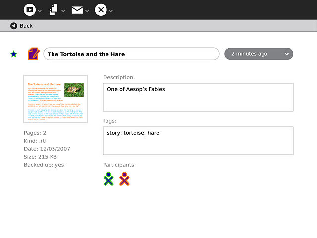
By clicking on a detail button from any view of the Journal the child will enter a page containing a larger thumbnail, object details such as size and format, and fields for entering a description and tags. By selecting the date popup for a given object, the child can navigate to its previous versions.


See also Object chooser.