Marketing Team/Boot Logo
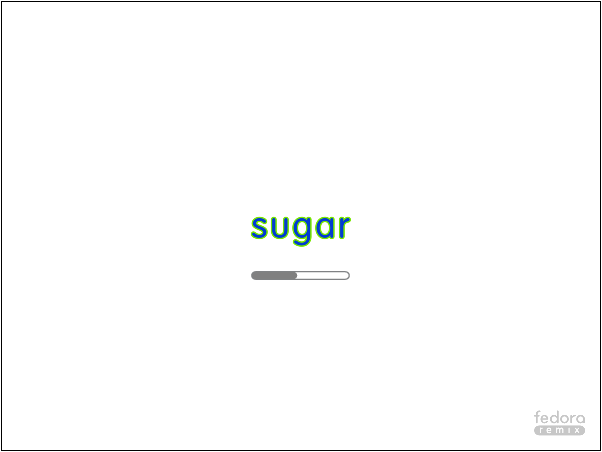
Basic Sugar Logo Boot Animation
Below is a basic animation that could be considered a safe starting point for experimentation, no surprises, no messing with user interface metaphors. Comprises of a white background, the Sugar logo in default colour at the centre, and 24 grey dots appearing in a circle around it (assumes a grey Fedora Spin logo off in one corner).

Basic Logo Variant with Changing Logo Colour

Retaining the XO
The use of the outlined XO has always been an important part of the design for us, since it's meant to convey the transition of the laptop/avatar to its "on" state, and the transition of the child into a collaborative/learning space. Here's a very basic option which shows the logo for a bit, but retains the XO for the latter portion of the boot sequence before the transition to Home view, when it becomes colored. (My apologies: I just have two stills to show for now.)

