Design Team/Proposals/Notifications: Difference between revisions
Appearance
< Design Team | Proposals
Garycmartin (talk | contribs) |
Garycmartin (talk | contribs) |
||
| (16 intermediate revisions by the same user not shown) | |||
| Line 2: | Line 2: | ||
===Frame Notifications=== | ===Frame Notifications=== | ||
:'''Rationale:''' | :'''Rationale:''' | ||
:: Notifications have so far been partially implemented to cover activity invitations, journal object transfer, clipboard copy events, and an activity event (used by IRC to notify of user nick mention). This proposal attempts to show a more complete solution. | :: Notifications have so far only been partially implemented to cover activity invitations, journal object transfer, clipboard copy events, and an activity event (used by IRC to notify of user nick mention). This proposal attempts to show a more complete solution. | ||
:'''Features:''' | :'''Features:''' | ||
:# <1st feature here> | :# <1st feature here> | ||
| Line 18: | Line 18: | ||
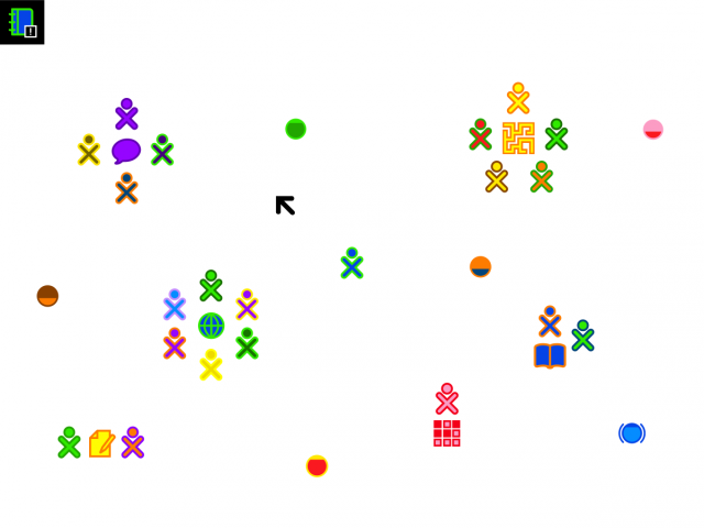
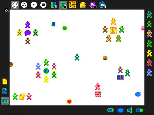
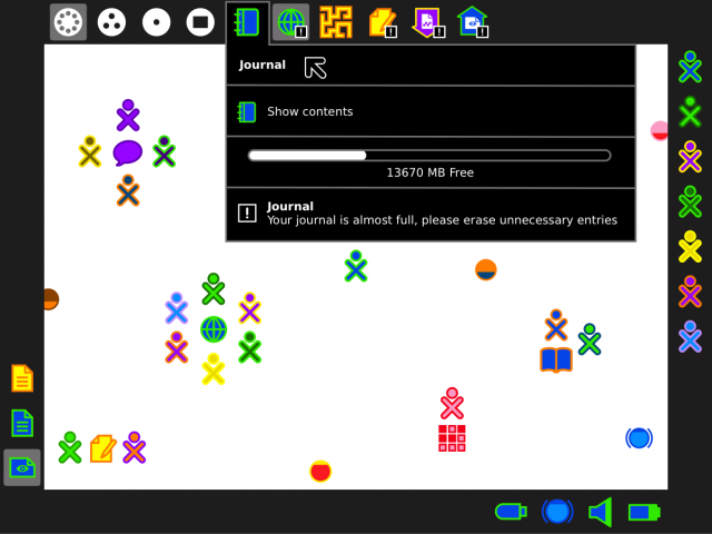
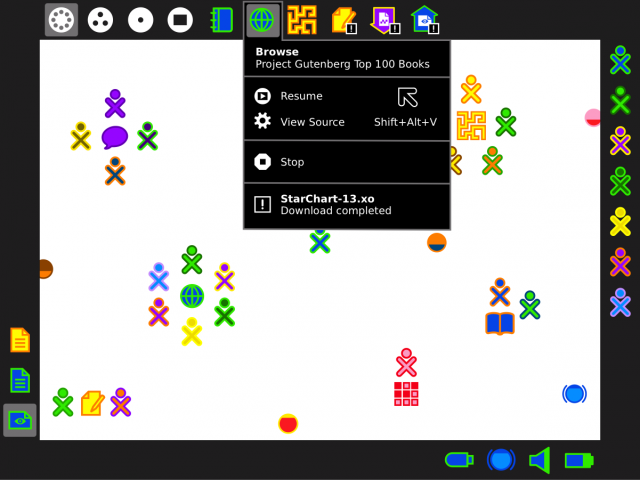
[[Image:Mockup_activity_notification_example_activity_corner_pulse.png | thumb | center | 640px | | [[Image:Mockup_activity_notification_example_activity_corner_pulse.png | thumb | center | 640px | | ||
New notifications pulse several times in their related frame corner and then are hidden as per [[Design_Team/Designs/Frame#12]]. In this example a notification from the Journal activity is shown pulsing in the top left corner (activity and shell notifications). | New notifications pulse several times in their related frame corner and then are hidden as per [[Design_Team/Designs/Frame#12]]. In this example a notification from the Journal activity is shown pulsing in the top left corner (activity and shell notifications). The small notification badge allows for potentially different notification types or levels, and helps reinforce that this pulsing icon is indeed a notification (contrast with the copy to clipboard event icon pulse in the bottom left, where no badge is needed). | ||
]] | ]] | ||
| Line 46: | Line 46: | ||
[[Image:Mockup_activity_notification_example_activity_invite.png | thumb | center | 640px | | [[Image:Mockup_activity_notification_example_activity_invite.png | thumb | center | 640px | | ||
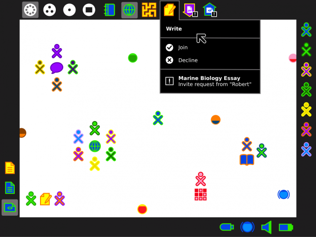
Mockup showing an activity invite notification. | |||
]] | ]] | ||
| Line 53: | Line 53: | ||
[[Image:Mockup_activity_notification_example_transfer_from.png | thumb | center | 640px | | [[Image:Mockup_activity_notification_example_transfer_from.png | thumb | center | 640px | | ||
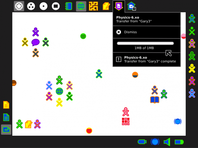
Mockup notification for a completed file transfer from another users. | |||
]] | ]] | ||
====Transfer to==== | ====Transfer to==== | ||
[[#Transfer from | back]] | [[#Transfer from | back]] | [[#School server messages | next]] | ||
[[Image:Mockup_activity_notification_example_transfer_to.png | thumb | center | 640px | | [[Image:Mockup_activity_notification_example_transfer_to.png | thumb | center | 640px | | ||
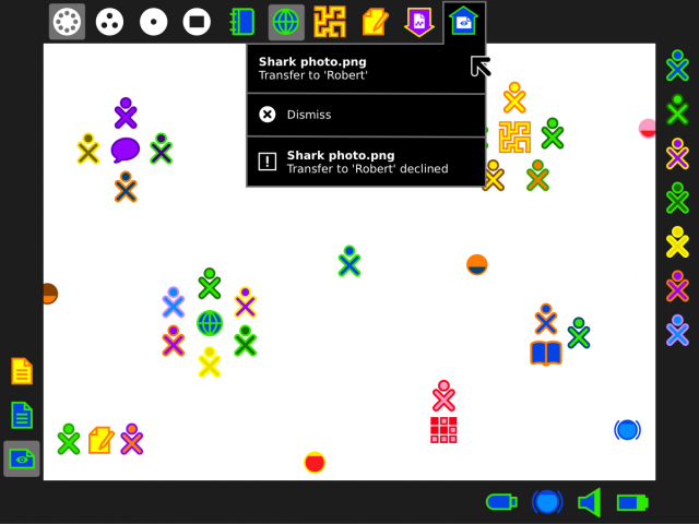
Mockup notification showing a file transfer to another user that has been remotely declined. Note that having displayed each full palette the notification badges on the frame icons have all been cleared. Revealing a palette with an old, already displayed notification could display the notification in grey to indicate it has been viewed instead of white (if it has not timed out and been auto removed). | |||
]] | |||
====School server messages==== | |||
[[#Transfer to| back]] | next | |||
[[Image:Mockup_notification_for_schoolserver_message_broadcast.png | thumb | center | 640px | | |||
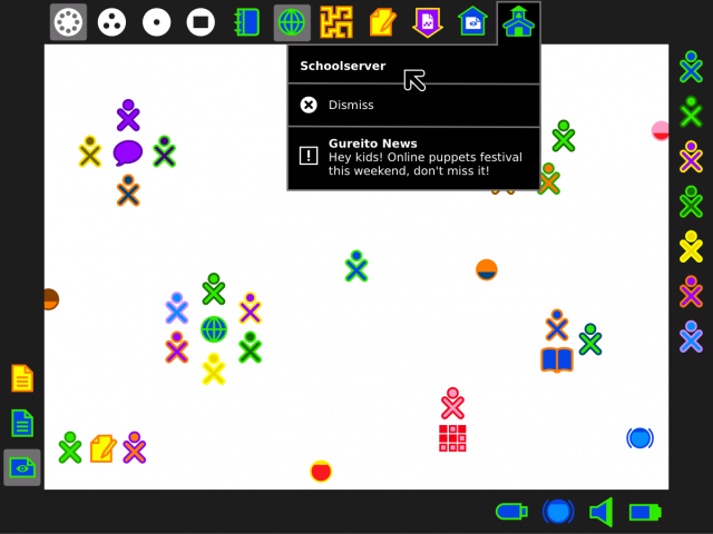
Messages from a schoolserver could use the same technique as the existing transfer to/from design. This could cover XS registration messages, institutional broadcast messages (the case shown above), and perhaps automatic updater messages (would make sense if schoolservers are being used to cache yum repos). | |||
]] | ]] | ||
---- | ---- | ||
===Alternative corner history design=== | ===Alternative corner history design=== | ||
For completeness, this was an initial attempt at a notification UI based on a [[Features/Messages Notification|feature proposal]] from [[User:Tch|Martin Abente]]. | |||
[[Image:Mockup_of_corner_activity_notification_history_examples.png | thumb | center | 640px | | [[Image:Mockup_of_corner_activity_notification_history_examples.png | thumb | center | 640px | | ||
'''Pros.''' 1) Simpler to implement. 2) All notification messages in a single place (well for each given corner type). | '''Pros.''' 1) Simpler to implement. 2) All notification messages in a single place (well for each given corner type). | ||
'''Cons.''' 1) Notification is not visually linked to the specific activity that generated it, e.g. if several uploads are ongoing which one was just declined? 2) Makes new use of the frame corner space, very lightly | '''Cons.''' 1) Notification is not visually linked to the specific activity that generated it, e.g. if several uploads are ongoing which one was just declined? 2) Makes new use of the frame corner space, very lightly to interfere with the frame hot corners, accidentally triggering the notification palette when trying to open the frame. 3) Adds new full size icon clutter/complication to the frame corners (which must be different than the icon of the actual activity to avoid confusion, e.g. two journal icons in the frame would be confusing). | ||
]] | |||
===Notification history as a device icon=== | |||
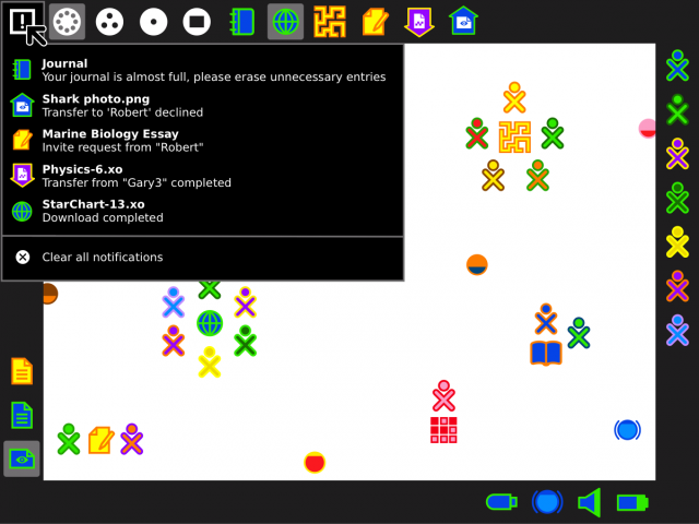
Walter suggested the possibility of having the notification history available as a device icon rather than in a frame corner. | |||
[[Image:Mockup_of_activity_notification_history_as_a_device_icon.png | thumb | center | 640px | | |||
Placing the consolidated history of all notifications in as a device icon would avoid overloading the frame corners with new UI behaviours, though dilutes the spacial link between a corner notification and its frame edge. Would notification text appear both in this device icon and a frame menu? | |||
]] | ]] | ||
[[Category:Design]] | [[Category:Design]] | ||
Latest revision as of 00:08, 11 December 2010
Frame Notifications
- Rationale:
- Notifications have so far only been partially implemented to cover activity invitations, journal object transfer, clipboard copy events, and an activity event (used by IRC to notify of user nick mention). This proposal attempts to show a more complete solution.
- Features:
- <1st feature here>
- <2nd feature here>
- Implementation Details:
- Related Material
- Reviewer Comments:
- comments here
Activity corner pulse
back | next
Notification badges
Journal example
Browse example
Activity invite
Transfer from
Transfer to
School server messages
back | next
Alternative corner history design
For completeness, this was an initial attempt at a notification UI based on a feature proposal from Martin Abente.
Notification history as a device icon
Walter suggested the possibility of having the notification history available as a device icon rather than in a frame corner.
