Design Team/Proposals/Groups: Difference between revisions
Garycmartin (talk | contribs) |
No edit summary |
||
| (3 intermediate revisions by the same user not shown) | |||
| Line 1: | Line 1: | ||
<noinclude> | <noinclude>__TOC__<!-- START OF BLOCK -- 1. COPY & PASTE this BLOCK to below the END OF BLOCK line. | ||
2. PASTE it before any pre-existing proposal, | 2. PASTE it before any pre-existing proposal, | ||
3. then OVERWRITE the place holders with your information, | 3. then OVERWRITE the place holders with your information, | ||
| Line 6: | Line 6: | ||
6. Click [Save page] to complete the edit. | 6. Click [Save page] to complete the edit. | ||
< | ===<Your proposal's pithy name here>=== | ||
:'''Rationale:''' | |||
:: <Your rationale here> | |||
:'''Features:''' | |||
:# <1st feature here> | |||
:# <2nd feature here> | |||
:'''Implementation Details:''' | |||
:: <Details here> | |||
:'''Reviewer Comments:''' | |||
:: comments here (signed with: --~~~~) | |||
END OF BLOCK line | |||
Existing proposals block below: --></noinclude> | |||
=== [[#Groups mockup|Groups mockup]] === | |||
<noinclude> | |||
TODO: | TODO: | ||
* Get agreement on any of this :-) | * Get agreement on any of this :-) | ||
| Line 45: | Line 57: | ||
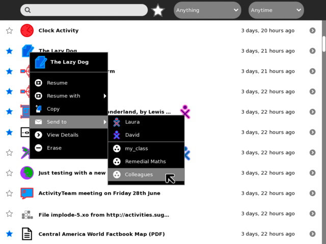
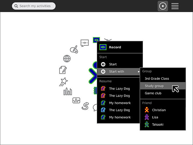
[[Image:Groups_6.jpg|thumb|centre|640px|The groups one belongs to appear in the "Start with" and "Send to" menus, making sharing and collaborating with sets of friends easy and efficient. I like Gary's use of the group icon in the menus. In fact, we might assign "arbitrary" colors to groups based on their creator. The group icon we'd use in the UI (in the Journal list, menus, etc.) would be the three dots, with stroke and fill, rather than the circled white zoom level icon.]] | [[Image:Groups_6.jpg|thumb|centre|640px|The groups one belongs to appear in the "Start with" and "Send to" menus, making sharing and collaborating with sets of friends easy and efficient. I like Gary's use of the group icon in the menus. In fact, we might assign "arbitrary" colors to groups based on their creator. The group icon we'd use in the UI (in the Journal list, menus, etc.) would be the three dots, with stroke and fill, rather than the circled white zoom level icon.]] | ||
==Subpages== | ==Subpages== | ||
{{Special:PrefixIndex/{{PAGENAMEE}}/}} | {{Special:PrefixIndex/{{PAGENAMEE}}/}} | ||
</noinclude> | </noinclude> | ||
Latest revision as of 18:06, 14 February 2011
Groups mockup
TODO:
- Get agreement on any of this :-)
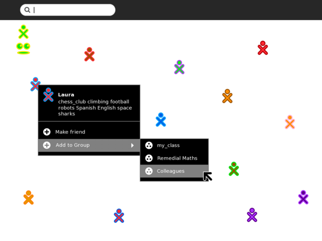
Add buddy to existing Group from Neighbourhood
Group view with additional management
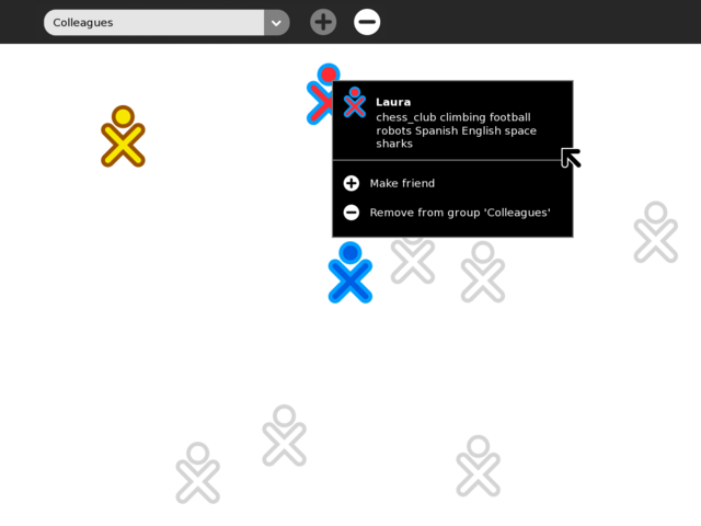
Group view with additional management

Journal view showing "Send to --> Group"
Former Design Sketches
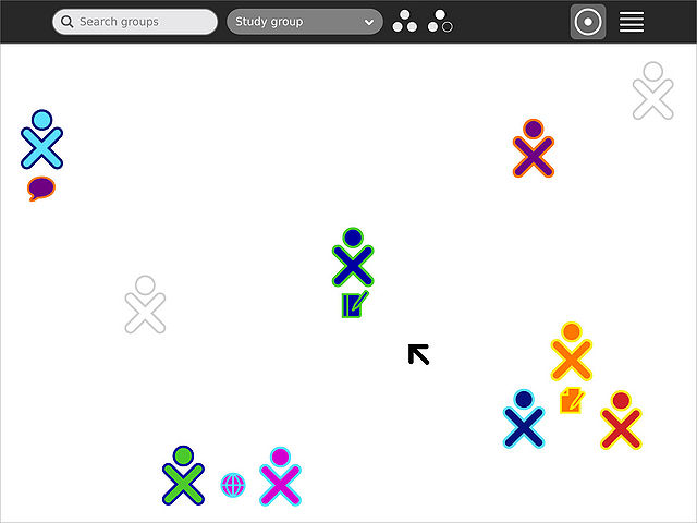
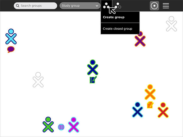
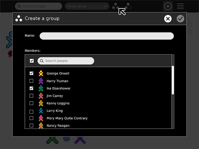
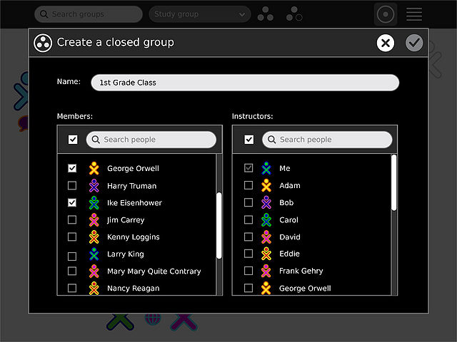
These images represent some earlier explorations of Groups, of both "open" and "closed" nature. For additional background on groups and their behaviors, please see Design Team/Specifications/Groups. If the above "local group" concept is implemented as a stepping stone to this model, we should be very clear in determining how that transition will happen. It's unclear to me how to illustrate the difference between the two, or how to convert local named groups to mutual open groups down the road. I do, however, see the open and closed groups specified here as more useful than local group names, since the benefits of group creation are enjoyed by all members.

Subpages