Design Team/Proposals/Journal: Difference between revisions
Appearance
< Design Team | Proposals
Garycmartin (talk | contribs) |
→Tollbar and palettes: add numbers |
||
| Line 31: | Line 31: | ||
* Try and find better design for the 'Anything' filter/funnel icon. | * Try and find better design for the 'Anything' filter/funnel icon. | ||
==== #1 ==== | |||
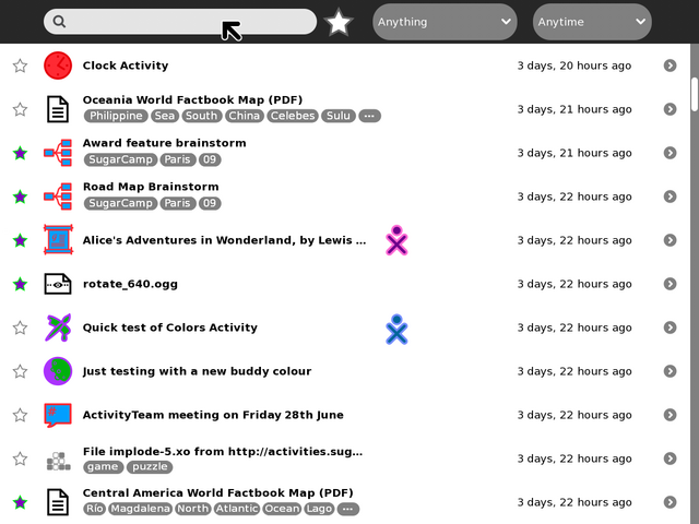
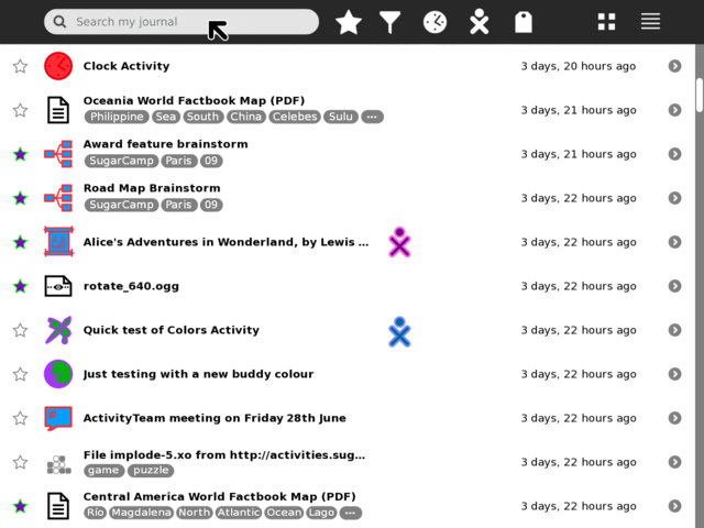
[[Image:journal_mockup_gary_toolbar.png|thumb|centre|640px|Toolbar rework using standard button icons instead of text menus (the Activity filter icon is a temporary design placeholder, suggestions welcome!)]] | [[Image:journal_mockup_gary_toolbar.png|thumb|centre|640px|Toolbar rework using standard button icons instead of text menus (the Activity filter icon is a temporary design placeholder, suggestions welcome!)]] | ||
==== #2 ==== | |||
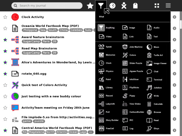
[[Image:journal_mockup_gary_filter_palette.png|thumb|centre|640px|Example using a palette with a grid layout to show many items on screen at once and reduce scrolling (Activity filter icon is a temporary design placeholder, suggestions welcome!) Clicking on an item will highlight it (as shown on the default 'Anything' icon) and place it's icon in the toolbar.]] | [[Image:journal_mockup_gary_filter_palette.png|thumb|centre|640px|Example using a palette with a grid layout to show many items on screen at once and reduce scrolling (Activity filter icon is a temporary design placeholder, suggestions welcome!) Clicking on an item will highlight it (as shown on the default 'Anything' icon) and place it's icon in the toolbar.]] | ||
==== #3 ==== | |||
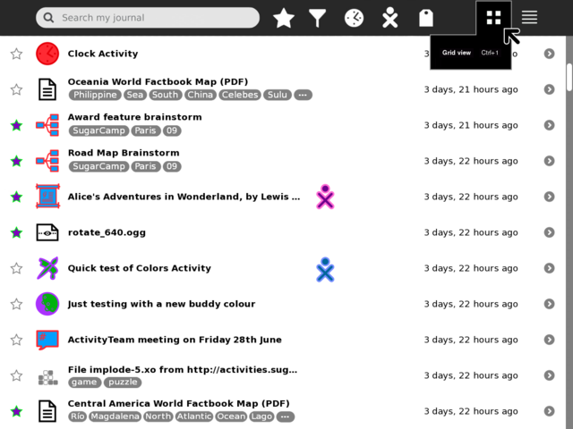
[[Image:journal_mockup_gary_grid_palette.png|thumb|centre|640px|Grid palette, not much here to see, other than to note that Grid view has been placed as a top level toolbar button as it's likely a frequent view to be switched to and from (grid view is inherently an object-view).]] | [[Image:journal_mockup_gary_grid_palette.png|thumb|centre|640px|Grid palette, not much here to see, other than to note that Grid view has been placed as a top level toolbar button as it's likely a frequent view to be switched to and from (grid view is inherently an object-view).]] | ||
==== #4 ==== | |||
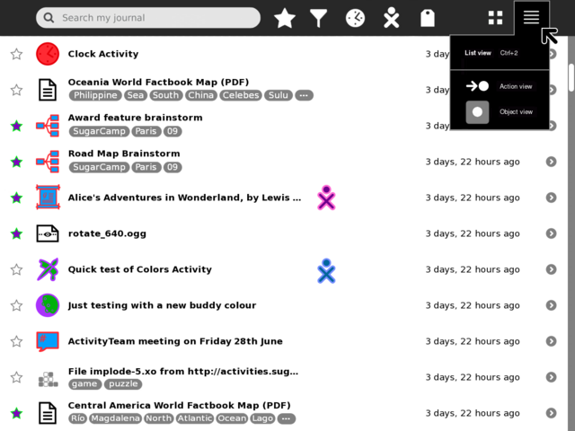
[[Image:journal_mockup_gary_list_palette.png|thumb|centre|640px|List palette, Journal Grid view and List view are (I think) the primary views users will switch between, so I've swapped around the design priority from Eben so that (potential future) action-view and object-view are secondary items for the List view. Once/if action-view is implemented/proven it would likely be the default List view.]] | [[Image:journal_mockup_gary_list_palette.png|thumb|centre|640px|List palette, Journal Grid view and List view are (I think) the primary views users will switch between, so I've swapped around the design priority from Eben so that (potential future) action-view and object-view are secondary items for the List view. Once/if action-view is implemented/proven it would likely be the default List view.]] | ||
Revision as of 22:54, 2 July 2009
<Your proposal's pithy name here>
- Rationale:
- <Your rationale here>
- Features:
- <1st feature here>
- <2nd feature here>
- Implementation Details:
- <Details here>
- Reviewer Comments:
- comments here
Tags under titles
Tollbar and palettes
TODO:
- Mock-up of tag palette (before alstoot starts throwing heavy objects at me).
- Add and mock-up an 'Anytime' palette.
- Add and mock-up an 'Anyone' palette.
- Try and find better design for the 'Anything' filter/funnel icon.
#1
#2
#3
#4
