Design Team/Proposals/Journal: Difference between revisions
Appearance
< Design Team | Proposals
Garycmartin (talk | contribs) |
Garycmartin (talk | contribs) |
||
| Line 78: | Line 78: | ||
==== Extended list view palette ==== | ==== Extended list view palette ==== | ||
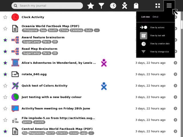
[[Image:journal_mockup_gary_list_extended_palette.png|thumb|centre|640px|The list view palette is extended here to cover sorting feature requirements. View by last edit (modification date), is the current presentation of the Journal. View by creation date, would list objects creation date (do we store this?), when in this mode rather than "16 min ago", | [[Image:journal_mockup_gary_list_extended_palette.png|thumb|centre|640px|The list view palette is extended here to cover sorting feature requirements. View by last edit (modification date), is the current presentation of the Journal. View by creation date, would list objects creation date (do we store this?), when in this mode rather than "16 min ago", the time column would display the real creation date "Today 12:30pm", "July 5th", "November 10th 2008". View by storage size, would sort by storage space taken up so that large files could be removed if short on space, the column usually used for showing time would instead show Kb/Mb type information (no extra columns need, and helps show what sort context a list view is in.)]] | ||
<noinclude> | <noinclude> | ||
Revision as of 13:58, 6 July 2009
<Your proposal's pithy name here>
- Rationale:
- <Your rationale here>
- Features:
- <1st feature here>
- <2nd feature here>
- Implementation Details:
- <Details here>
- Reviewer Comments:
- comments here
Datastore
- See Sascha Silbe's version support project specifically datastore-redesign and this mailing list thread.
Tags under titles
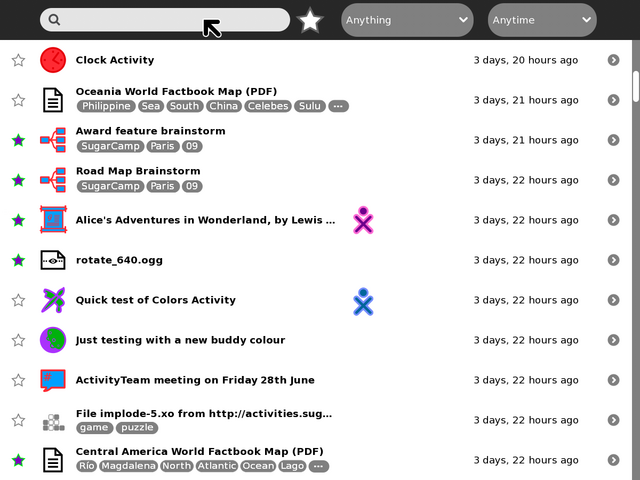
Toolbar and palettes
TODO:
- Add and mock-up an anyone/who palette.
- Try and find better design for the anything/what filter/funnel icon.
- Show multi entry selection and applying actions to them
- shift key modifier and click to multi select (toggle, or could be block range)
- modified pop-up palette when interacting with multi selected items
- Try tag functionality in the search magnifying-glass icon
- less scary number of buttons for novice users
- could also be part of autocomplete when typing
- What/Anything filter could switch main canvas to a 'tree map' like view
- clicking on a grid would then just list that Activity type
- each grid would be sized based on frequency of entries
- each grid would show icon and Activity name
- maximum use of space
- no scrolling and no scary palettes
- perhaps tags could be treated in the same way?
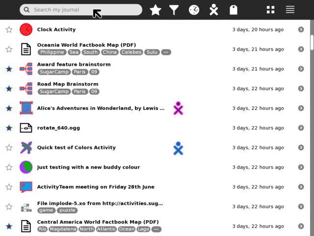
Button icons in toolbar
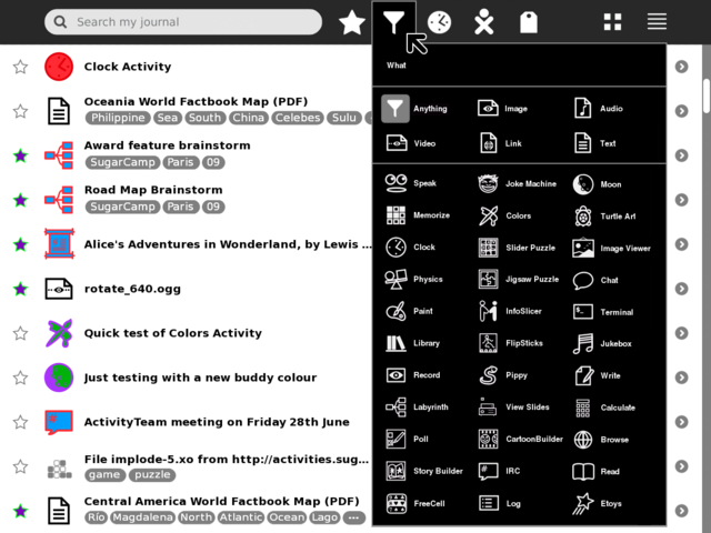
What/Anything palette
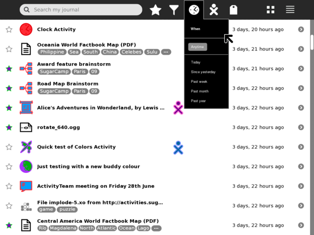
When/Anytime palette
Who/Anyone palette
- TBA
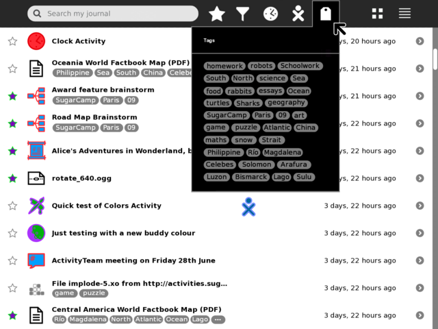
Tags palette
Simple order by frequency
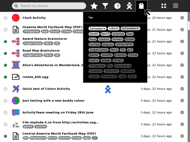
Show frequency as gradient
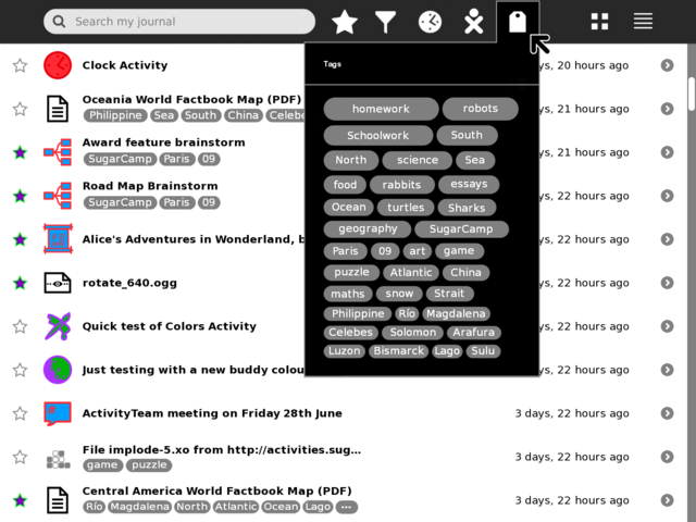
Show frequency as proportional size
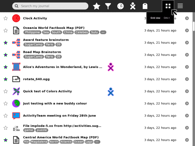
Grid view palette
List view palette
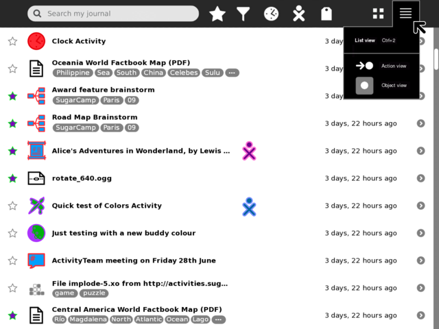
Extended list view palette
