Features/Replace combo box in journal search: Difference between revisions
No edit summary |
|||
| Line 1: | Line 1: | ||
<noinclude> | <noinclude> | ||
[[Category: | [[Category:FeatureLanded|Replace combo box in journal search]] | ||
</noinclude> | </noinclude> | ||
| Line 19: | Line 19: | ||
* Targeted release: 1.02 | * Targeted release: 1.02 | ||
* Last updated: 2014-02-17 | * Last updated: 2014-02-17 | ||
* Percentage of completion: | * Percentage of completion: 100% | ||
See https://github.com/walterbender/sugar/tree/replace-combo-boxes | See https://github.com/walterbender/sugar/tree/replace-combo-boxes | ||
Latest revision as of 07:27, 18 July 2014
Summary
When lots of activities are installed, the "what" combo box on the Journal toolbar becomes unwieldy. This feature would replace the combo box with a palette.

Owner
- Name: Walter Bender
- Email: <walter at sugarlabs dot org>
Current status
- Targeted release: 1.02
- Last updated: 2014-02-17
- Percentage of completion: 100%
See https://github.com/walterbender/sugar/tree/replace-combo-boxes
Detailed Description
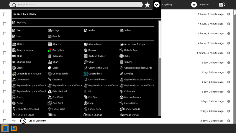
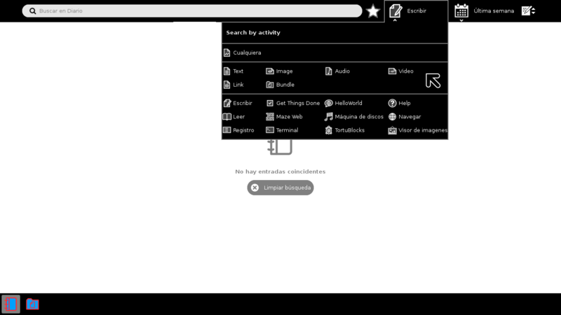
When lots of activities are installed, the "what" combo box on the Journal toolbar becomes unwieldy. This feature would replace the combo box with a palette (as shown in the figure). (In addition, the current implementation of the combo box sorts the activities by bundle_id, not very useful. The new code would sort by Activity name.)
From the palette, you see more choices w/o needed to scroll. Plus the palette is much easier to use with touch.
A palette is also used for the "when" filter for consistency.
Benefit to Sugar
This feature will help us scale to more activities.
Scope
The intervention is limited to:
- sugar/src/jarabe/journal/journaltoolbar.py
- sugar-artwork/icons/scalable/actions/view-type.svg, a new icon for the what filter, and
- gtk-toolbar-style = GTK_TOOLBAR_BOTH_HORIZ in gtk3/theme/settings
How To Test
Features/Replace combo box in journal search/Testing
User Experience
The user will see a palette displayed instead of a combo box. In the example illustrated, it means that rather searching through an un-alphabetized list in a combo box 10x the screen height, the user scans 2.5 screens of items in alphabetical order.
Dependencies
No new dependencies
Contingency Plan
There is no adverse impact if this feature does not land.

