Activities/Portfolio
Portfolio Activity
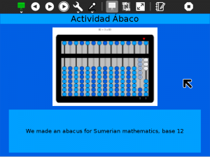
The portfolio activity creates a slide show from Journal entries that have been 'starred'...
How to use Portfolio
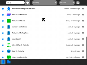
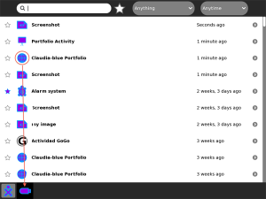
Before you launch the activity, use the ☆ on the left of each Journal entry to mark that entry for inclusion in the portfolio. The Portfolio Activity will use the entry title as well as the preview image and description.
When running the activity, use the ◀ and ▶ buttons to step one-by-one through the slide show. Use the autoplay button to start/pause a slide show. The delay between slides can be controlled by the interval chosen in the combo box. (The default is 10 seconds.)
Note that the colors used in the background are taken from the XO colors of the user.
As of Version 3, a warning is displayed if there are no starred entries in your Journal.
As of Version 4, the slide show can be saved as an HTML document that can be shared.
How to Save the content of you Portfolio to HTML
Each time your launch the Portfolio activity, it will update to reflect the current contents of your Journal. If you want to save a portfolio that represents a particular moment in time (or you want to share your portfolio with someone else), you need to save it as an HTML document. Select the "Save as HTML" option from the menu and the content of the portfolio will be saved as a document in the journal.
Tip: Open your Journal to make sure the portfolio has been saved.
Tip: You may want to copy the HTML file to a USB to open it in a different XO, or any other computer, using a web browser.
Where to get Portfolio
The Portfolio activity is available for download from the Sugar activity portal: Portfolio
The source code is available on the Sugar Labs Gitorious server.
Sample portfolios
Where to report problems
You can report bugs and make feature requests on our bug-tracking system (You need to create an account first). To list all open tickets of Portfolio you can use query component=Portfolio. You are also welcome to leave comments/suggestions on the Talk:Activities/Portfolio page.
Mock-ups for future development
This are mock-ups previous to Walter's implementation. The activity icon and play icon needs to be updated in the toolbar, and also the timer selector.
Horizontal split works better for long descriptions, and vice versa. Maybe the activity use one template or another based on this.
Showing areas for thumbnail and description in the design grid:
