Activity Team/New Toolbars: Difference between revisions
Appearance
Garycmartin (talk | contribs) No edit summary |
|||
| Line 3: | Line 3: | ||
== Log == | == Log == | ||
* make share button insensitive, icon for logsend (could be edit one) | * make share button insensitive, icon for logsend (could be edit one) | ||
: I'll pick up this one [[User:Garycmartin|Garycmartin]] | |||
:Looks to be done already in latest git, but reveals a new sub toolbar issue in that it does not conform to the standard height (it must be relying to the height of share/keep icon) [[User:Garycmartin|Garycmartin]] 19:03, 30 August 2009 (UTC) | :Looks to be done already in latest git, but reveals a new sub toolbar issue in that it does not conform to the standard height (it must be relying to the height of share/keep icon) [[User:Garycmartin|Garycmartin]] 19:03, 30 August 2009 (UTC) | ||
| Line 18: | Line 19: | ||
: And potentially [[Image:tab-next.png]] and [[Image:tab-previous.png]]? --[[User:Garycmartin|Garycmartin]] | : And potentially [[Image:tab-next.png]] and [[Image:tab-previous.png]]? --[[User:Garycmartin|Garycmartin]] | ||
: Also need a potential tab primary toolbar icon [[User:Garycmartin|Garycmartin]] | |||
[[Image:Tabs.png]] [[Image:Hidden_share_option.png]] | [[Image:Tabs.png]] [[Image:Hidden_share_option.png]] | ||
| Line 28: | Line 31: | ||
* keep as options | * keep as options | ||
[[Image:TA_save.png]] | [[Image:TA_save.png]] | ||
* keep eye out for a better 'keep/save/export/import' type primary toolbar button | |||
* save snapshot | * save snapshot | ||
| Line 47: | Line 51: | ||
* view, edit, the rest of the options go into the primary one | * view, edit, the rest of the options go into the primary one | ||
* bug: copy when no text is selected (type clipping) | * bug: copy when no text is selected (type clipping) | ||
: I'll pick up this one [[User:Garycmartin|Garycmartin]] | |||
== Calculate == | == Calculate == | ||
| Line 59: | Line 64: | ||
== Pippy == | == Pippy == | ||
* simple activity (hello world example) | * simple activity (hello world example) | ||
* can we put the "Stop" and "Run" controls in the primary toolbar to give more vanvas space? [[User:Garycmartin|Garycmartin]] | |||
== Paint == | == Paint == | ||
| Line 70: | Line 76: | ||
* how to differentiate the activity close button and the play/stop one? | * how to differentiate the activity close button and the play/stop one? | ||
* do we actually keep the stop button? | * do we actually keep the stop button? | ||
: I'll pick up this one [[User:Garycmartin|Garycmartin]] | |||
== Typing turtle == | == Typing turtle == | ||
| Line 79: | Line 86: | ||
== Infoslicer == | == Infoslicer == | ||
* new concept (currently edit and library tab) | * new concept (currently edit and library tab) | ||
== Write == | |||
* some icon polishing and a reorder | |||
: I'll pick up this one [[User:Garycmartin|Garycmartin]] | |||
= Other = | = Other = | ||
== Tabs == | == Tabs == | ||
* is the 'x' icon correct or should it better be '-'? | * is the 'x' icon correct or should it better be '-'? | ||
Revision as of 20:08, 30 August 2009
Activities
Log
- make share button insensitive, icon for logsend (could be edit one)
- I'll pick up this one Garycmartin
- Looks to be done already in latest git, but reveals a new sub toolbar issue in that it does not conform to the standard height (it must be relying to the height of share/keep icon) Garycmartin 19:03, 30 August 2009 (UTC)

Note that the sub toolbar is not the correct height once the two buttons have been removed.
Nope, it is hidden, but we agreed to make it insensitive. And I would show the keep option as well.Erikos
Terminal
- close icon on tab
- tabs not distinguishable
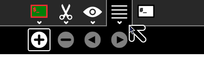
- Are we moving session tabs to the top as we put in the new toolbar? Perhaps we should focus on the toolbar for now, and worry about the current tab style later. I would like to see tabs in the same style as Browse for consistency if possible (should make the tab names shorter to make tabs more usable). Regarding toolbar, the "Tab" tab can go and all functions fit in the primary toolbar, will need new (tab shape) icons for "New tab" and "Close tab" perhaps also "Previous tab" and "Next tab" though we could consider removing these --Garycmartin
- OK, how about these two new icons (likely want them in sugar-artwork so other activities can use them)
 and
and  ? --Garycmartin
- And potentially
 and
and  ? --Garycmartin
- Also need a potential tab primary toolbar icon Garycmartin
Browse
- tabs not distinguisable
- move edit and vew icon to the left
TA
- keep as options
- keep eye out for a better 'keep/save/export/import' type primary toolbar button
- save snapshot
Read
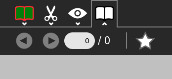
- readtoolbar icon? (bookmarks one?) No palette for star icon
- maybe the bookmark ones can go into the top bar?
- open unsupported document (_load_document l540)
- alert?
- can I reload a document?
Memorize
- play/create icons? How to switch between the two modes?
Labyrinth
- view, edit, the rest of the options go into the primary one
- bug: copy when no text is selected (type clipping)
- I'll pick up this one Garycmartin
Calculate
- icons for algebra, trigonometry...?
Imageviewer
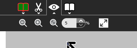
- view section only? all the view related things in the main line?
Jukebox
- view section, rest in the main screen
Pippy
- simple activity (hello world example)
- can we put the "Stop" and "Run" controls in the primary toolbar to give more vanvas space? Garycmartin
Paint
- paint: edit, image (eye), color icon, shape icon, text icon, tools icon? (or main one?), effects icon
Record
- use type (audio, video etc) icons
Physics
- everything in the top?
- how to differentiate the activity close button and the play/stop one?
- do we actually keep the stop button?
- I'll pick up this one Garycmartin
Typing turtle
- simple one
Playgo
- everything in top, restart button from memorize
Infoslicer
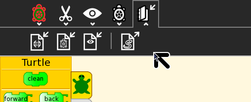
- new concept (currently edit and library tab)
Write
- some icon polishing and a reorder
- I'll pick up this one Garycmartin
Other
Tabs
- is the 'x' icon correct or should it better be '-'?


